Biophilic Divider - Your workspace matters
Brief
Design and develop a solution for How might we improve the experience for the increasing number of people with hybrid working patterns.
Goal
Create a functional 3D Biophilic Divider that is sustainable, easily assembled, alter arrangements, and fulfill its purpose of separating work life from home life.
Role in Project
Designer
3D Artist
Video Editor
Software
![]() Blender 2.93
Blender 2.93
![]() Quixel Mixer
Quixel Mixer
![]() Quixel Bridge
Quixel Bridge
![]() Premiere Pro
Premiere Pro
Prep
1.0 Introduction to Project
1.1 What is Biophilic Design?
1.2 14 Patterns of Biophilic Design
1.3 Primary Target Audience Research
1.4 Room Dividers
Mock-Ups & Concepts
1.5 Quick Mock Up Concept
1.6 Bedroom References
1.7 Real Plants
1.8 Artifical Plants
1.9 IKEA Room Divider
2.0 Concept Idea #2
2.1 Concept Ideas Analysis
Final Concept Research
2.2 Constructive Thinking
2.3 Plants & Textures
2.4 Mixing Textures
2.5 Lights, Candles & Shelving
2.6 Biomorphic Patterns
Divider Trailer Creation
2.7 New & Final Concept
2.8 Selected Focuses Accomplished
2.9 Feedback Alterations
3.0 Inital Video Plan
3.1 Order of Assembly
3.2 IKEA Box References
3.3 IKEA Box Making
3.4 Box Openings
3.5 Moodboard of Box Slide In
3.6 Premier Pro Editing
3.7 Conclusion
1.0 Introduction to Project | Concept Trailer
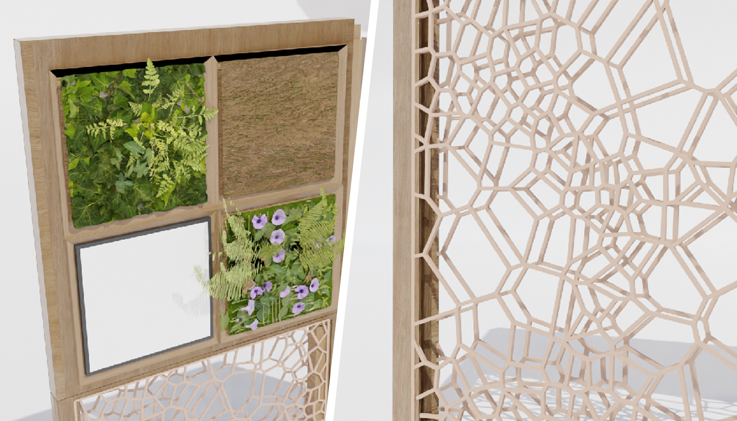
The biophilic divider is a compactable slide-in room divider that aims to improve
the well-being of people working from home! The divider will be placed in the room
you work in, separating work life from home life! By having real & artificial plants
as tiles, and wooden carved nature patterns, I believe the divider will significantly
help improve the well-being, focus & productivity due to the feel of being closer to nature!
The video above is a concept trailer designed to look like an IKEA advertisement, using
audio from one of their videos “Make Black Friday a little greener with IKEA”. The goal of
the video is to keep it simple and minimalistic, displaying how easy the divider can be
assembled in the hope to make customers more interested in buying the product. The video
was also a test to see if I’m able to make a product I designed a realistic trailer, to
which I’ve gotten many positive responses claiming it’s very much like an actual IKEA advertisement!
I believe that the design and development of the biophilic divider has been a great success, going
through various design stages due to constructive feedback received, allowing me to finalize my
design to its full potential! I’d say I’m quite proud that you can alter the placement of square
tiles and wooden patterns, giving the user more freedom to match their personal preference! Overall,
I am very proud of this project, and very much enjoyed the entire work process!
1.1 What is Biophilic Design?
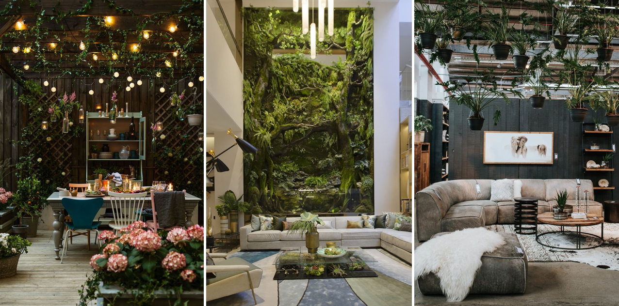
Biophilic Design is the concept of adding more nature into your workspaces, such as plants, natural light & general visual connections with nature. The concept was introduced by E.O. Wilson, a biologist, and University Research Professor, in his 1984 book Biophilia. His research outlined a fundamental tendency of human beings to be attracted to nature and emulate its processes and structures in everyday life. Essentially, it creates natural environments for us to live, work and learn whilst unconsciously reconnecting to nature.
1.2 14 Patterns of Biophilic Design | Selected Focus
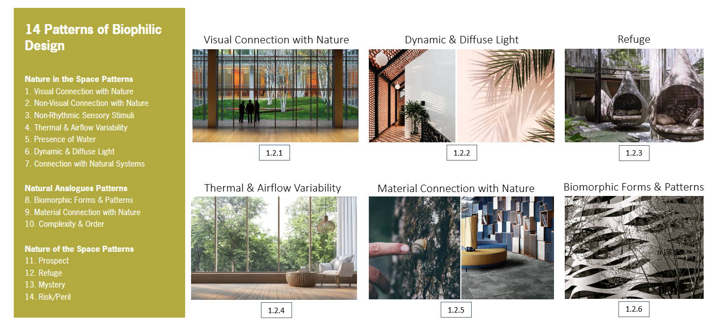
14 Patterns of Biophilic Design articulates the relationships between nature, human biology,
and the design of the built environment so that we may experience the human benefits of biophilia
in our design applications.
Within my project, I decided to focus on 6 biophilic design patterns. Visual connection with
Nature [1.2.1] was key when designing a biophilic divider, making sure there was an actual
visual display of nature, and there was a sense of connectedness. This is followed by Dynamic
& Diffuse Light [1.2.2], making sure natural light was involved, a necessity when it comes to
the design principles of biophilia.
The most important pattern to me in this project was Refuge [1.2.3], the feeling that you’re
protected from the loud surroundings and bright lights from the outdoors when working. This
was something I really wanted to achieve as the divider was aimed towards separating work
life from home life for hybrid workers, making sure they feel comfortable, safe, whilst
gaining the physiological benefits from biophilia. Following this, Thermal & Airflow Variability
[1.2.4] is also an important pattern to follow, as it’s something we tend to forget often, making
sure we allow enough fresh air in.
Something I really wanted to focus on when designing my biophilic divider was a Material
Connect with Nature [1.2.5], including various aspects of natural materials such as bark,
moss, or stone to further add the feeling of connectedness with nature. Finally, Biomorphic
Forms & Patterns [1.2.6] was key when designing the divider, making sure every aspect of the
divider had a resemblance to nature!
1.3 Primary Target Audience Research | Google Form
To start my primary research, a google form survey focused on obtaining quantitative
data was sent out to 300 Winchester university students via email, whilst using other
social platforms such as Facebook and Instagram to gain more responses. The survey was
titled “Hybrid Home - Studying/Working from home”, asking a total of the 65 respondents
their views on working from home, how it has affected them, and would they like to implement
biophilia into their lives. Overall, the number of responses received was sufficient,
being just under a third of what had been sent out. Quantitative research was the focus
here because it’s more scientific, objective, fast, and focused, providing me with the
answers required to conclude a public response.
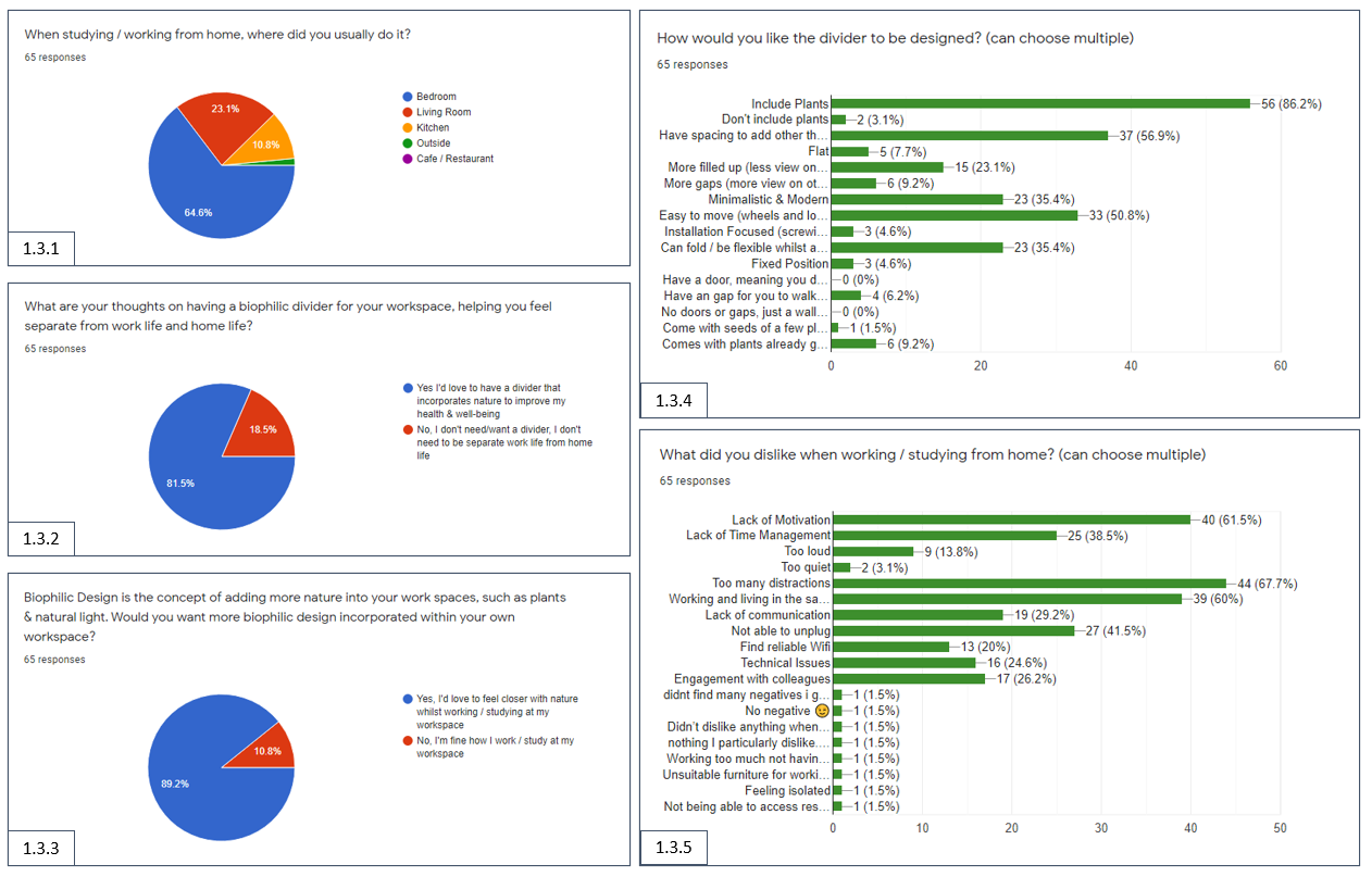
[1.3.1] Displays that over 64.6% of respondents studied/worked from their bedroom, with 23.1%
in their living room, and 10.8% in their Kitchen. This further reiterates the importance of a
workspace, having their bedroom as their main way of working from home, living, and working in
the same space.
[1.3.2] Displays the respondents’ thoughts on having a biophilic divider in their workspace, to
which 81.5% of respondents stated they would. This is good to know as a high percentage of
respondents indeed would like to implement a divider that incorporates nature to help improve
their health and well-being
[1.3.3] Informs the respondents of what biophilic design is, to which 89.2% have stated they
would love to feel closer to nature whilst working/studying at their workspace. Only a few 10.8%
of respondents would rather work/study in their current workspace. This further goes well with my
research, knowing that primary researched respondents would like to feel closer to nature when
working/studying at their workspaces.
[1.3.4] Gives me the necessary information on what the respondents want to see in the design of the biophilic
divider. 86.2% of respondents wanted to include plants, which was reassuring. This was followed by 56.9% wanting
to have spacing to add other things (a shelf), however, I decided not to add this in the current concept as I
wanted to focus more on easy assembly whilst focusing on the refuge of the design. Finally, something I wanted
to focus on was the flexibility of the divider, to which 35.4% of respondents agreed they want it to fold/be flexible.
[1.3.5] Identifies that the main reason why people dislike working from home is due to “Too many distractions” at 67.7%.
This is followed by the second, being “Lack of motivation” at 61.5%, and the third “Working and living in the same space”
at 60%. Finally, It was interesting to see what the respondents wrote as their own answer, giving me further insight into the issue.
1.4 Room Dividers | Secondary Research
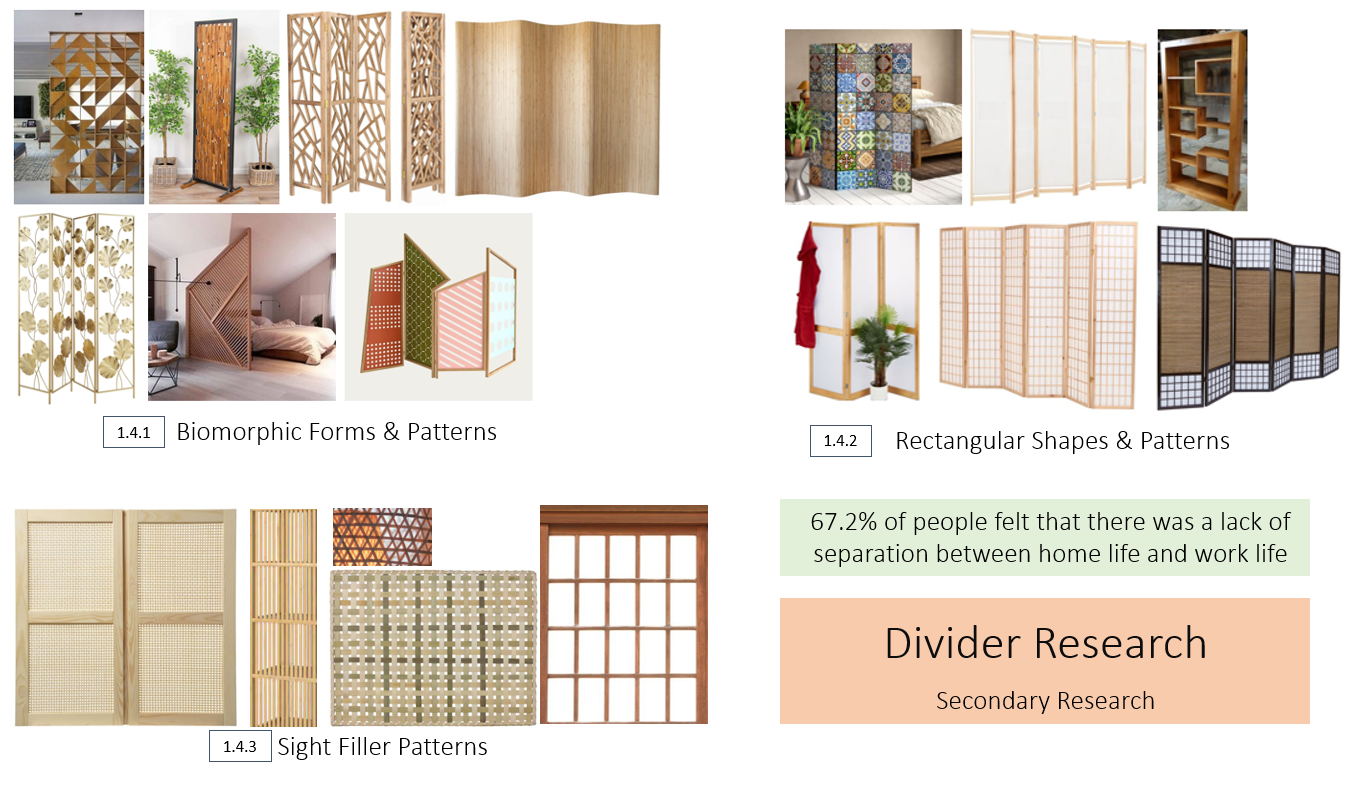
With the primary statistics I have now, secondary research was the next step. I began to look at room dividers [1.4.2], observing their rectangular shapes and patterns to gain a better understanding of what makes a divider. Next, I looked into the various biomorphic forms and patterns [1.4.1], seeing how a divider could resemble the patterns of nature. This was very useful as this information told me I was not bound to a rectangle. Finally, I wanted to gain a better insight into the various materials and methods used as a sight filter [1.4.3], which have little visibility whilst still letting light through. With all this research, I aimed to keep to my primary statistics of the 67.2% of people who felt there was a lack of separation between home life and work-life, making sure I achieve the goal of creating this distance.
1.5 Quick Mock Up Concept
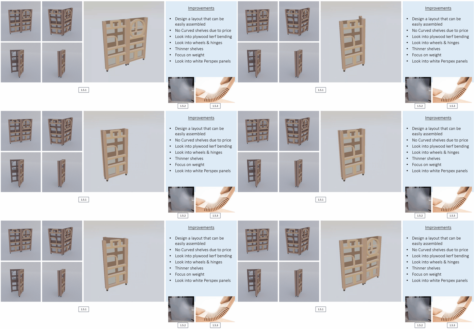
To get my head around the whole assembly of a room divider, I decided to just go for it and make something in 3D, allowing me to think more clearly when observing in 3D space. My attempt with this mock-up was to get an idea of what I needed to focus on, to which I had been given feedback on some areas that need improving.
I needed to design a layout that can be easily assembled since this mock-up is too thick and heavy. To rethink curved wood due to the expenses, but was introduced to plywood kerf bending [1.5.3], much more cost-effective. Next was to look into white Perspex panels, acrylic-like material that reduces visibility but still lets light through. And in general, the form of the divider, not too thick, not too heavy, not a hassle.
1.6 Bedroom References | Primary Research | IKEA
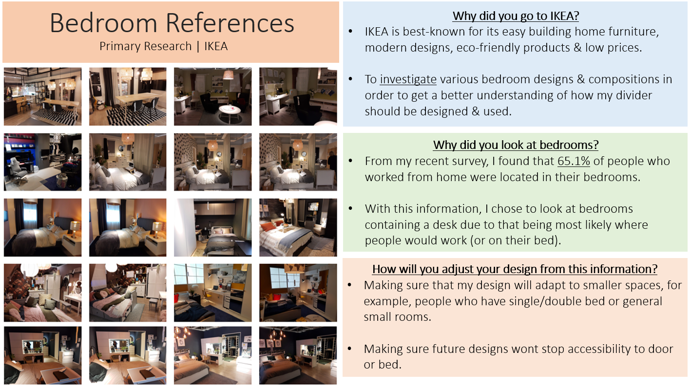
For my primary research, I went into IKEA to look further into the compositions of bedrooms, as from my survey I found that 65.1% of respondents worked from home. With this information, I’m more aware of the various spaces, making sure the divider is not in the way no matter the space.
1.7 Real Plants | Primary Research | IKEA & Home
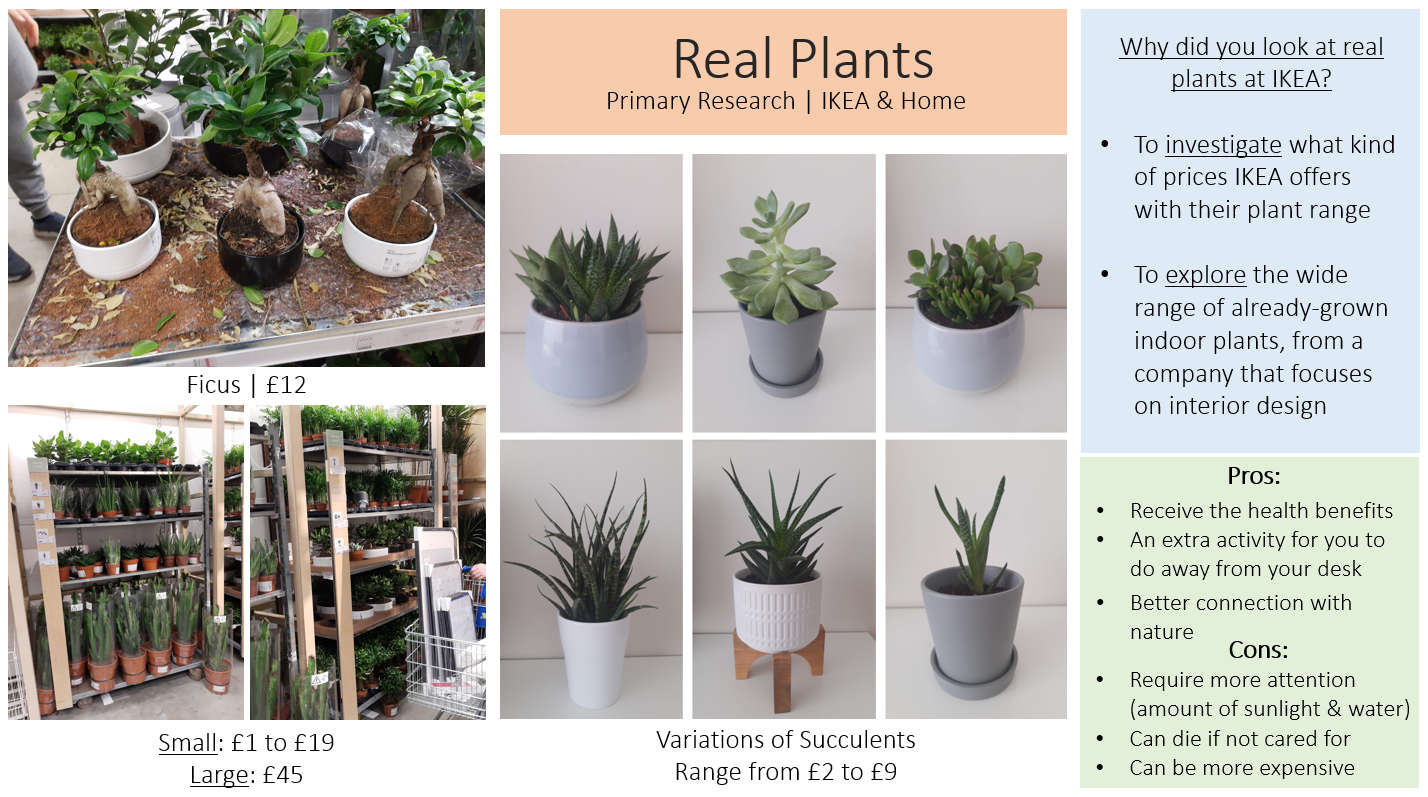
During my time at IKEA, I found a section of real plants. Due to IKEA being well known for being a company that focuses on interior design, I thought taking notes of their plants was worth knowing as my divider is biophilic focused. I took notes on their prices to see what kind of plants I could possibly implement or advise to use. I also looked into my own plants at home, noticing that I have a lot of succulents in various shapes and sizes. This was good to note, as succulents require little water, meaning there would be little hassle of keeping them alive, whilst getting the biophilic benefits of being closer to nature.
1.8 Artifical Plants | Primary Research | IKEA
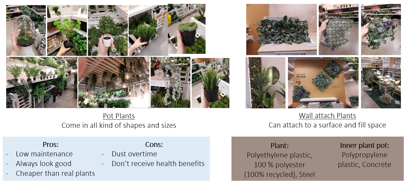
Further into IKEA, I stumbled upon artificial plants, and there were a lot of them. Due to the plants being fake, they came in all kinds of shapes and sizes, from pot plants to wall attachments. This was something I definitely wanted to focus on, and not everyone might want the divider to be fully real plant-based, putting them off from buying the product. The best part about this is that they’re recyclable, meaning you could always switch it up. In terms of biophilic benefits, the feel of being closer to nature is a personal opinion, and for many people, artificial plants could be just as good as real ones.
1.9 IKEA Room Divider | Secondary Research
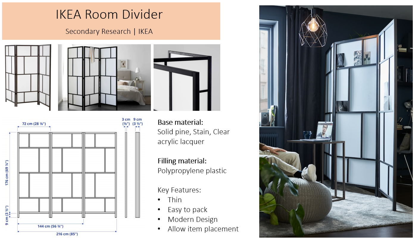
Going back to secondary research, I found that IKEA once sold a room divider of their own, so I decided to analyse their design decisions. It was shown that the divider was meant for no visibility, including light. Although being quite tall, it’s thin and seems that it could fold and be put away with not too much hassle. I also took note of the measurements they’ve listed, adjusting my own divider to match the market standard.
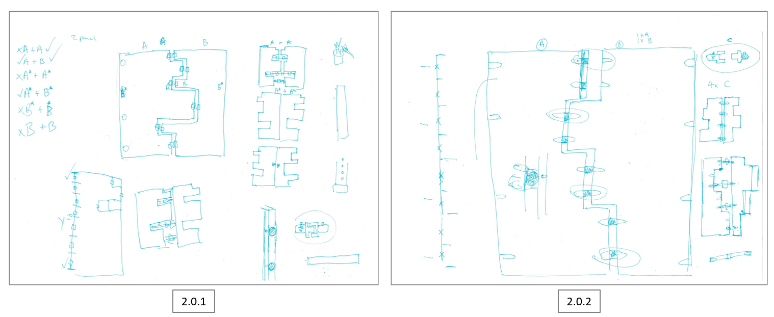
With all the research done so far, I tried sketching out my idea. Although the market standard divider resembles a rectangle, I wanted to try and make an interesting biomorphic pattern that comes together. Within the first sketch [2.0.1], I played around with various designs, seeing how the divider can come together, and where the hinge holes could be located. The second sketch [2.0.2] goes into further detail about where hinges could be located and how you can alter the axis of the divider panel.
2.0 Concept Idea #2 & Sketches
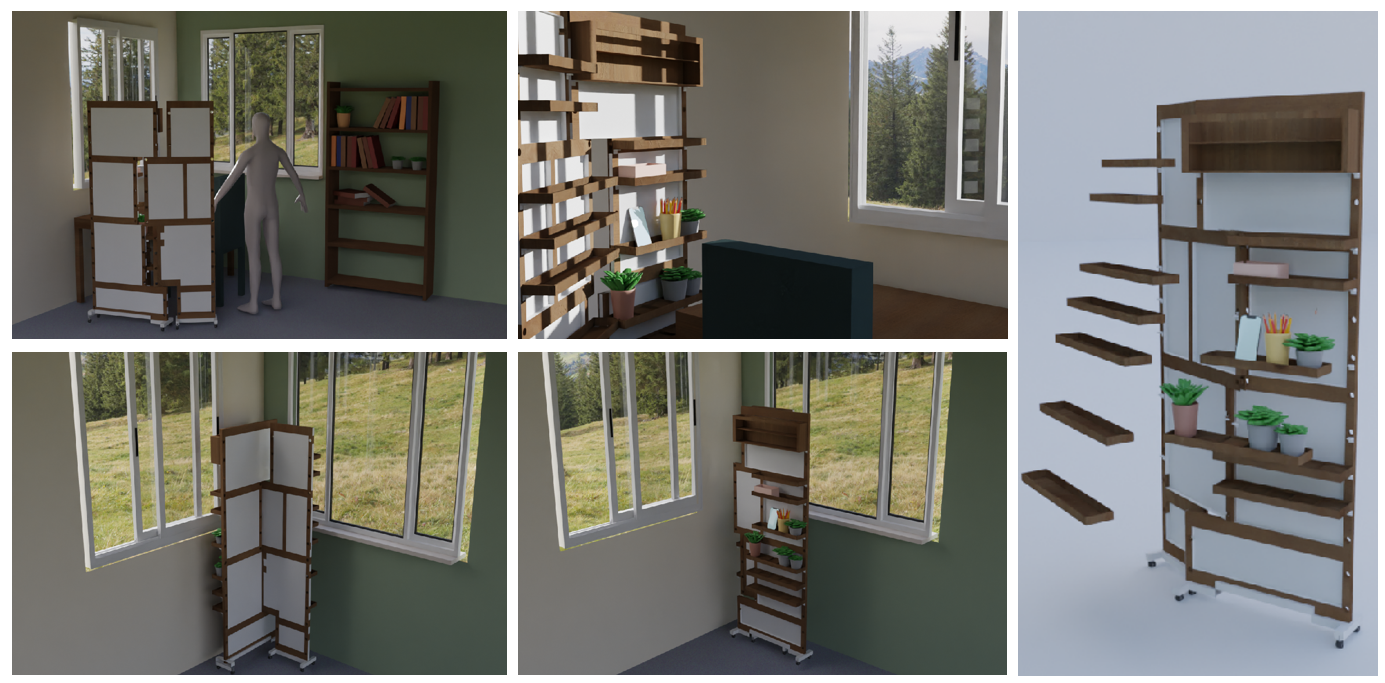
This is my concept idea #2, the second stage of my biophilic divider development. The concept focuses on being compact, mobile, providing shelving and the users own space. However, what this design does lack was biophilia, only providing shelving to allow small pots to be placed (and other general items). Although this design was interesting, I was still not satisfied. After a presentation, I also gained some feedback, stating it may be a hassle to put away and could be more focused on being portable, easier to move around the house for convenience.
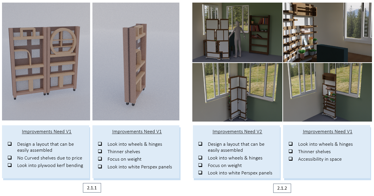
2.1 Concept Ideas Analysis | Reflecting on feedback
This is my concept idea #2, the second stage of my biophilic divider development. The concept focuses on being compact, mobile, providing shelving and the users own space. However, what this design does lack was biophilia, only providing shelving to allow small pots to be placed (and other general items). Although this design was interesting, I was still not satisfied. After a presentation, I also gained some feedback, stating it may be a hassle to put away and could be more focused on being portable, easier to move around the house for convenience.
2.2 Constructive Thinking | A New Idea
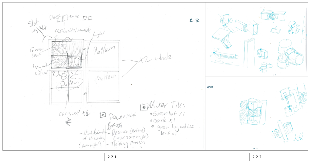
With the feedback given, I created a new design, something more biophilic focused [2.2.1]. This design includes 3 biophilic panels and 1 light panel. The bottom 2 areas include biomorphic patterns, whilst being able to take out and swap up them, giving the user free will to match their personality. The top right section was going to include a pattern; however, this was later changed to a whiteboard. The main idea I came up with was to make it compatible, having the divider slide into itself! The other two sketches [2.2.2] goes further into the hinges, drawing the 3D objects to gain a better understanding of how I intend them to work.
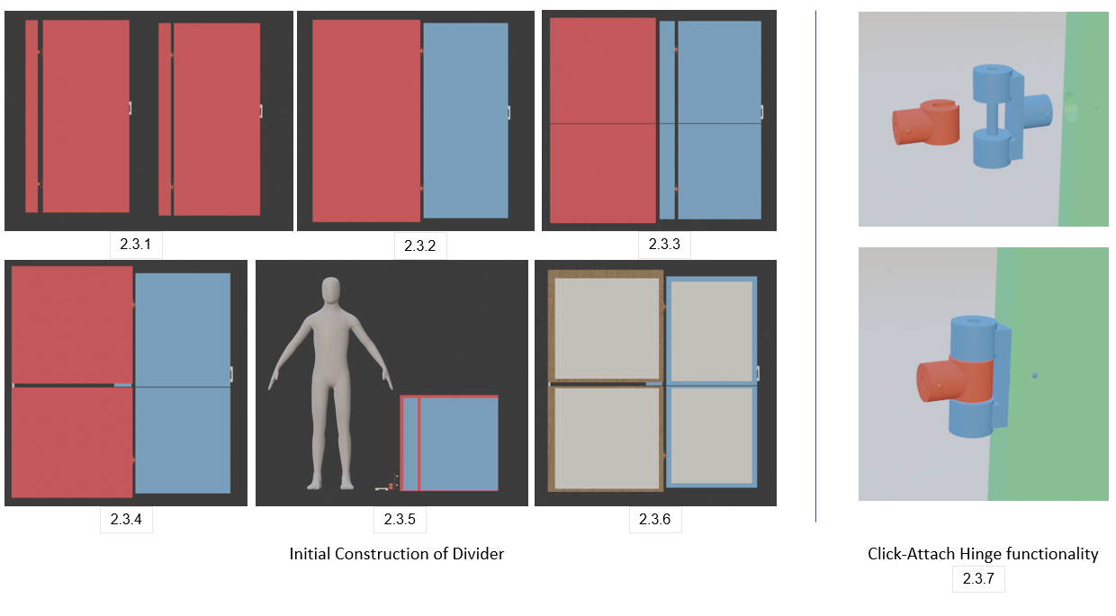
Moving into Blender, I began constructing the divider. I started by creating the basic shape of the divider [2.3.1], playing around until I was satisfied. I later reassembled it to its final shape [2.3.2], adding the extendable divider in position. As I was developing the divider, I found that it’s possible to cut it in half [2.3.3], meaning it would come in a more compact form, and can be put away much easier [2.3.4] [2.3.5]. Finally, I made an insert to where the biomorphic patterns will be [2.3.6].
Going back to the hinges, I made them into 3D to help present how they will work [2.3.7]. Essentially, one will go inside the divider, pushing down on the metal button to make sure it stays, and then click-attach the other hinge together. This is finished by moving the other panel together. Ideally, this would be done on the floor not stood up.
2.3 Plants & Textures | A New Idea
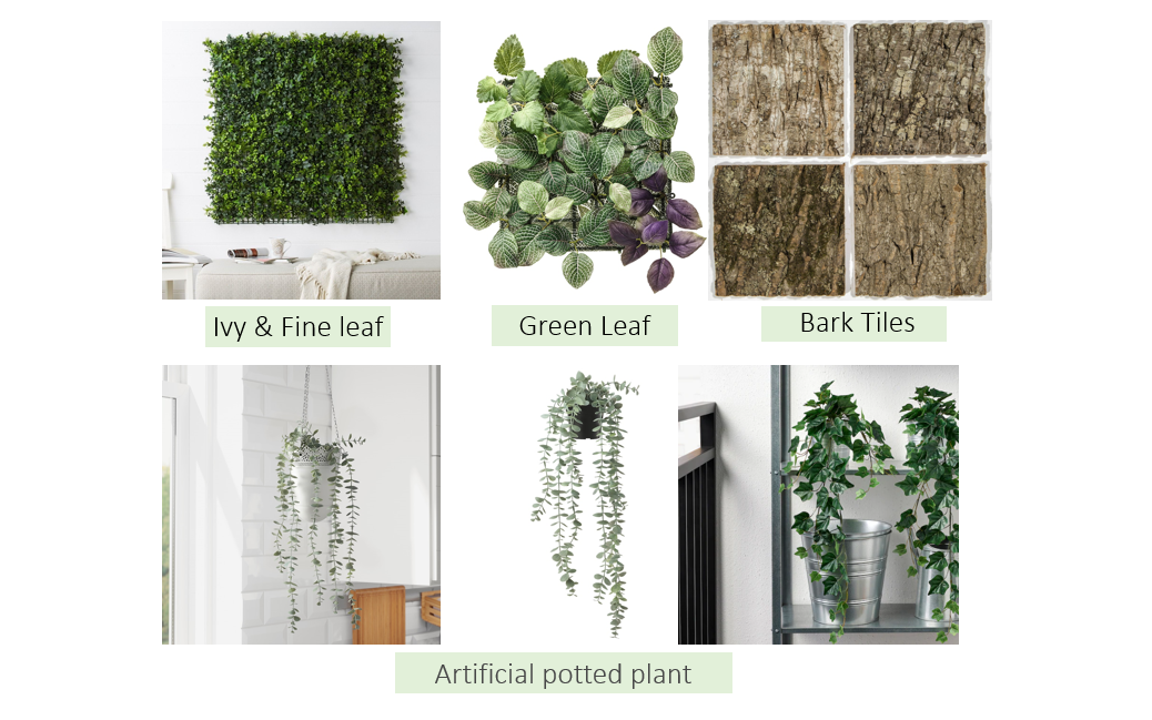
With the square tiles in mention, I looked further into plants and textures that could be applied to them, giving the sense of feeling closer to nature. The top 3 (Ivy, green leaf, and bar tiles) are the ones I believe would work best, giving a nice variety of nature. The artificial potted plants were a suggestion given during my presentation, having them hang somewhere on top of the divider. However, I did not implement them at the end as I didn’t want to over-complicate the design of the divider.
2.4 Mixing Textures | Mixer
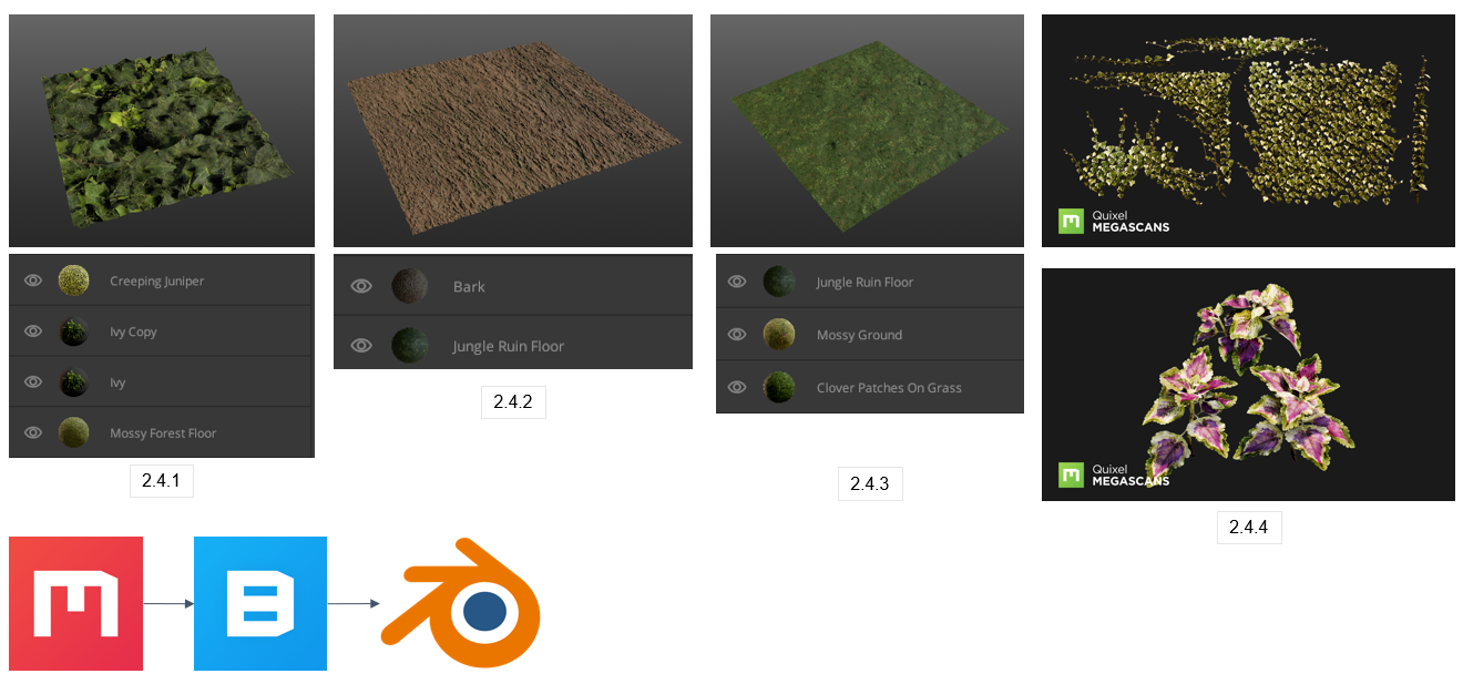
With the secondary research of plants and textures done, I began making the texture in Mixer. Quixel Mixer is a texturing software that allows you to create and Utilize Physically Based Rendering (PBR) materials. Its biggest advantage is it allows you to procedurally create tileable textures and directly paint on 3d models utilizing a large free library of materials and the Quixel Megascans library.
I gathered various textures and blended them together in an order that visually looked best. I started by creating the Ivy and fine leaf [2.4.1], using Ivy and moss layers to create a mini-environment piece. Next, I created a mossy bark texture [2.4.2], combining a mossy jungle texture with enough height to make the moss visible on the bark. Finally, I mixed the jungle moss with a clover patch of grass, creating the base of the Green Leaf tile.
I then moved onto Quixel Bridge, similar to Mixer, Bridge holds your assets library whilst offering various 3D assets. What’s useful from using Bridge is you can instantly export a 3D asset into your program, which in my case was Blender. This is what I used to gain some 3D assets of plants and leaves, making the tiles look more alive and realistic [2.4.4].
2.5 Lights, Candles & Shelving | Brainstorming
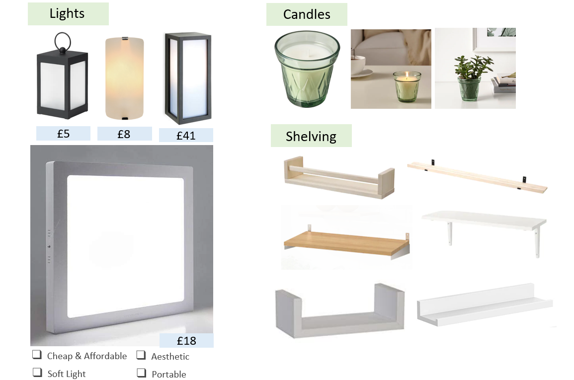
Continuing my secondary research, I looked further into costs when it came to lights, candles and shelving. I looked for alternative light sources that could maybe replace the tile, however, they were either too expensive or too simple for its use, especially when its task is to provide light when it’s darkened within a space. This is why I settled with the square tile, it’s affordable, portable, gives a soft light and looks aesthetic, especially when applied with the rest of the biophilic tiles.
I also looked into candles and shelving; however, I did not implement them towards the end as I wanted to keep the divider simple whilst following my initial sketches. If I would have continued this project, I would have definitely tried to implement them, making the shelf attach, hang off or slide in, however my aim was to keep it minimal and easily moveable, with no hassle
2.6 Biomorphic Patterns | Secondary Search
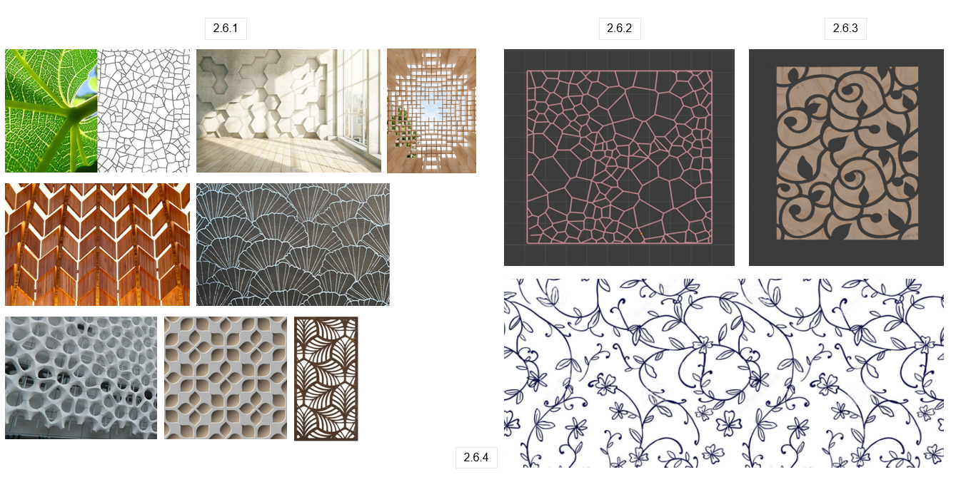
Biomorphic forms and patterns are those that represent natural forms often in an abstract way, relying on contour, patterns, and textures to draw a connection to nature. This is something I really wanted to implement into my design. I found some interesting patterns [2.6.1], all resembling nature patterns. I quite liked the leaf outlined [2.6.1] and floral pattern [2.6.4], so I recreated my own versions [2.6.2] [2.6.3]! This was achieved by using Illustrator to make the pattern, importing it as a . SVG and converting it into a mesh.
2.7 New & Final Concept | Functional Biophilic Divider
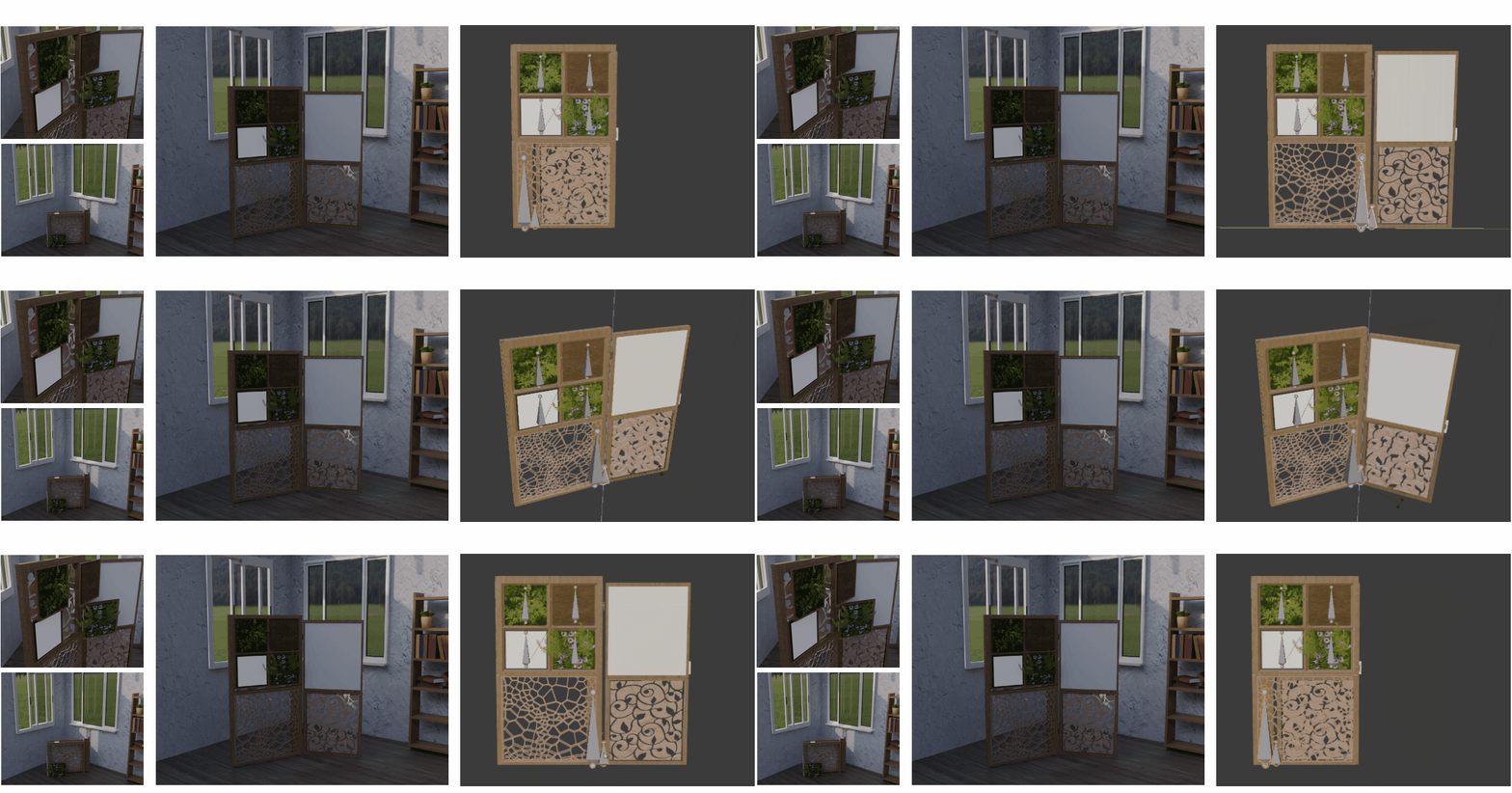
This is my new and final concept of a biophilic divider! The divider can be easily assembled/dissembled for carrying use (moving to a new place or collecting from a shop). The slide in and out function of the divider is perfect, allowing the user to extend the divider out to cover more space, keep it closed for smaller spaces, and can be put to the side with ease whilst looking visually pleasing! The 4 artificial plant/material tiles can be rearranged in any way, slot in and out, whilst being able to swap them for the biomorphic pattern below! The square light tile was a great addition, having the divider able to shine soft light when working at your workspace during night hours. To keep the divider up, there are 8 total mini wooden poles that are slotted inside the divider at each end. The shelves were not implemented because I wanted to keep it simple for its use, however, in the future, I’d definitely consider adding an attachable shelf.
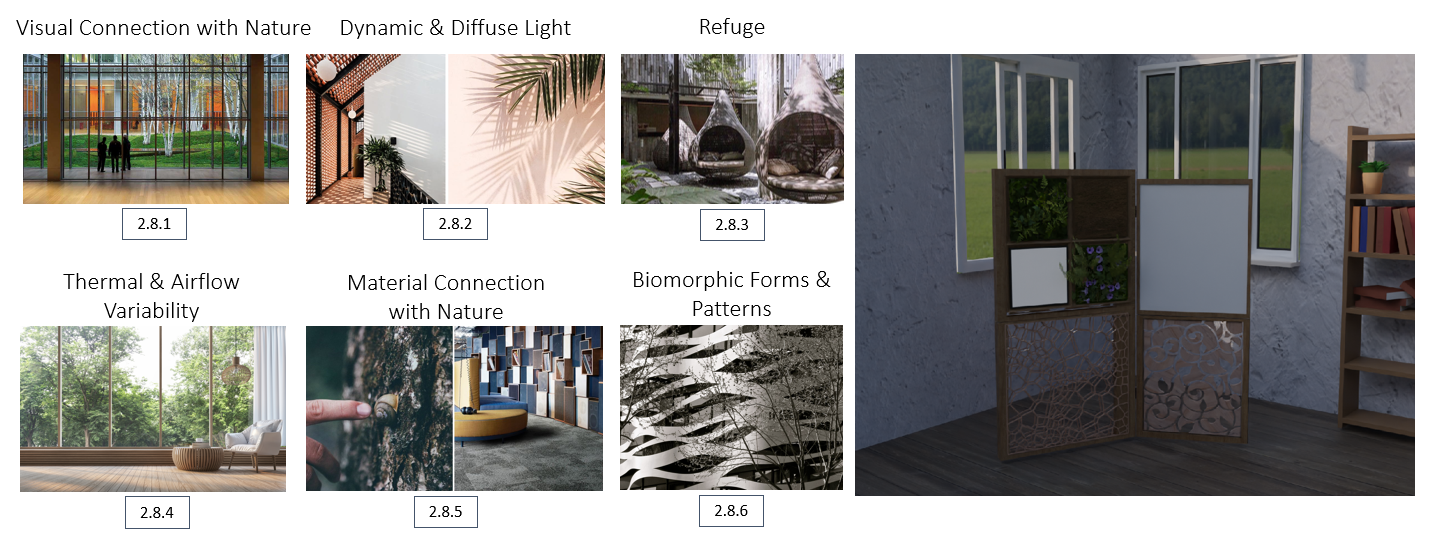
2.8 Selected Focuses Accomplished | Patterns of Biophilic Design
Going back to the selected patterns of biophilic designs, I believe that I’ve successfully achieved my 6 focused patterns! Visual connection with nature [2.8.1] was achieved by the 3 biophilic tiles, containing artificial (or can be real) plants that easily resemble the beauty of nature. Dynamic & Diffuse Light [2.8.2] was achieved by the gaps in the patterns, the soft light square tile, and by having the whiteboard being made out of fogged plastic (talked about in 2.9), letting light through whilst maintaining little visibility from the other side to maintain privacy. Refuge [2.8.3] was achieved by the divider itself, having the fogged plastic whiteboard to allow light in, the 3 biophilic tiles and the softy light square tile, meaning you won’t need to move the divider out the way as much as it maintains its uses throughout the day, keeping you in refuge.
Thermal & Airflow variability [2.8.4] was achieved by having the patterns with various gaps, allowing air to flow through the divider. Material connection with nature [2.8.5] was primarily achieved with the 3 biophilic tiles, however, the main was being the mossy bark tile. Finally, biomorphic forms and patterns [2.8.6] were achieved by implementing wooden carved patterns that resemble nature, one being the cell structure of a leaf, the other being a floral pattern.
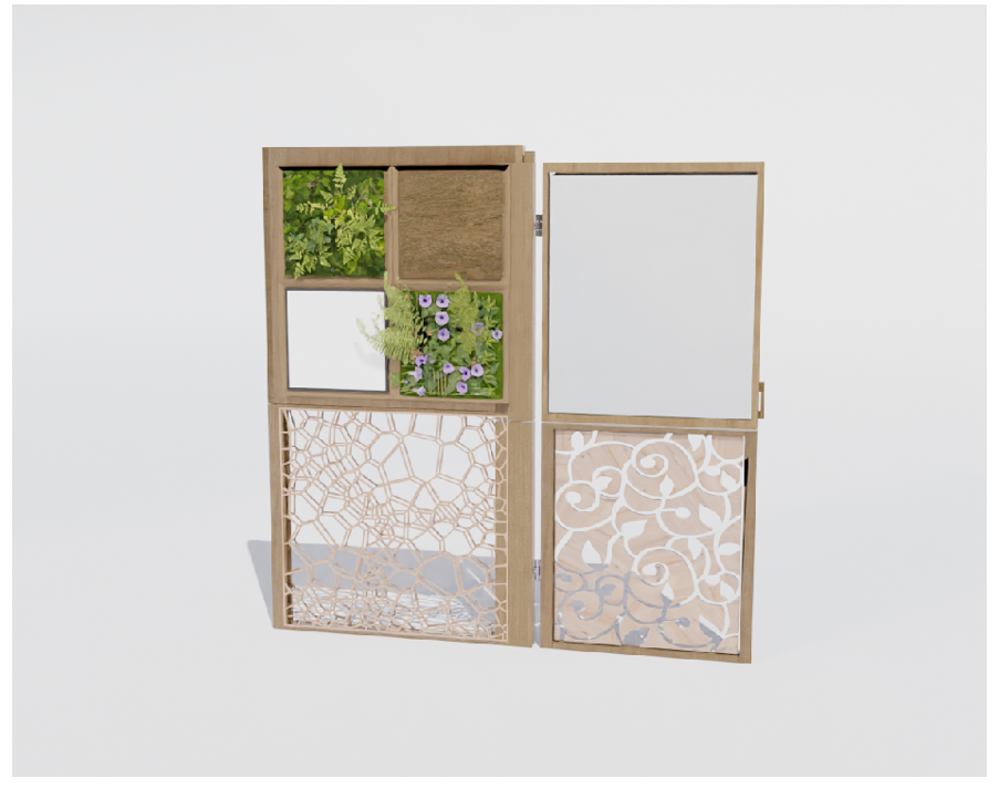
2.9 Feedback Alterations | White Bored
After presenting my project to my class and lectures, I received feedback concerning the whiteboard. Due to the whiteboard being what it is, it blocks visibility whilst possibly being in the way. One suggestion I received was to add a cover that hides the whiteboard. However, another suggestion I received was to maybe make it out of glass, allowing visibility. I was quite fond of that idea, however, thought that glass would be heavy and too fragile when moving the divider.
After presenting my project to my class and lectures, I received feedback concerning the whiteboard. Due to the whiteboard being what it is, it blocks visibility whilst possibly being in the way. One suggestion I received was to add a cover that hides the whiteboard. However, another suggestion I received was to maybe make it out of glass, allowing visibility. I was quite fond of that idea, however, thought that glass would be heavy and too fragile when moving the divider.
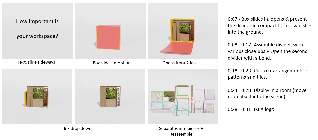
3.0 Inital Video Plan | Trailer
This is my initial video plan. On this mood board, I blocked out the timings with a 31 second IKEA video Make Black Friday a little greener with IKEA. I’ve selected audio because of how the music progresses throughout the video, whilst having no talking, allowing the viewer to tune in and focus on what is being shown. Although I’ve blocked out the timings, after some experimenting with the 3D visuals, I decided to do a new plan with how the divider will be displayed.
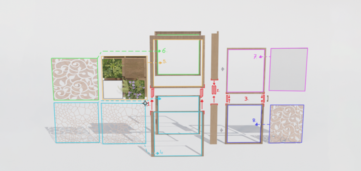

3.1 Order of Assembly | Trailer
Using Photoshop, I highlighted and labelled in what order the divider will be assembled within the trailer. To make this work in Blender, I keyframed the divider in its complete form, moving it to towards the end of the animation. I then worked on keyframing the disassembly of the divider using the plan, from 8 to 1, meaning when moving the keyframes first, the animation will show the divider being assembled in the exact positions.

3.2 IKEA Box References
To start making the IKEA box, I began gathering secondary references [3.2.1], seeing what the most common and simple IKEA box design was. This was going to match my initial box opening animation [3.2.2], sliding into shot and revealing the divider, however, this changed further in development.
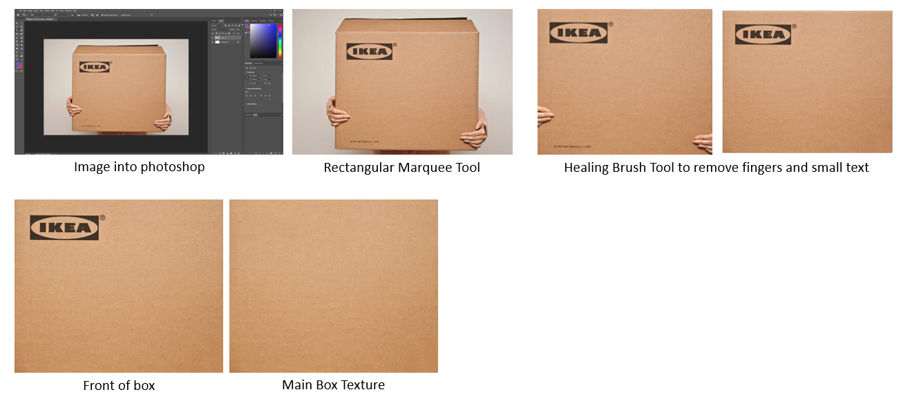
3.3 IKEA Box Making | Photoshop
Moving into Photoshop, I cut out the box, and removed the extra text and hand, finishing by making a blank box for all other sides. These images were later applied to the box made in Blender.
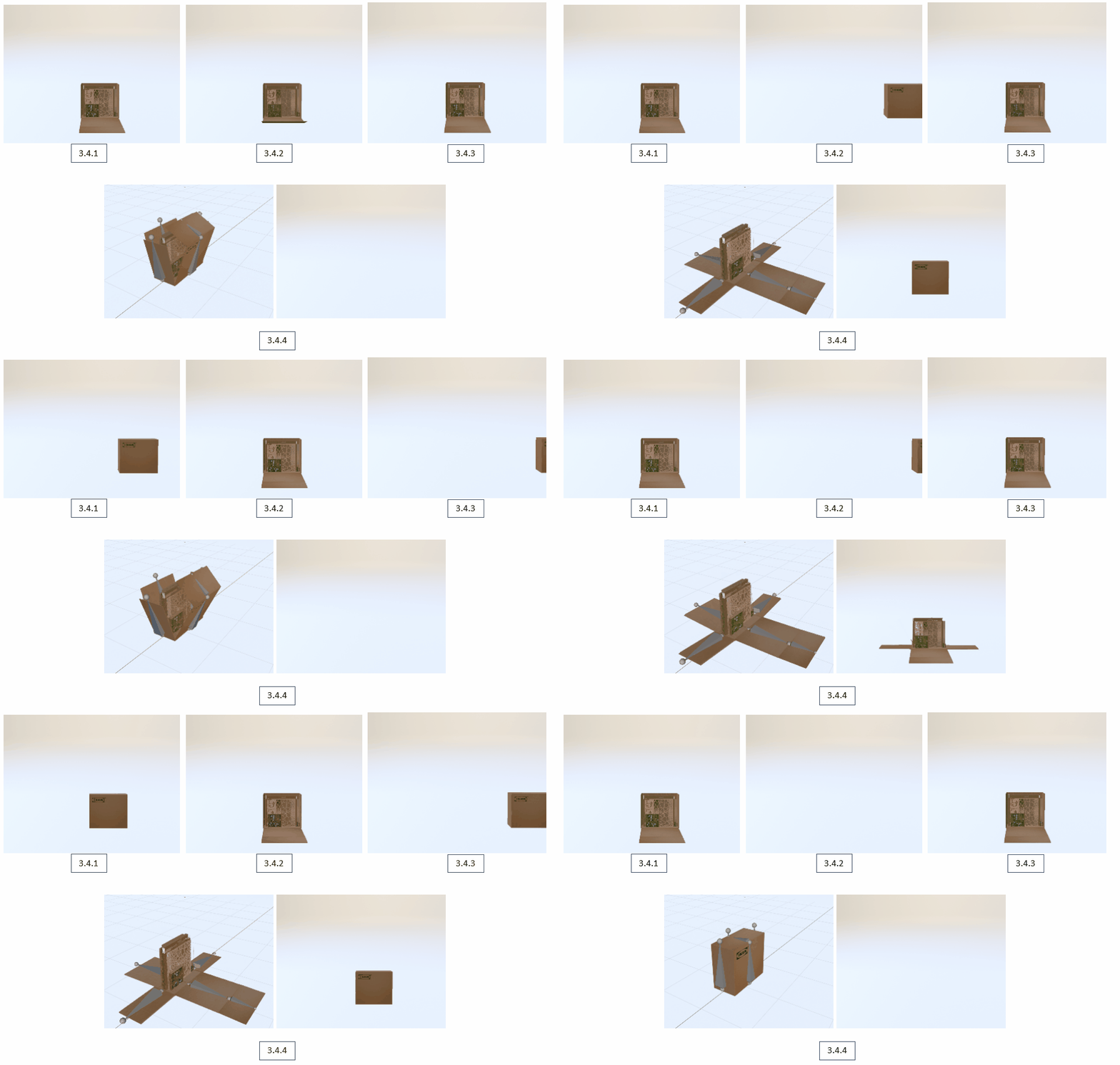
3.4 Box Openings | Experimenting
With my initial plan of only the front box opening, I wanted to see if there was any other way of the box disappearing. With these experiments, I looked into the box vanishing with the divider and proceeding to the next shot [3.4.1], sliding down into the floor [3.4.2], or just having the box vanish [3.4.3]. However, either of these methods was flawed, which led me to go a new route, having the box fully open instead [3.4.4]. This method was much better as when the box opens it’s much easier to dispose of the box, simply lowering the transparency when opened.
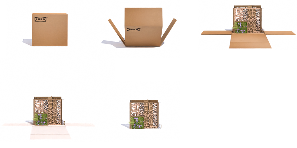
3.5 Moodboard of Box Slide In
With the plan in motion, I applied the IKEA box texture and rendered the animation. I believe this was the best method for the box animation. In terms of the animation process of the divider being assembled, I followed my previous methods. With the 2 animations done, disassembled & assembled, I keyframed the compact version of the divider towards the end of the timeline, meaning when reversed, the divider parts will follow on to the next animation of it being assembled. I understand I did this in a weird order, but this was the easiest way, making each part of the animation, and repositioning the keyframes in the timeline. This was due to me disassembling the divider, and then simply reversing the rendered video to make it assemble, making it far quicker than trying to put them into place myself.
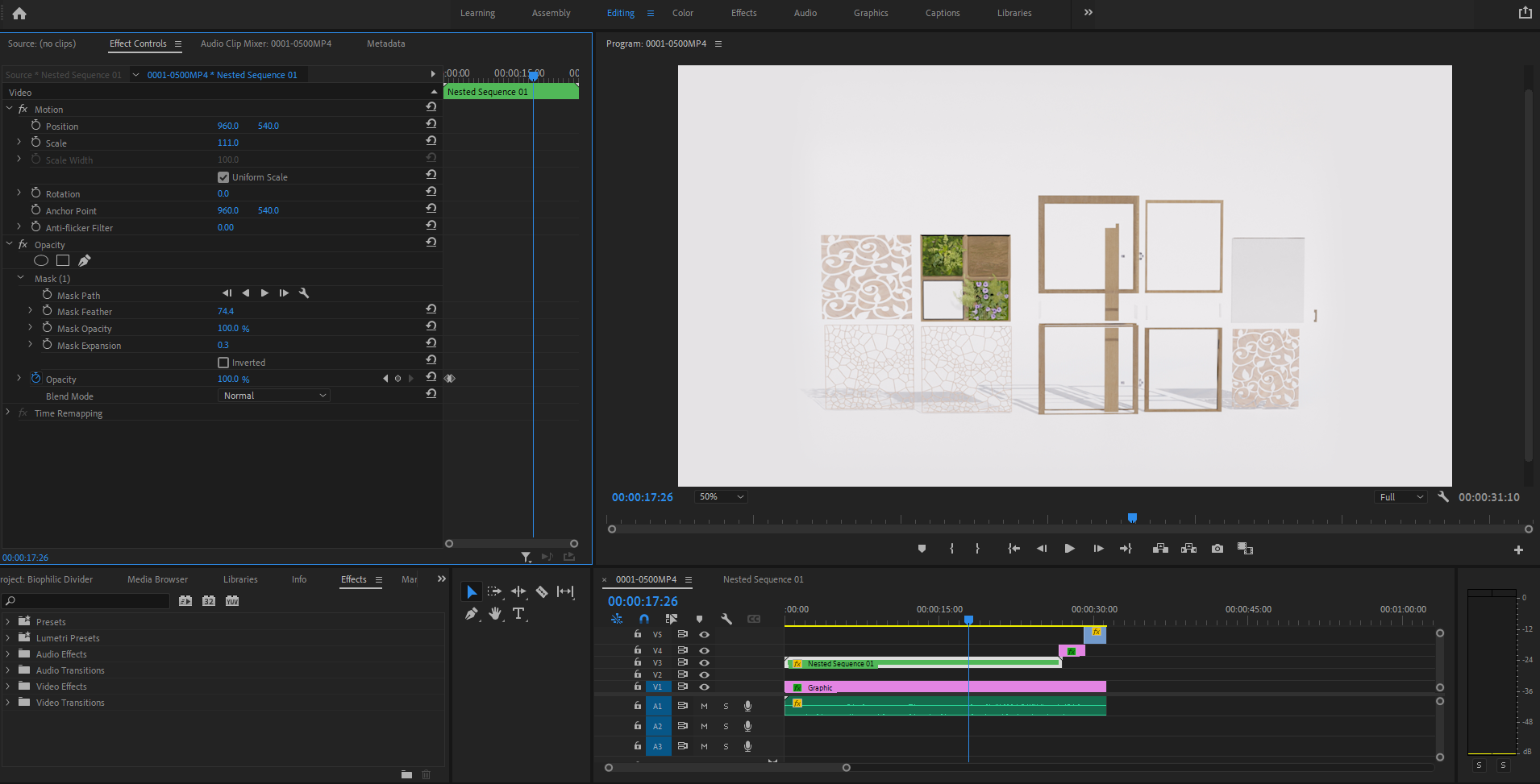
3.6 Premier Pro Editing
After I gathered the rendered result, I moved into Premier pro to edit the rendered video with the selected audio. Due to me rendering 2 videos, one being the assembly, the other being the box sliding in, I rescale and reposition the clips by lowering the opacity of the top clip so I could see both, and filled in the gap by making the background white, feathering the clips so they blended with the background. This also meant that when the box slides in, it will fade in with no weird cuts. The IKEA logo at the end was a simple opacity keyframe, finishing by exporting as an MP4 file.
3.7 Conclusion | Concept Trailer Final Outcome
In conclusion, I am extremely proud of my outcome with this project! Having gone through the many alterations when designing, taking in feedback and more importantly acting upon it, the outcome of the divider works quite well! With that said, the trailer has also been a complete success! My goal was to follow a simple, minimal yet informative style, which I feel that I’ve achieved! This project has introduced me to other programs such as Quixel Mixer & Bridge, enhancing my 3D skills even further! Overall, I am satisfied with this project, taking a 3D approach to answering the RSA brief!