CaseClosed | Psychological Thriller Game

Brief
Design and develop a photorealistic, First Person Psychological Thriller, involving various levels, monsters and puzzles.
Goal
Create a First Person Psychological Thriller Game Demo with a storyline, containing 3 levels that follow a realistic art direction, including puzzles, monsters or both within each level.
Role in Project
Lead 3D Environment Artist
Softwares
 Unreal Engine 5.1
![]() Quixel Bridge
Quixel Bridge
![]() Blender 3.1
Blender 3.1
Prep
1.0 Introduction to Project
1.1 Target Audience
1.2 Personas
1.3 Inspiration & MoodBoard
1.4 Video Game References
The Forest
1.5 Dynamic World Setup
1.6 Environment Planning and Creation
1.7 Surface Textures
1.8 Landscape Texture Node-Setup
1.9 Surface Painting
2.1 Surface Painting | Before & After
2.2 Terrain Building
2.3 Terrain Sculpting & Adjustments
2.4 Terrain Preview
2.5 Environment Planning
2.6 Adding Grass
2.7 Vegetation
2.8 Making Paths
2.9 Path Preview & Adjustments
Assembly
3.0 Adding Trees & Fog
3.1 Tree Texture & Triangles
3.2 Culling Distance
3.3 Volumetric Fog
3.4 Debris
3.5 Collision
3.6 Virtual Textures
3.7 Packing Game
Blueprints
3.8 Interaction Node-Setup
3.9 Forest Door
4.0 Door Interaction & Better Node-Setup
4.1 Door Adjustment & Character Capsule Collision
4.2 Aura Lighting
4.3 Environment Walk-Through | Forest
Hotel
4.4 90s Hotel Corridor Moodboard
4.5 Supraliminal Level Intro
4.6 Floor Plan
4.7 Reception Assembly Showcase
Rooms
4.8 90s Hotel Rooms MoodBoard
4.9 Hotel Room Plan
5.0 Room Layout Plan
5.1 90s Hotel Moodboard
5.2 Room Assembly
5.3 Making the Bed
5.4 Bedroom Blood
5.5 Bathroom MoodBoard
5.6 Bathroom Plan & Assembly
5.7 Bathroom Blood
5.8 Room Layout Preview
5.9 Corridor Adjustments
Dining Room
6.0 Dining Room Plan
6.1 Dining Table
6.2 Dining Room Assembly
6.3 Dining Room Showcase
6.4 Dining Room Entrance
6.5 First Floor Preview
Second Floor
6.6 Second Floor Setup
6.7 Tilted Door Opening
6.8 Corridor Preview
6.9 Second Floor Showcase
7.0 Acting on Feedback
Master Bedroom
7.1 Master Bedroom MoodBoard
7.2 3D Assets Assembly
7.3 Master Bedroom Showcase
7.4 Mirror Dimension
7.5 Mirror Secrets
7.6 Level Walkthrough | Hotel
Conclusion
7.7 Conclusion of Project | CaseClosed
1.0 Introduction to Project | Game Demo
Video, Level Mechanics & AI Interactions | Made by Developer Ian
Zombie Monster | Made by 3D Artist Kirsty
For our client project, we got given a brief that stated” Design and develop a photorealistic, First-Person Psychological Thriller, involving various levels, monsters and puzzles.” Over various group meetings, discussions and planning out our ideas, we came up with “CaseClosed”, A first-person Psychological Thriller Game where the Protagonist has a split personality, being both the Detective & Murderer.
The game plays out that you’re investigating various superluminal locations, each containing a monster from your past, in hopes of vengeance. The idea was that it would have a dream-like, superliminal experience, never sure where you are, why you’re here, and what the next location could be. Looking at the video above (video), our developer, Ian, produced a game demo that shows various game mechanics within each environment. This included an Inventory system, a working flashlight, monster AI, object interactions, and various sounds following each interaction within the game.

1.1 Target Audience
Our Primary Target Audience would be gamers who love playing psychological thrillers, horror and puzzle-solving game genres, followed by a good storyline. The game would be aged rated at PEGI 18, due to the use of blood, and visual/audible violent referencing.
Our Secondary Target Audience would be anyone looking for a good story-driven game to play, not your typical horror game. These people ideally have similar game tag interests, such as first-person, horror, single-player, puzzle, dark, thriller, and narrative. Not to mention, the game could be played by various streamers online, as the narrative allows the player, and the audience to follow along.
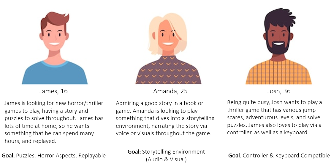
1.2 Personas
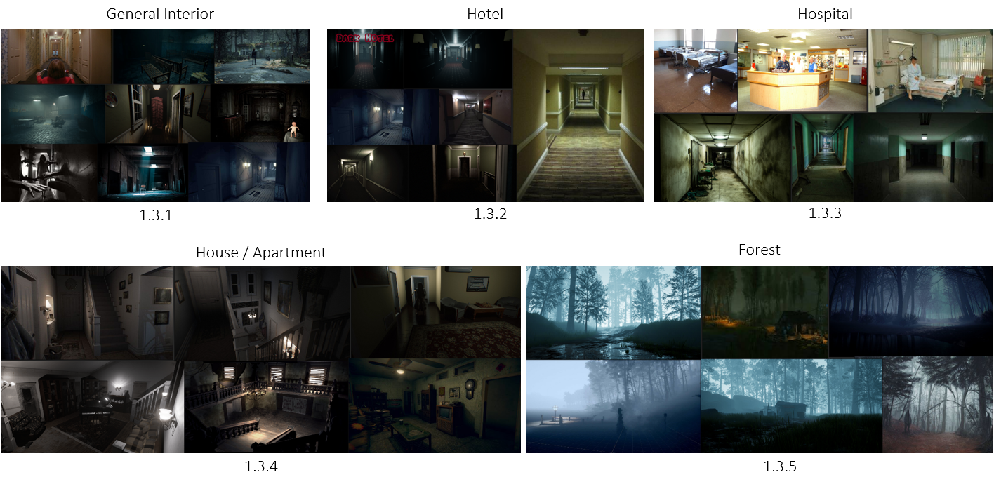
1.3 Inspiration & MoodBoard
After discussing with the team what kind of game we were making, I began creating a mood board that takes various horror/thriller/puzzle elements, and what I could do to recreate a similar environment to match our intentions.
I started by looking at real-life and game interiors (1.3.1). I noted how these places look abandoned, yet have low flickering lights. This is followed by the desaturated look, and the distance made using depth-of-field techniques.
The Hotel environments gave me a superliminal look (1.3.2), having their long corridors that make you feel you’re in a maze the more you progress. Interestingly, I liked the idea that although there are multiple rooms, they all almost looked identical, following the same design and colour palette. By adding a bit of fog, you make the player have a different experience, making them question if they’re actually in a hotel building, or in some other place designed to keep them there.
The hospital is a classic horror game level (1.3.3), having dead bodies, uncomfortable colour palettes, and equipment scattered, such as needles, blood bags, and weapons. I did question whether to do this level first or later, as I don’t want the players to think its game is the same as any other horror one out there. However, possibly adding it later would be a good addition, due to the familiarity with common-level designs to ground the player.
Houses & Apartments I felt was an interesting idea (1.3.4). These places give any person a sense of safety, knowing that only you or your family/partner occupy it. However, the idea would be to break that sense of safety through classic house terror techniques, such as locking doors, dark figures, flicking lights, scary sounds, and of course, not being able to leave. This also limits the player’s ability to run away, as you won’t be able to loop around through one-way hallways and stairs, forcing them to be strategic.
Finally, a classic but interesting location could be a Forest (1.3.5). The player would be in an open, dark space with no sense of direction. This would be followed by lots of dense fog, forcing them to listen to their surroundings, and tread lightly.
After showcasing this to my team, we agreed that the game will start in an office (made by our other 3D Environmental Artist, Roland), however as they open the door to exist, they will find themselves in a forest. The idea is that the dramatic change in environment would distort the player’s game expectations of being logical. The forest would be the transporting environment, meaning they need to find their way through the forest to find the door, which would lead them to the next level.
The team also agreed that the following level would be a hotel, for the same reasons mentioned above. This allowed the game designers to begin their work by making a concept of what monster would fit in each environment. This also allowed us to keep our pipeline at a steady pace, as our 3D Artist, Kirsty, would then be the 3D Monster Creation.
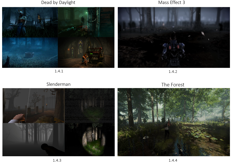
1.4 Video Game References
With the forest being the first environment I make, I did some research on some Video Game References that have a forest. Dead By Daylight (1.4.1) has various forest maps within the game, and each one has a killer that is designed to fit in within the environment. The forest maps include a lot of fog, and varying colours such as blue or green to separate the maps. The maps always look abandoned, having broken down houses, old wells, and dead trees, adding to the horror genre.
Within Mass Effect 3 (1.4.2), I found a great scene where the character is walking through a forest that has a large fog aura, meaning you’re able to see more around you, but not far away. They use a very white fog, and feather falling, signifying it’s a dream.
Slenderman was another game I looked into (1.4.3), as the main purpose of the game was set in a dark forest, with a monster lurking near you. The game mechanics are similar to what we intended to have, a working torch in a thick fog to see your surroundings, whilst playing eery sounds to spook the player.
Finally, The Forest (1.4.4) was a great reference to look into, mainly to its only setting of a photorealistic forest, something I aimed to achieve. This includes dynamic lighting, fog, and grass, and all this is to be optimized for max performance.
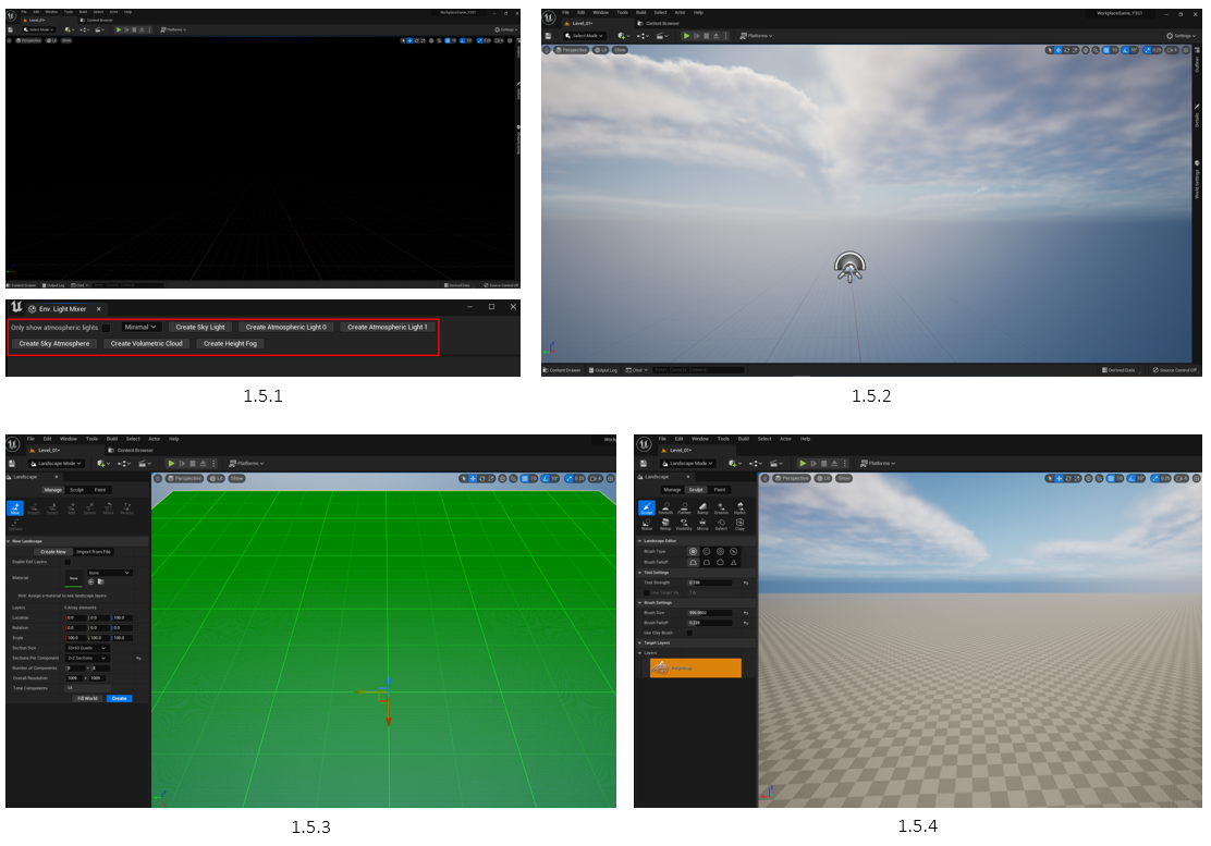
1.5 Dynamic World Setup
For this project, I decided to work with Unreal Engine 5.1 as I wanted to learn a brand-new game engine. It’s a powerful game engine, having many companies moving into its pipeline. UE5 is capable of putting high-end graphics and visual design together with audio, lighting, animation and other capabilities. A well-known feature of this engine is that it provided Real-Time Capture. This is a mode that displays dynamic and specular environment lighting, making possible dynamic time-of-day simulations with real-time reflections on scene elements.
Opening a brand-new project, the world was black, so it needed a proper setup (1.5.1). Going into Windows > Environment Light Mixer, I was able to add various lights and volumetric atmospheres (1.5.2). Next, I began creating the Landscape. I followed the recommended settings for a new landscape (1.5.3) in order to have a well-optimised world. Hitting ‘create’, it generated a flat world (1.5.4), allowing me to now sculpt the landscape in any way.

1.6 Environment Planning and Creation
Using various landscaping tools, I made a medium-sized environment that was based on the default character model (video), which we agreed as a team would be the size we’re working with. The edge of the landscape was set high and steep (1.6.1), making sure the user will not escape, whilst keeping them on track to where they can walk.
The idea of this map is that it would have the Office Building within the Forest, making a smooth transition for when the player opens the door and walks through, having a general path to discover and follow (1.6.2) (1.6.3).
The level may look compact/small, but my intention will be to make it a night, and add lots of trees, vegetation and fog, which in theory should make the user feel they’re in a large open space (video).

1.7 Surface Textures | Quixel Bridge
Unreal Engine offers a lot of free resources, one of which is Quixel Bridge. This program can provide access to the Megascans library, browse collections, search for specific assets, and add assets to your Unreal Engine projects. To start texturing my environment, I looked for various textures that I can assemble into a forest surface (1.7.1). After finding the ones I wanted to use, I simply downloaded them, and selected “Add Quixel Content”, importing the high-resolution textures into their own folder (1.7.2).
1.8 Landscape Texture Node-Setup
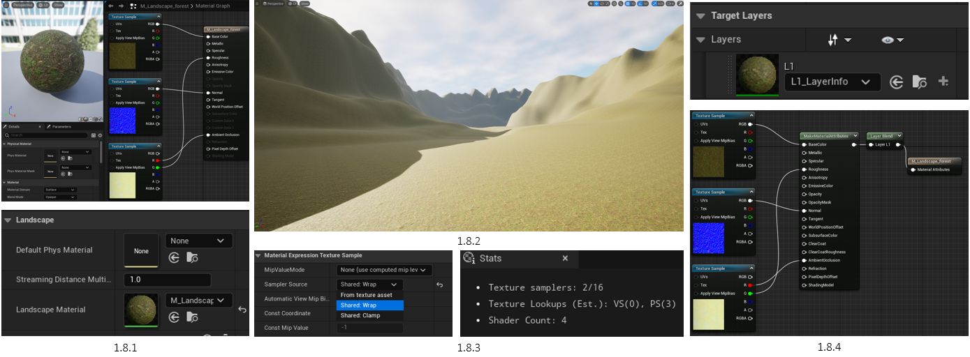
To apply the texture to the landscape, I created a master material, to which I can add all the layers of the grass texture. I Copied the Forest Floor Maps and applied them to the correct material attributes (1.8.1). To test how the texture looked, I applied the surface texture to Landscape Material (1.8.2).
As I intended to add multiple textures, I changed “From texture asset” to “Shared Wrap”, allowing more than 16 textures in one material (1.8.3). Later, I began the setup for all the other surface layers, editing the original material graph to include a layering system, allowing me to paint other surface textures using the same smart material (1.8.4).
1.9 Surface Painting | Node-Layers
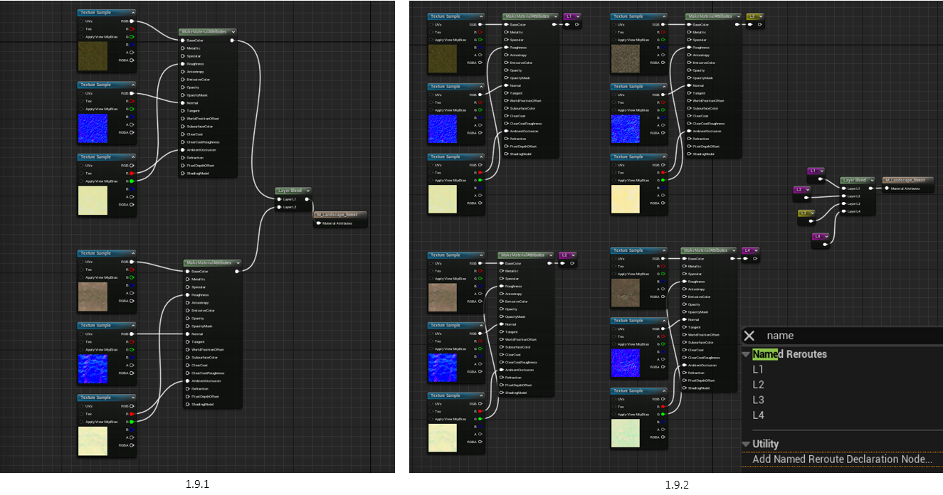
As I’m using more than one surface texture to paint, I repeated the process with a different surface texture, adding a new layer, and created ‘Layer info’ to allow weight painting (1.9.1). However, as more textures were going to be added, the node network will soon look too messy. To fix this, I used Named Reroutes to make the material graph more organised when adding multiple surface textures (1.9.2). With the node setup configured, I applied the changes and was now able to surface paint and blend the textures (video).
2.0 Tiles & Contrast
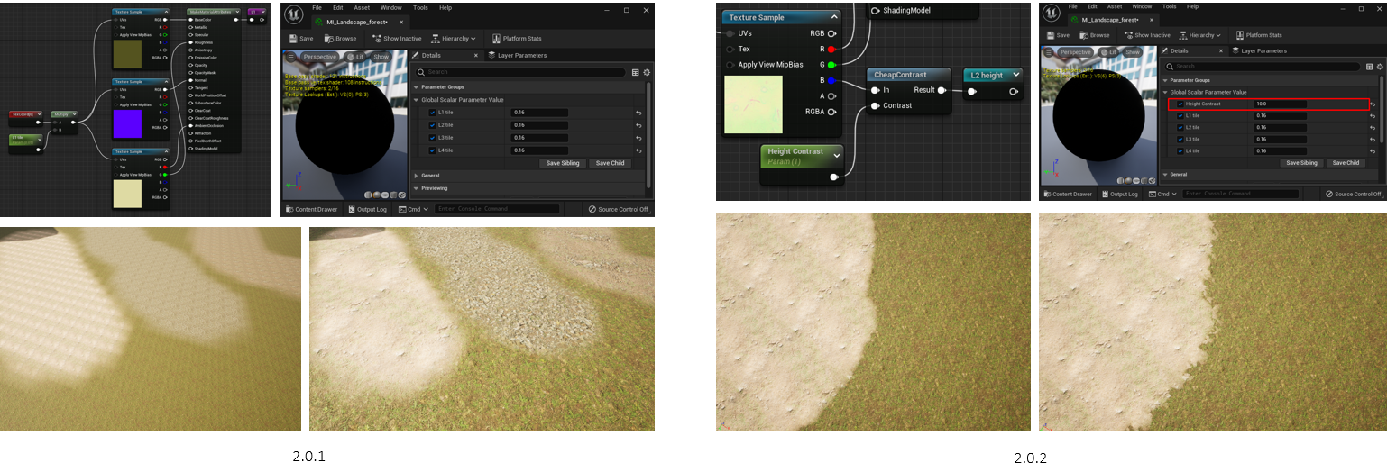
A few more adjustments were needed before I could paint properly. First, I made a Material Instance of the original smart material, allowing me to make and edit parameters more easily. Next, I added Text Coordinate Parameters and Name Reroutes to take in the texture maps, which allows me to edit the tiling of each surface texture (2.0.1).
However, the textures looked too blurry than realistic when mixing the layers. To fix this, I created a CheapContrast Node to edit the height contrast of each texture. This is followed by adding the Parameter ‘Height Contrast’, and now able to adjust everything using the Material Instance (2.0.2).
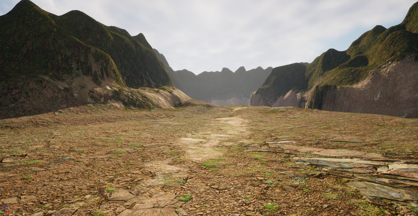
2.1 Surface Painting | Before & After
Interactive Slider
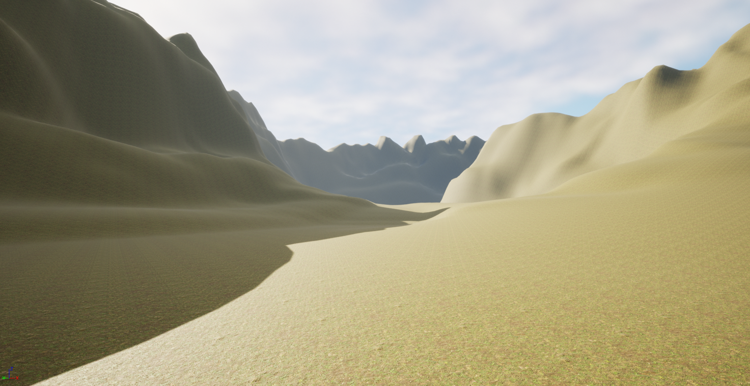
With the surface textures ready, I began painting the landscape, using various strengths and sizes of each texture to create the perfect blend. I focused on giving more greenery closer to the rocks due to less environmental & wildlife interaction, allowing the grass to grow. The middle part of the environment is more mud and dirt due to more interaction between the environment & wildlife, such as walking around in the same areas.
During the painting, I kept switching to Sculpting in order to adjust certain aspects of the environment, such as flattening the area, smoothing the edges, and changing the height of the surrounding hills.

2.2 Terrain Building
After I was satisfied with the surface texture painting, I began using Quixel Bridge for assets (2.2.1). I searched up various moss rocks & boulders and applied them in various shapes and sizes, hoping to make the environment look more natural than built (2.2.2). With the boulders in place, it was time to make changes to the ground, as it looked a bit too flat (2.2.3).

2.3 Terrain Sculpting & Adjustments
Before I started sculpting, I saw that the boulders were slightly too bright, having the same light level as the ground (2.3.1). To make it more realistic, I simply adjusted the Material Instance > Parent of the model and turned it down manually (2.3.2).
Using the Sculpting tool, I flattened and smoothened the areas closer to the edges of the map to make the connections between the boulders and the ground more seamless (2.3.3).
2.4 Terrain Preview
With the edge sculpting in check, I went back to painting and made a brief path from the start, to the end of the landscape, a general direction the player will follow.
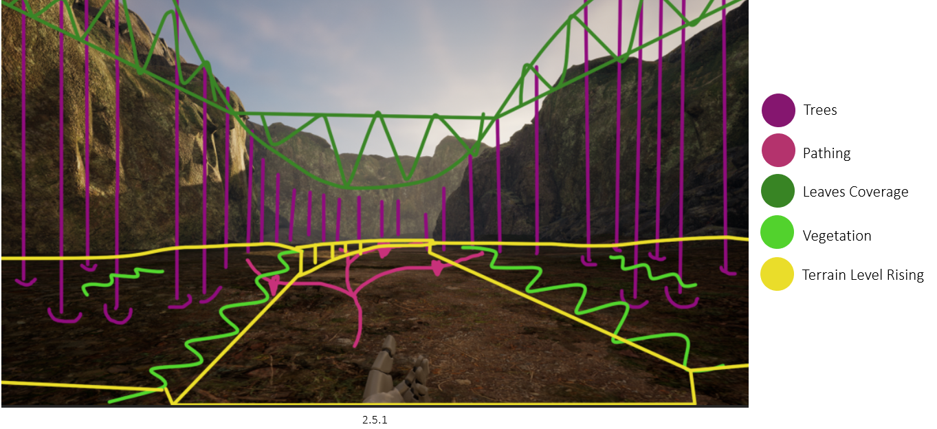
2.5 Environment Planning
Pink: Shows narrow, roughout paths that lead the player through the forest, potentially getting lost along the way. Paths would vary on the amount of grass covering, making the player think before following a path.
Yellow: The terrain elevation, as the forest was a little too flat for my liking.
Purple: Shows general placements of the trees, notice how there aren’t any on the path itself, giving a sense of pathing, but still creating the eery atmosphere.
Dark Green: Shows the leaf coverage, making sure the user feels secluded in the forest but not able to see much of the rock edges. With the leaf coverage and planned fog, the user may not be able to see the night sky, making them question even more where they are.
Light Green: Shows general vegetation, such as bushes and general plant life. These are close to the pathway to again help slightly with the navigation, but only if the player notices, will of course blend with the environment to not make it too obvious.
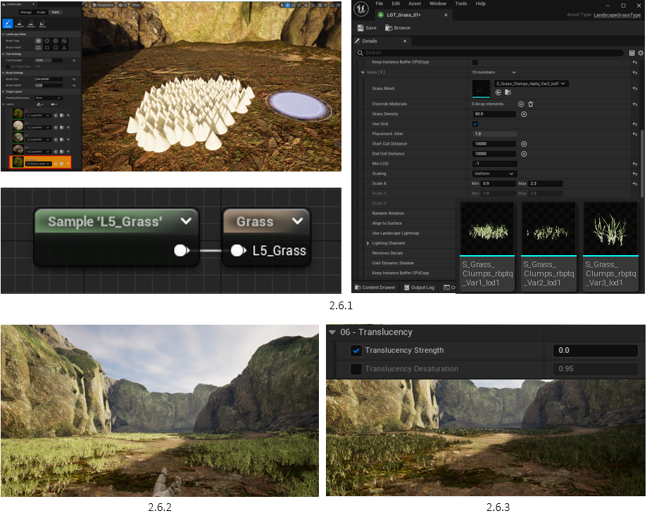
2.6 Adding Grass
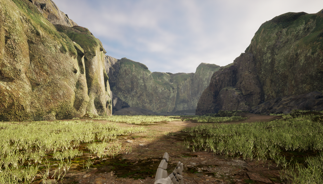
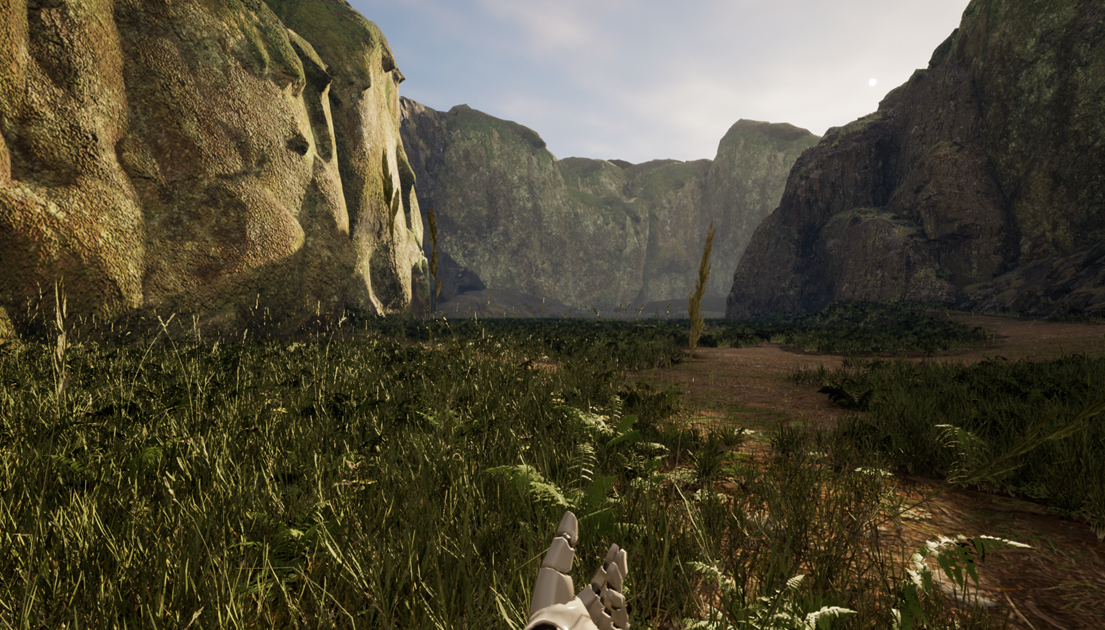
To begin adding grass, I followed the same methods of adding a new surface texture layer but using cone shapes to test how the grass painting looked (2.6.1). I started by taking a sample reference of the grass’s surface texture and created a Landscape Grass Type (2.6.1). I Added 3 different grass textures in various shapes and sizes, however, the grass was too bright and short (2.6.2). I was later able to edit the Grass Materials Translucency from 7.0 to 0, making it less bright (2.6.3).
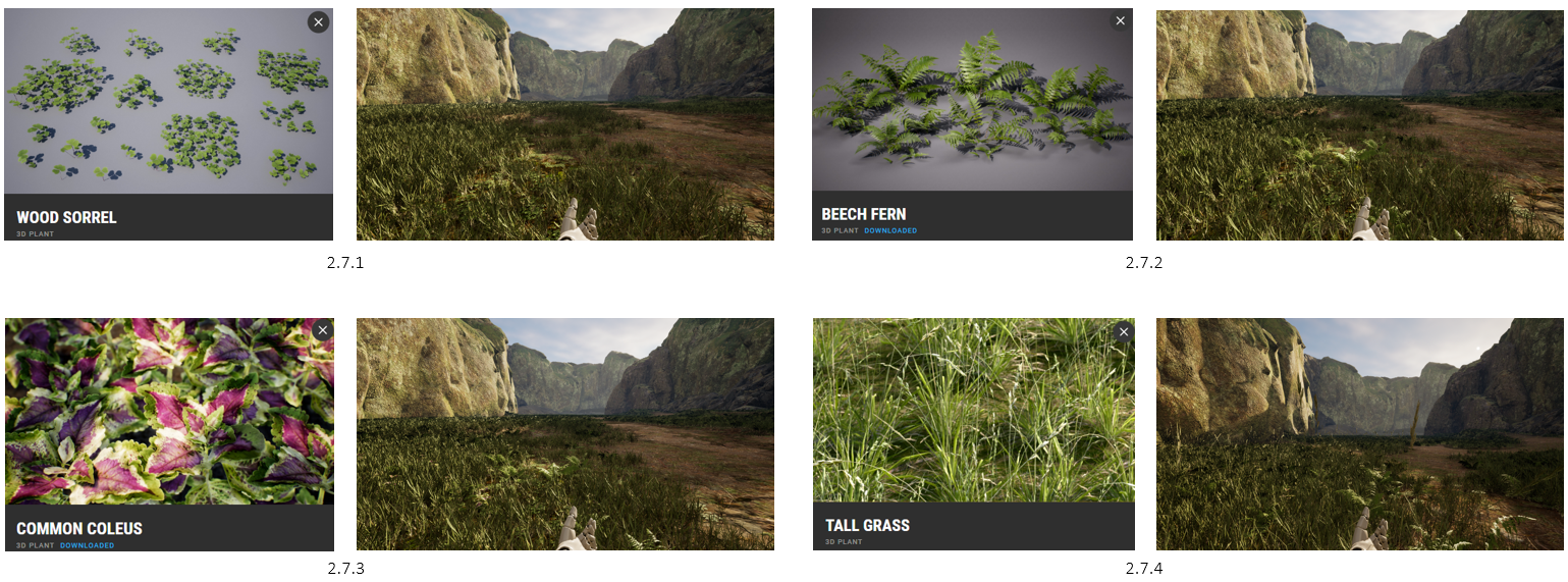
2.7 Vegetation
Interactive Slider
Using Quixel Bridge, I added some Plant assets within the Landscape Grass Type. This includes Wood Sorrel (2.7.1), Beech Fern (2.7.2), Common Coleus (2.7.3), and Tall Grass for height variation (2.7.4).
2.8 Making Paths
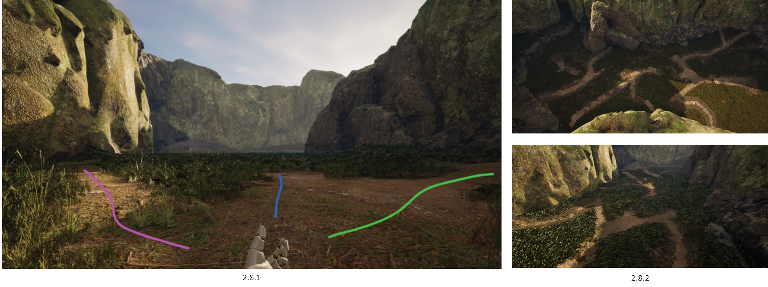
Pink: Looks more like the right way, not too hidden, not too obvious
Blue: Pathing stops, the player may want to stick to pathing if one route ends
Green: Looks too obvious
(2.8.1) The idea behind the variations of paths is to make the user question every input, not knowing what to trust. Do they take the obvious path, the more natural looking, or keep going after the path stops to see if it continues? The end goal is to keep the player in the forest for a reasonable set of time, whilst making them question their own actions, and staying high alert due to eery sounds.
Later, I made more of a maze with paths (2.8.2), trying to make the player go different ways, and spend more time in the forest, which would make the forest seem bigger than it actually is.
2.9 Path Preview & Adjustments
Added some leverage to the terrain. The grass terrain area was levelled up, and the paths lowered, creating the sense that it’s been walked over many times. Has someone else been lost here before?
3.0 Adding Trees & Fog
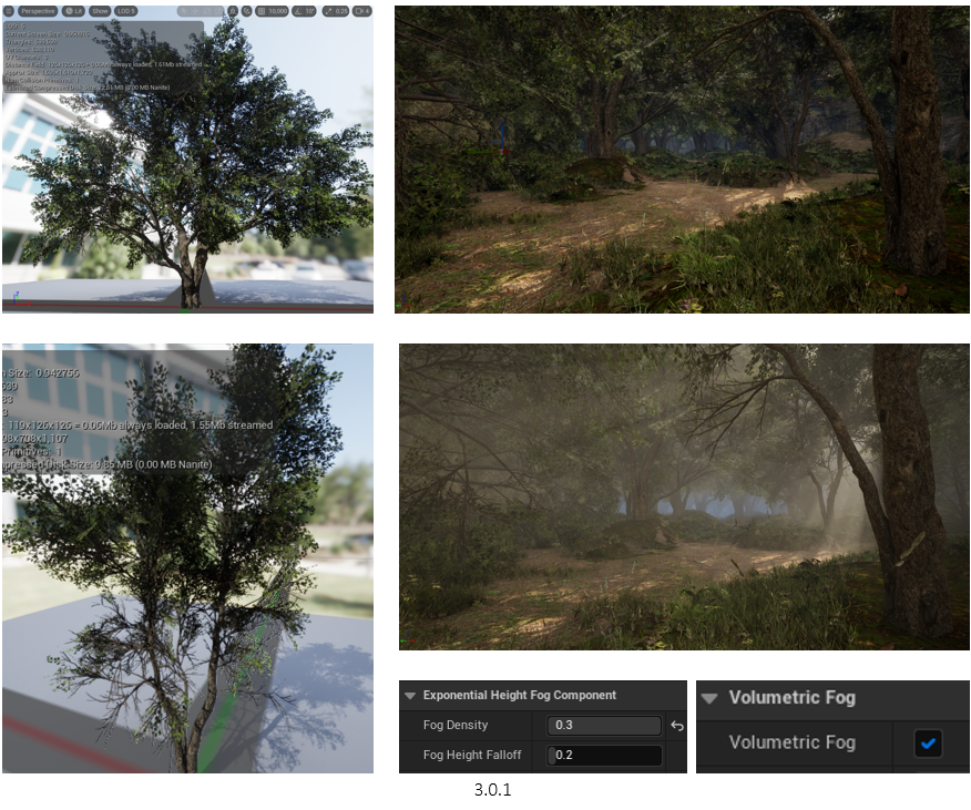
Although Quixel Bridge had many assets, it didn’t have specific things that I needed, such as trees that fit the environment. I Imported Trees from the Unreal Engine Free Assets Store (3.0.1), which can be used commercially, and using the same method as before, I painted the trees onto the terrain. Next, I enabled volumetric fog, tinted it to a light blue, and increased the density to 0.3 for now, giving the scene some life (3.0.1).
However, when placing the trees and enabling the fog, my 3070 TI Graphics Card got quite hot & lost frames very quickly, having only 20-30 fps. The whole scene was pure lag, I began my optimisation process (video).
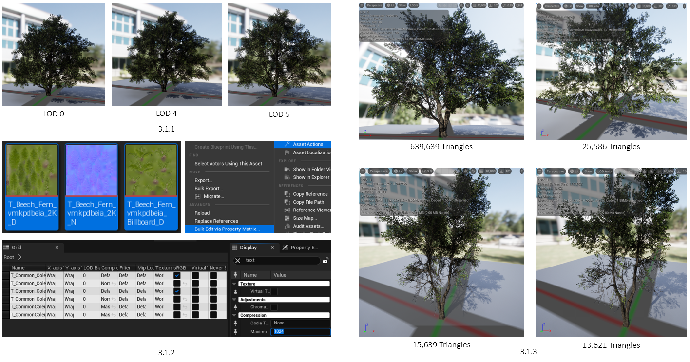
3.1 Tree Texture & Triangles | Optimization
To make the trees better performant, I had a look at the various LODs of each tree model (3.1.1). LOD 0 displays the full high-resolution texture of the tree. LOD 4 looks almost the same but uses less texture quality. However, LOD 5 seems to have more gaps between the leaves. I found that LOD 4 for all trees was the sweat spot, keeping enough detail, and using fewer resources. To make sure this took effect, I went to the LOD Settings of each model and set the minimum LOD to 4.
Due to the forest having lots of various different foliage, such as grass, ferns, flowers, etc, I decided that they could have their textures lowered as the player won’t be observing each aspect of the foliage. To Bulk edit all the textures (3.1.1), I selected all relevant textures > Asset Actions > Bulk Edit Via Property Matrix. This allowed me to edit the Max Texture Size and set them accordingly, instead of 4k. In the end, 128 Max Texture Quality increased FPS from 30 to 50 on average.
Although each texture was reduced, I wanted to hit above 50 frames. I found that the tree’s LOD 4 settings could be further optimised, as they still had thousands of triangles (3.1.3). Going into the Reduction settings, I was able to reduce the “Percent Triangles” from 100% to only 5%, yet still maintaining the original LOD 4 look. This increased the performance, reaching the 60 frames mark.
3.2 Culling Distance | Optimization
Looking further into optimising the environment, I found that within the settings of the Grass Type Mesh, in this case, the trees, I was able to create a cull distance. Essentially, I was able to make things load in as the player gets near them, and unload when moved further away. This by default increased performance already, however, it came to the question of what happens when the player looks through the environment and finds out there are no trees until they reach it, will their immersion be fractured? Well, it could, but I had an upcoming fix for this.
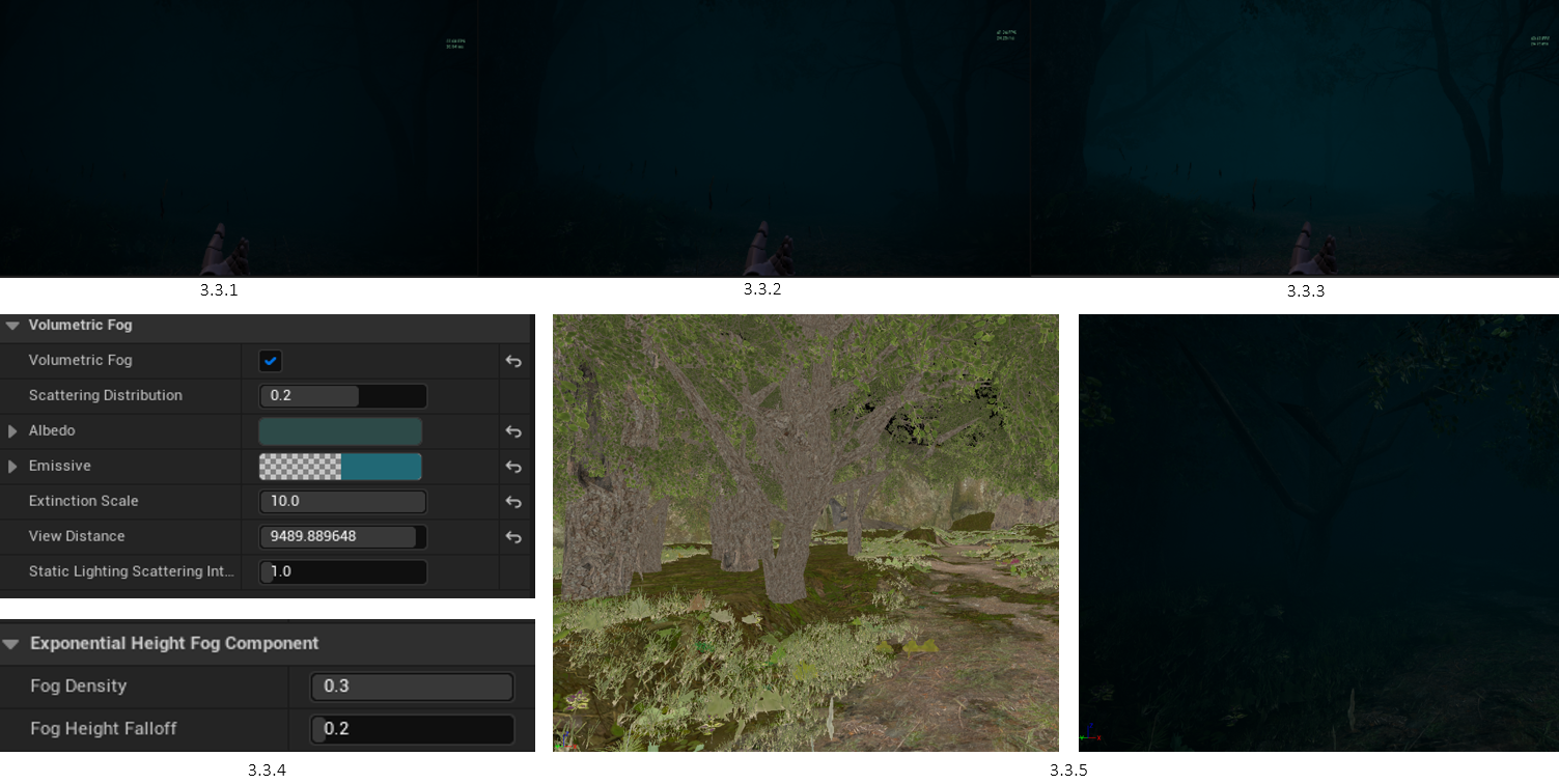
3.3 Volumetric Fog
When creating the volumetric fog, I tested out the various settings of darkness, colour, and density. I found that a cold blue would be eery for the player, however, I still had some experimenting to do with the density of the fog. As a team, we thought (3.3.1) was too dark, and (3.3.3) was too bright, knowing that the player will have a flashlight at hand. So, we decided with (3.3.2), enough to see what’s ahead of you, but just not far enough to see what’s surrounding you.
These are the settings for the agreed fog (3.3.4). Back to the upcoming fix conversation, the density of the fog allowed me to still keep the culling distance mechanics as the player won’t be able to see the unloaded chunks (3.3.5), even with the flashlight, having the render distance of the trees set from 1000 to 10000.
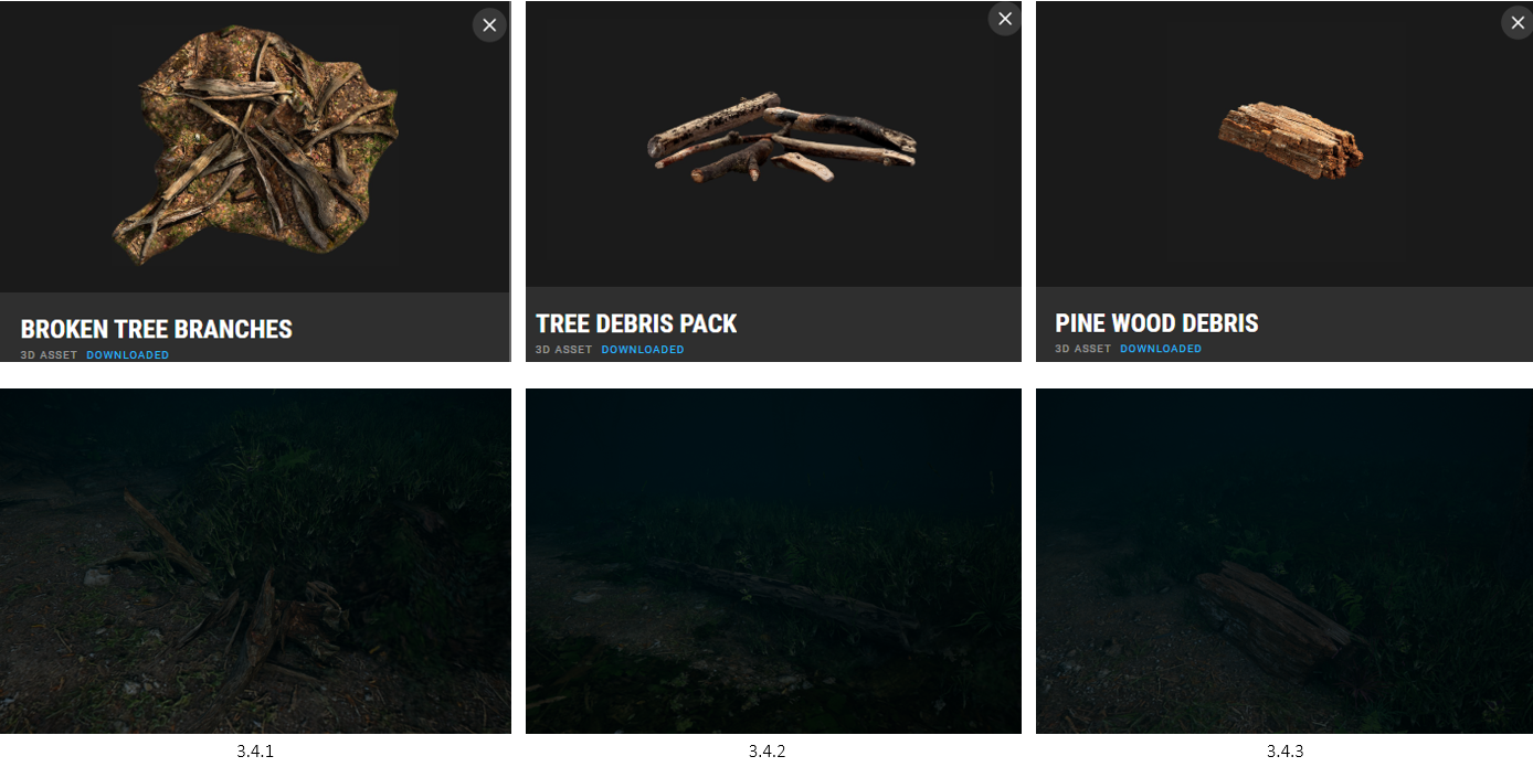
3.4 Debris
With the environment setup in motion, I began adding classic forest debris. Each asset was placed manually, making sure they fit within the location to give the impression of natural design, not built. This included broken tree branches (3.4.1), tree debris pack (3.4.2), and pine wood debris (3.4.3), all adjusted in rotation, depth, and colour to signify how long they have been there.
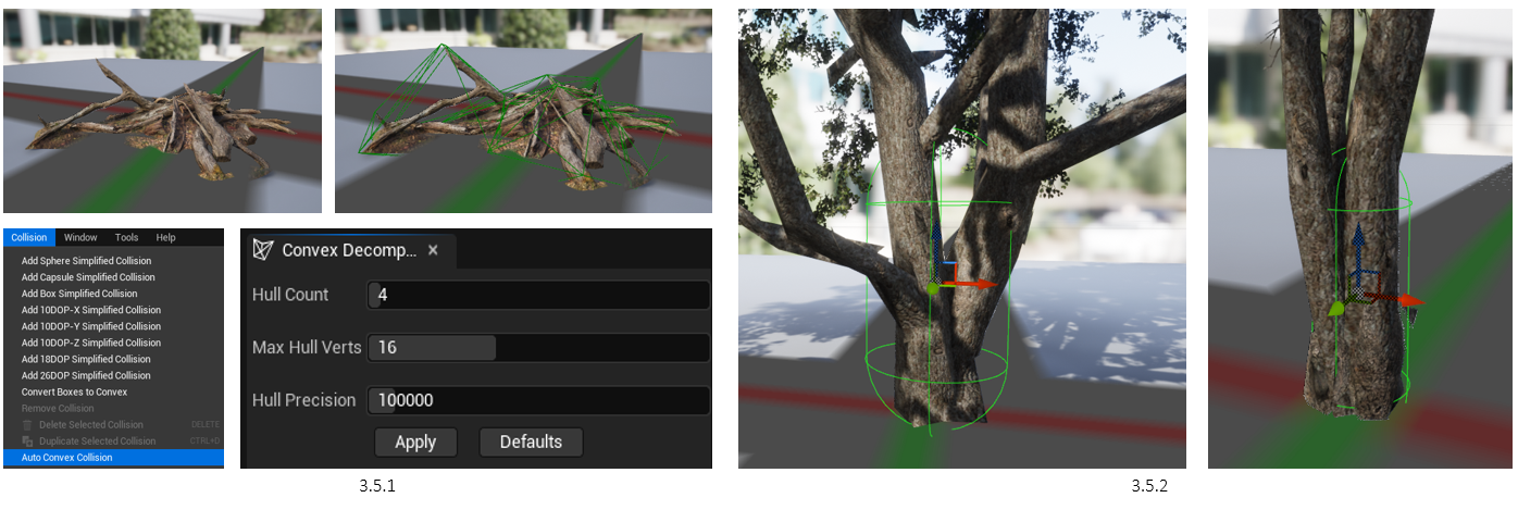
3.5 Collision
As I explored the environment, I found that none of the assets I’ve added have any collision, meaning you can simply walk straight through them, including the trees (video). For objects such as Debris, I am able to use Auto Convex Collision (3.5.1), as Unreal Engine calculates where to add collision and adjusts the settings to match the object more.
For the trees, I didn’t need to make complex collisions as the lines would connect from the trunk, diagonally to the furthest leaf. A much easier way was to add collision capsules at the centre of the trunk, slightly surrounding it (3.5.2).
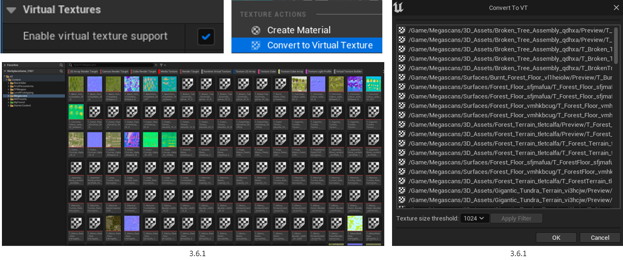
3.6 Virtual Textures
Normally, an entire texture is either completely in VRAM or not at all. With virtual texturing, you can have part of a texture in VRAM. In UE5, this is used mainly for 2 things.
SVT: Sacrifice performance to gain higher resolution textures and better quality in the same amount of VRAM.
RVT: Spend VRAM to gain performance by essentially giving yourself a gigantic lookup table (that wouldn't fit without virtual texturing) of precomputed colours/results
In case, I focused on performance. I started by highlighting all Megascans textures and converted them to Virtual Textures (3.6.1), setting the texture size threshold to 1024 (3.6.2). I’ve shown a visual representation of how this optimisation works (video), moving away and towards one of the boulders.
3.7.1
3.7.2
3.7 Packing Game | FPS Performance
I needed to see how the game runs as a .exe file. To do this, I packaged the game for PC use and outputted the whole game. However, the FPS resulted in 30 frames on average (3.7.1). After doing some research, I found that Unreal Engine has Virtual Shadow Maps (Beta) enabled by default. I switched this back to Shadow Maps, which increased the FPS by 50 (3.7.2).
3.8 Interaction Node-Setup
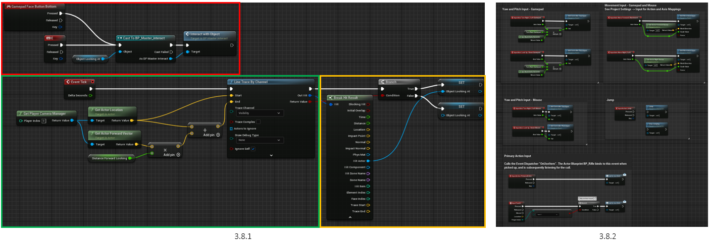
With the environment optimised, I began focusing on the interaction mechanics (3.8.1).
Red: Created an input event for the letter E & Gamepad Face Bottom Button. This is then cast to the master interaction blueprint, which reads if the object was interacted with.
Green: Calculating the distance of the first-person camera from the object, which was set to 200.
Orange: True & False statements on what the player is looking at. If what the player is trying to interact with is not part of the Master Interact or Children Blueprint, it will print a false and not work.
It’s worth noting that the first-person character model provided by UE5 comes with movement blueprints (3.8.2). Making small adjustments, you are now able to move around with a keyboard and controller. I created a 3D Rectangle to test the node setup, attaching the Master Interact blueprint to the object to see if I get print statements (video).
3.9 Forest Door
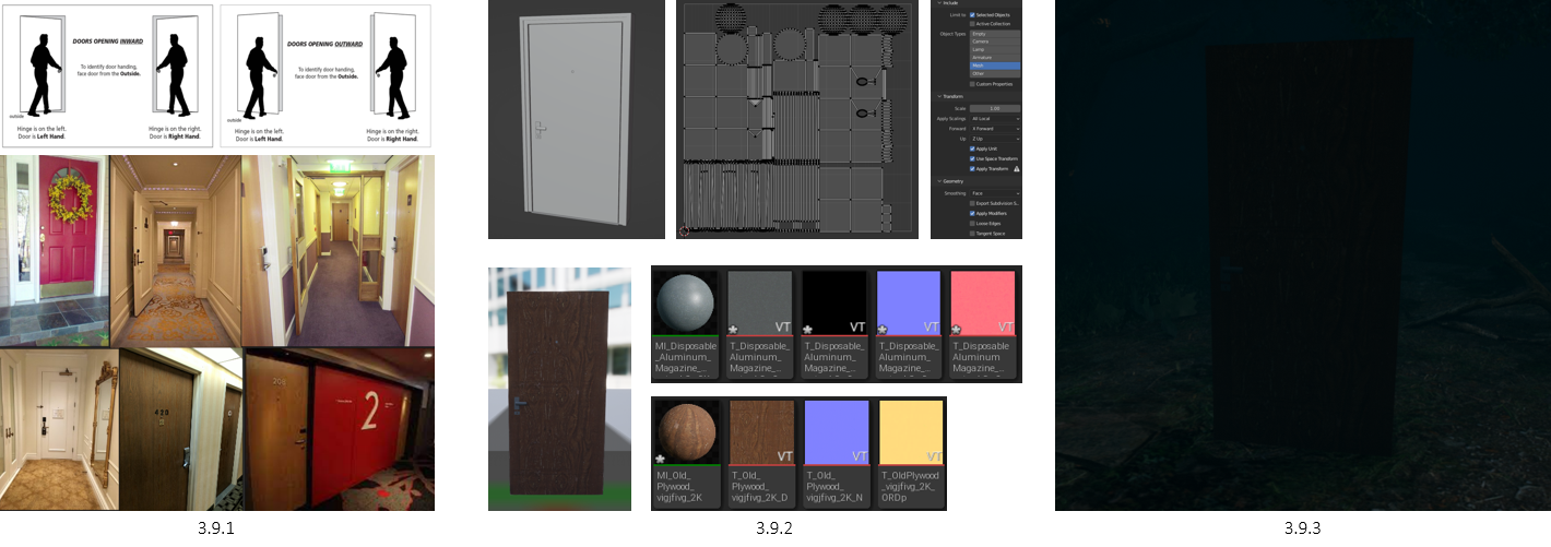
I did some research on how doors open inwards in hotels due to privacy and security (3.9.1), which is a key to knowing when trying to immerse a player in a game based on real knowledge. This Is followed by secondary research on hotel doors, looking at the shapes, colours, and styles (3.9.1).
Our 3D Artist team member has already made the door they will be using for the office, so to keep up the continuity of measurements, I used it. I unwrapped it, exported it from Blender, imported it to UE5, and applied the selected materials (3.9.2). This was then placed into the environment, having an old rustic wooden look, abandoned (3.9.3).

4.0 Door Interaction & Better Node-Setup
With the door made, I attached the blueprint and made some adjustments, making it less complex to read to when I hand this over to our Developer (4.0.1). The door is now able to open 90 degrees (4.0.2). however, the pivot is not set up correctly (4.0.3).
4.1 Door Adjustment & Character Capsule Collision
Next, I moved the pivot to the corner of the door mesh and made the door a child. Now the door opens to where the Pivot is located (4.1.1). However, a new issue was found, the player couldn’t fit through the door (4.1.2).
To make the character fit through the door, I narrowed the capsule radius (4.1.4) (4.1.5). This will minimise the number of collisions the player will experience when turning corners or going through gaps/doors (4.1.5).
4.2.1
4.2.2
4.2 Aura Lighting
When the character walks, the area around them feels like it’s lit up, not giving the feeling of the night or eeriness from the fog (4.2.1). To fix this, I increased the density of the fog by 1, and moved the sun underneath the world (4.2.2).
4.3 Environment Walk-Through | Forest
YouTube settings to view in 1080p | Please note Video Compression
The forest plays out as a transporting area, finding your way through, following various paths in order to find something, which in this case is a door that takes you to the next level. The forest would be handed over to our developer to add the necessary mechanics, such as Monster AI, various sounds and puzzle interactions.
4.4 90s Hotel Corridor Moodboard
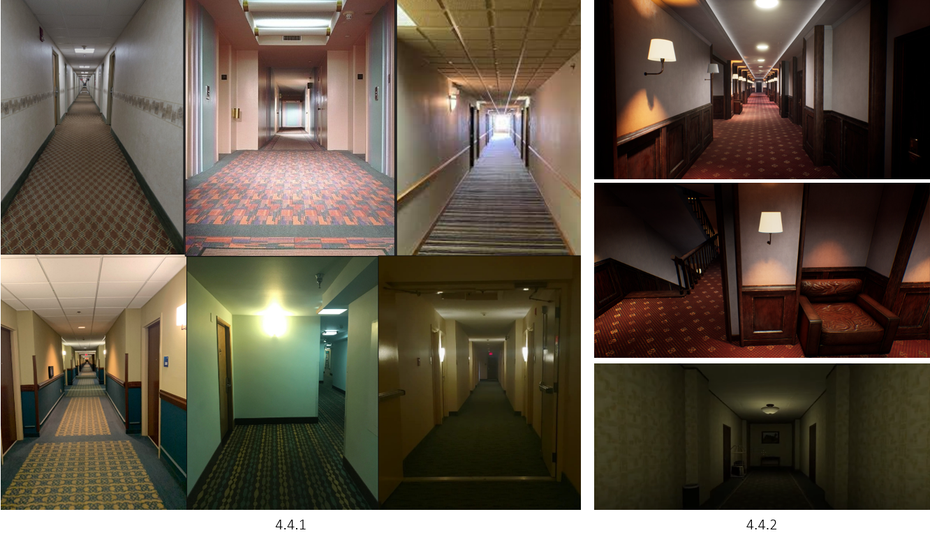
When it came to developing the Hotel, I knew I first wanted an eery, superliminal introduction, not a simple fade-in and-out transition from the forest to the hotel. I started by looking into 90s hotel corridors, both in real life (4.4.1) and in games (4.4.2). With this, I found a recurring theme: unsettling patterns, colours, and always having a long corridor.

4.5 Supraliminal Level Intro
With that in mind, I made a small room that opens up into the superliminal corridor that the player has to walk through. The idea is that you start with feeling that you’re in the open, to later find the walls are narrowing down as you walk forward until you reach the door (4.5.1) (4.5.2). I added some temporary lights, see what works and what doesn’t, but also make sure the player can see where they’re going to an extent. This of course will be developed over time (video).
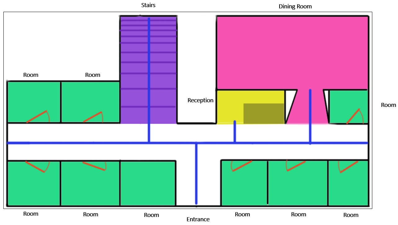
4.6 Floor Plan
With the introduction walkthrough set, I began making a floor plan. Although this was a rough concept, I feel that I’ve stuck close to it, making only a few adjustments along the way.
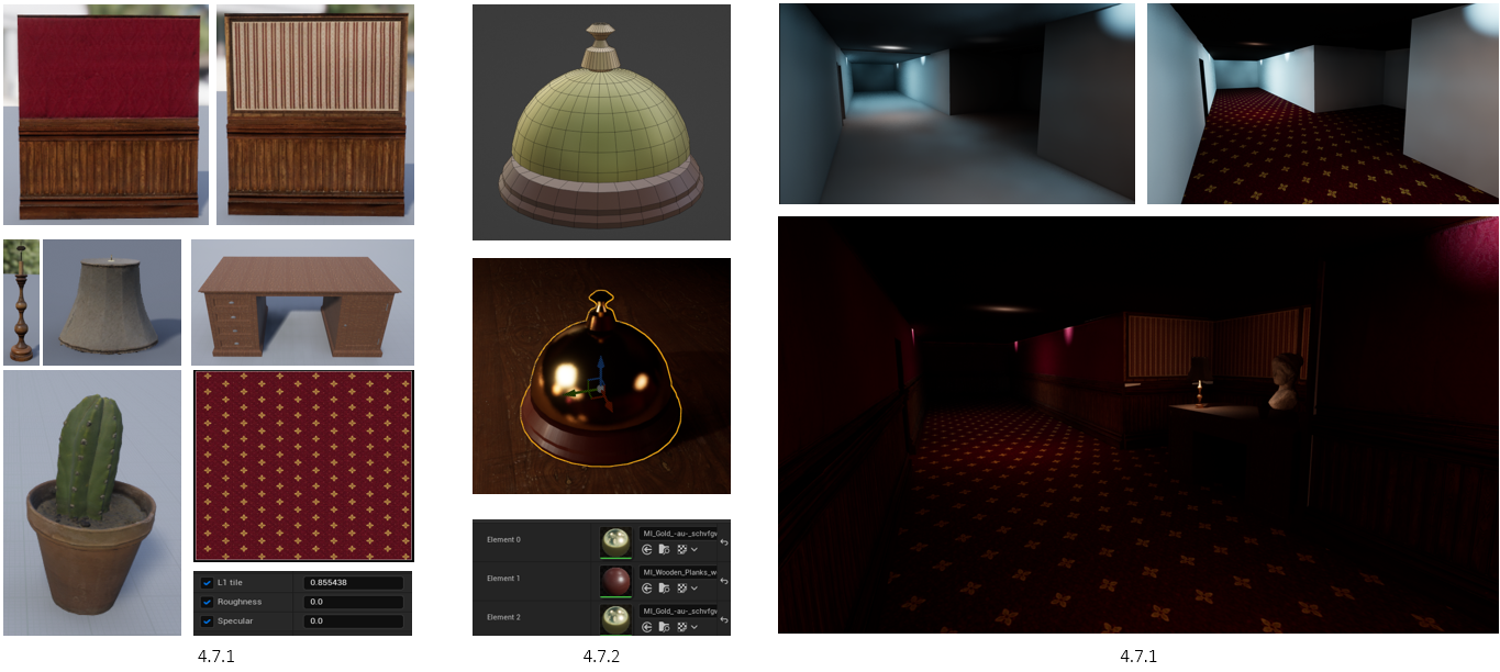
4.7 Reception Assembly Showcase | First Floor
Using Quixel Bridge & other free-to-use models (4.7.1), I gathered all the models I thought would fit into the environment and began constructing. Some models, such as a service bell, I made myself in Blender, apply the materials either in Blender or using the Quixel Bridge Library (4.7.2).
Using Unreal Engine’s shapes, I blocked out a section of the floor plan, a corridor and a reception (4.7.3). The idea I proposed to the team was to make the hotel look a red royal/fancy aesthetic, keeping that 90s old look, but also having the player question why are we in a luxurious hotel place right after a forest (video).
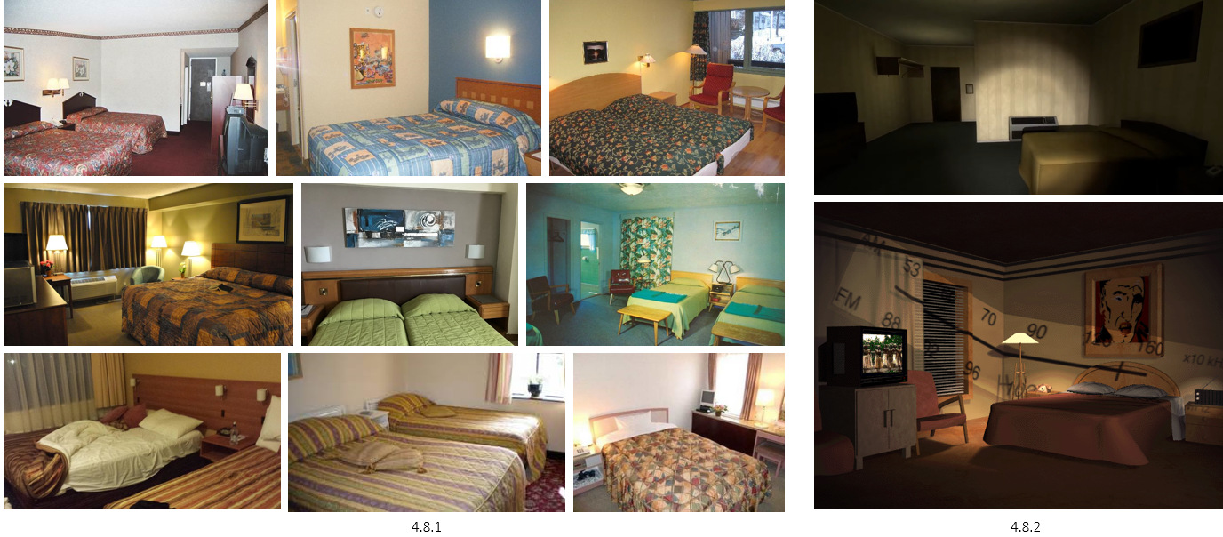
4.8 90s Hotel Rooms MoodBoard
I began looking into 90s hotel rooms to see any similarities, and differences, and how I can incorporate the style to fit my own (4.8.1). This was followed by game referencing and concepts as well (4.8.2), seeing how horror game creators love adding hotels to one of their levels, they may follow a theme that can add to the thrill of this game.
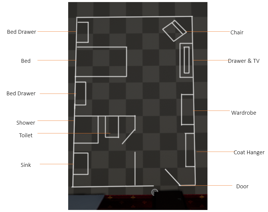
4.9 Hotel Room Plan
Going back to the drawing board, I started to plan out a causal 90s hotel room. From the research shown above, I found various similarities to make my one look generic yet mysterious. Note that they’re no windows, giving the sense they’re trapped than free in such an open space building.
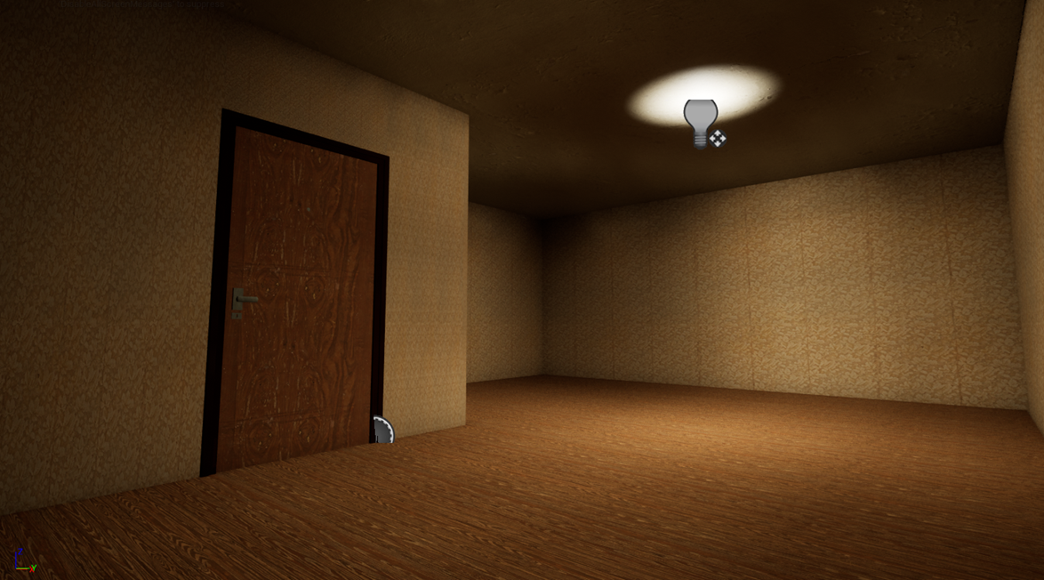
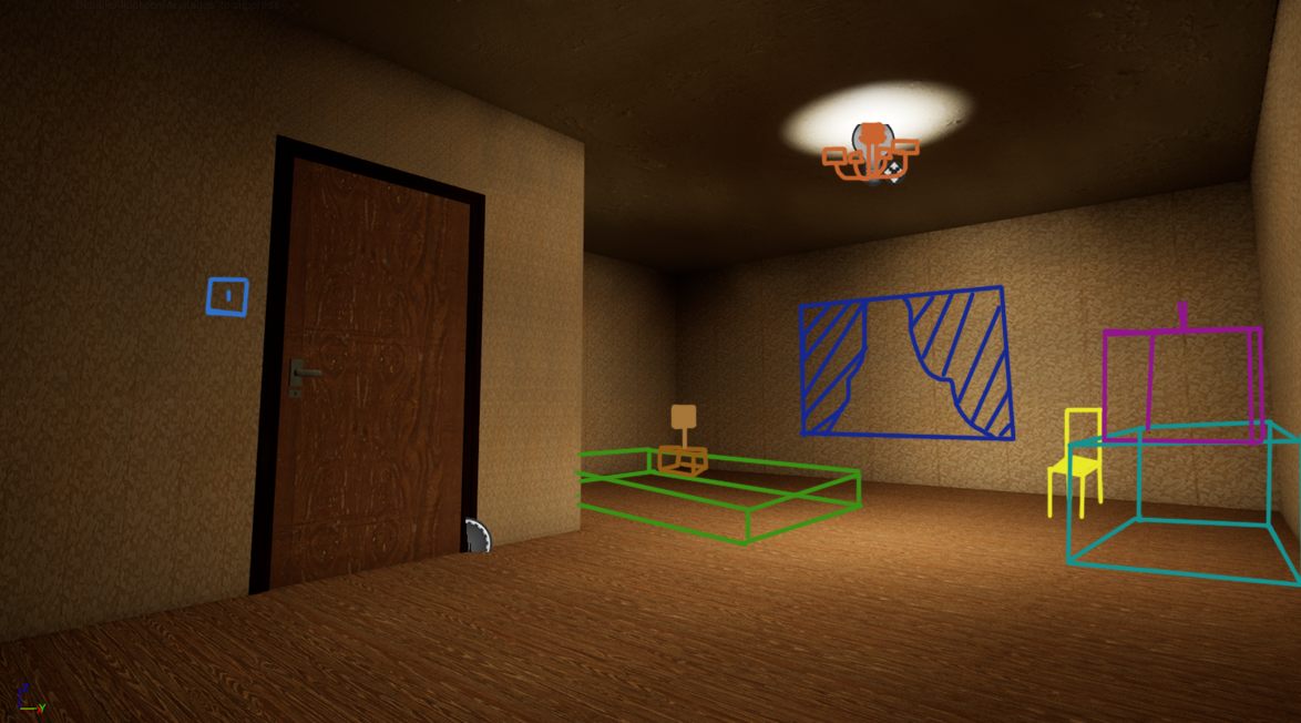
5.0 Room Layout Plan
Interactive Slider
Following my pipeline as before, I constructed the walls, an old wooden floor, and a single light source for the whole room. This is a visual plan of how the room will look like when adding various 3D assets.
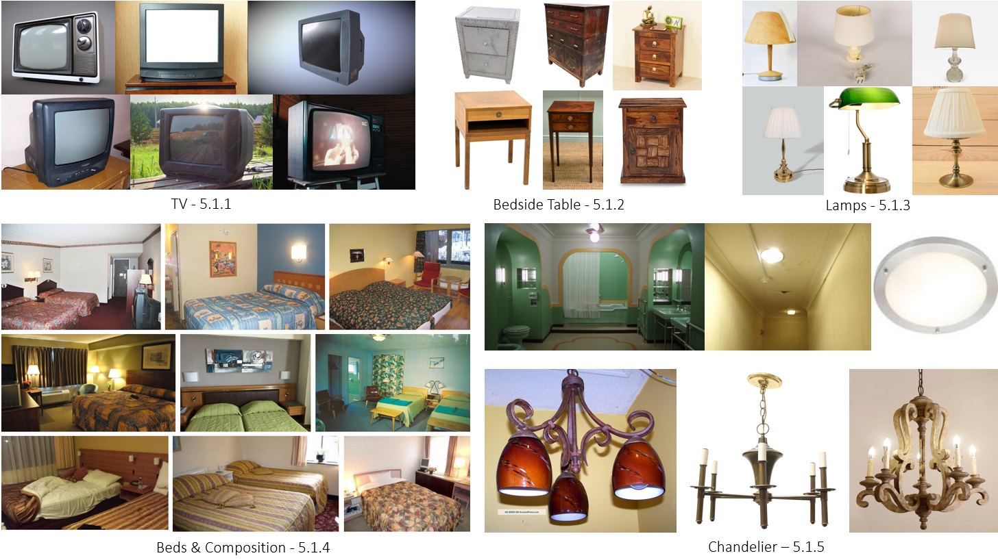
5.1 90s Hotel Moodboard
Before I acquired the various 3D assets to place in the room, I did some secondary research on some of the main things I wanted to get right, since the setting is in the 90s. This included TV’s (5.1.1), Bedside tables (5.1.2), Lamps, (5.1.3), Beds & Room Composition (5.1.4), and various lights, including chandeliers (5.1.5)
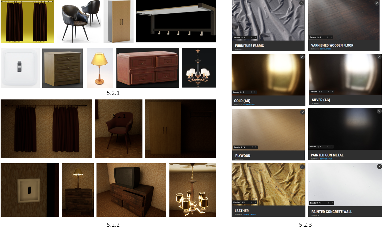
5.2 Room Assembly
Using various free-to-use assets, I managed to assemble a collection that I could use to build the room (5.2.1). Using the various Quixel Bridge materials (5.2.3), I positioned each asset throughout the room (5.2.2). Notice how the curtains have no window, once again making the player feel they’re trapped, not knowing what or where this hotel is.
5.3 Making the Bed
However, I never managed to find a decent bed asset to use that matched my intentions, so I took matters into my own hands and made one. Using the Physics Properties > Cloth, I essentially dressed the bed as if it was done by an actual person (5.3.1) (5.3.3). This was followed by using a mix of Quixel Bridge material and a 90s bedsheet sample (5.3.2). I’ve also changed the Lamp to an old-fashioned one, trying to add some historic lore to make the player question how long has this hotel been around. Why haven’t they added more minimal 90s lamps?
5.4 Bedroom Blood
With the room assembled, I began adding various styles of blood to add an eery atmosphere when entering each room (5.4.3). Blood samples were used from Quixel Bridge (5.4.1), allowing me to essentially apply them to any surface / 3D object (5.4.2).
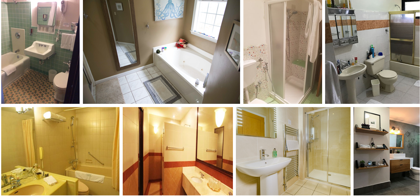
5.5 Bathroom MoodBoard
The next step was to make the Bathroom. I found some 90s classic bathroom designs, looking for similarities, and how I could replicate them. The common themes I saw were they always include a mirror, Ceramic toilet and sink, and pale white or yellow lighting, and all done in a compact form.
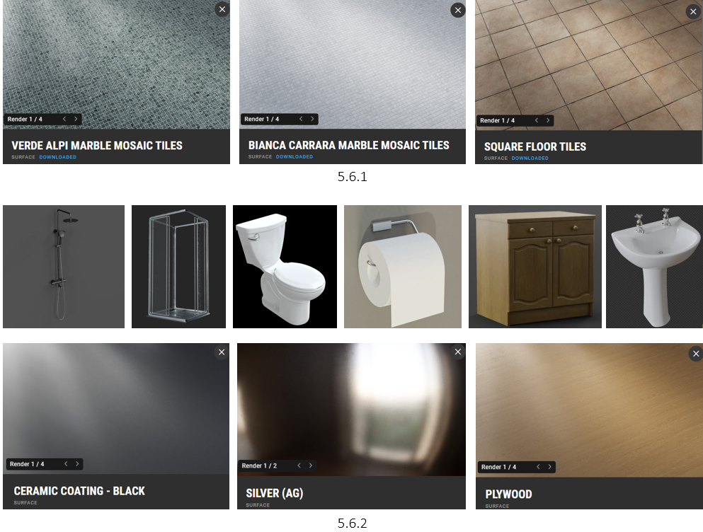
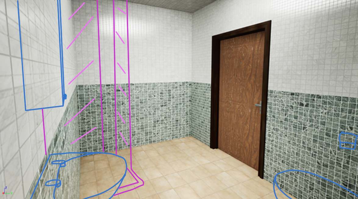
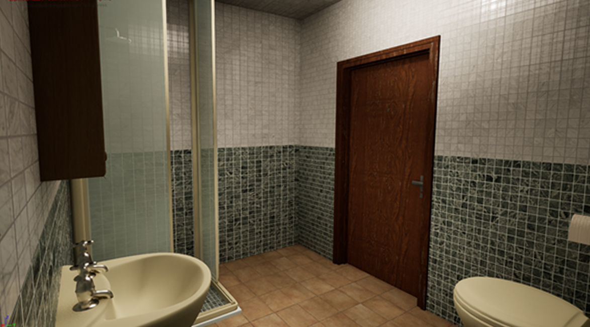
5.6 Bathroom Plan & Assembly
Interactive Slider
With the plan outlines, I began creating a library of assets to use. After blocking it out, I applied a pool-like walling and floor, aiming to keep that generic 90s look (5.6.1). Next, I filled the space with all the necessities to make the bathroom a bathroom (5.6.2), including the materials.

5.7 Bathroom Blood
Finally, using the same blood samples, I applied blood in various locations in the bathroom. The various samples allow the player to determine their own conclusion of what happened in the bathroom. Was someone murdered in the shower? Did they do something in the sink? Why did he go into the cabinet?
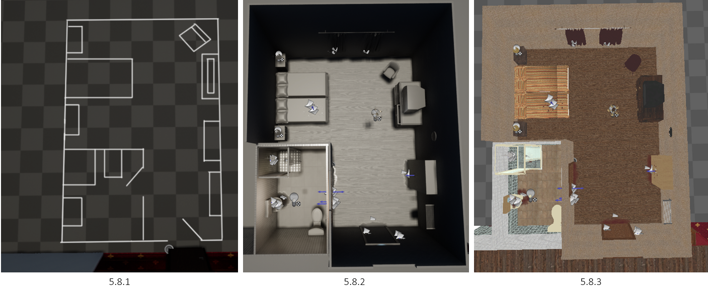
5.8 Room Layout Preview
Looking at the images above, it’s interesting how much I’ve stuck with my initial room plan, with only minor alterations of positioning (5.8.1), (5.8.2), (5.8.3).
5.9 Corridor Adjustments
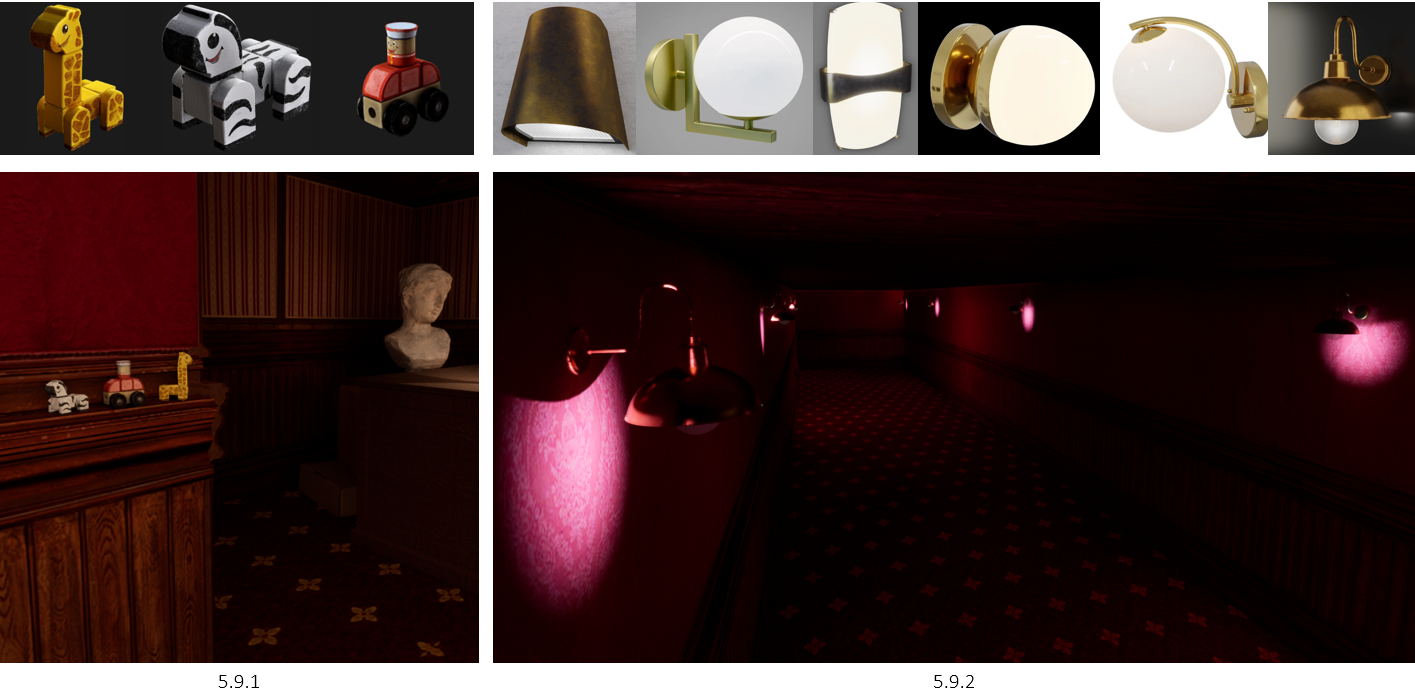
With the rooms ready, I made a few adjustments to the corridor. Within our game we have a child character that follows the player, being seen in random places throughout the game. To solidify her presence, I added some child toys on the wooden panels (5.9.1). This allows the player to determine their own story as to why those are there. Has she been here for years? Does she play with them in her spare time? Do they mean anything? Is she trying to scare me?
Doing some research into lamps, I gathered an asset list of what kind of lamps I think would suit the hotel best. I picked the ones I chose due to the interesting shape and surreal feel it displays when in this setting. (5.9.2).
6.0 Dining Room Plan
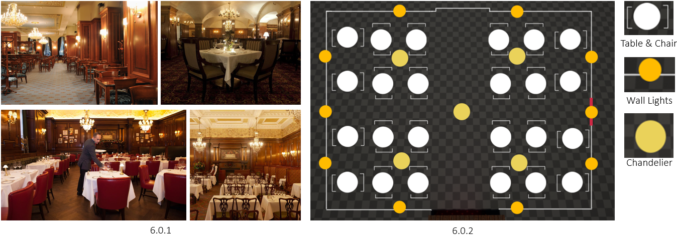
The next step of the hotel was the dining room, as the writers in our team had various plans on what could happen in terms of the interactions between the monster and the player. The size was set to be spacious, enough to walk around, run around tables, and keep the high lifestyle look. I did some research on fancy dining rooms and found a common theme of wood being used a lot, followed by very white tablecloths, and chairs being a red material or wood (6.0.1). With an idea in mind, I drew up a plan for the dining room (6.0.2)
6.1 Dining Table
When it came to making the dining table, I started by gathering assets that I could assemble (6.1.1). I imported the assets into Blender and used physics with the tablecloth to lay the table. This was followed by layering the glass, plates and cutlery (6.1.1). In the end, I went with a wooden chair, as I felt it would give more breathing room when moving around in the space (6.1.2).
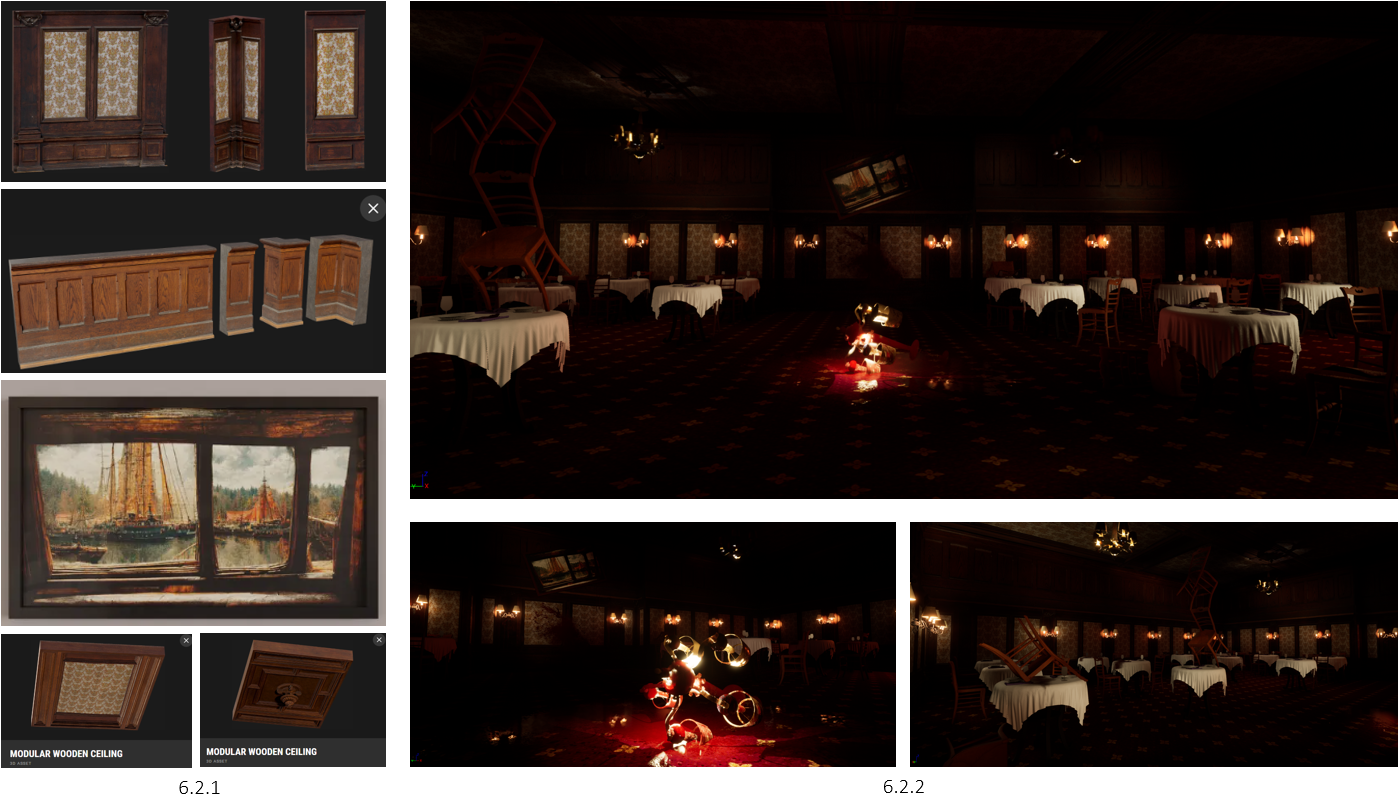
6.2 Dining Room Assembly
Using Quixel Bridge, I gathered various wooden walls, ceilings, lights, and a painting for decor (6.2.1). Using these assets, I proceeded to create the dining room environment, following the floor plan (6.2.2).
6.3 Dining Room Showcase
The dining room was a space I wanted to have some fun with, adding surreal scenarios to make the player have more questions than answers. An example of this would be the chairs, having one set balancing perfectly. Of course, I later added blood to make the player think a slaughter had happened, with blood splattered in various places, under the broken chandelier, table cloths, and painting that’s breaking.
6.4 Dining Room Entrance
I wanted to add more superliminal feels to the environment, so I followed a similar theme of long corridors getting narrower. Using 2 extra assets, an old door, and a golden clock (6.4.1), I positioned them at various angles and rotations on the walls and ceiling. These are simple additions, but the intention is to make the player stay on their feet and expect the unexpected (6.4.2). Why are there so many clocks? Do they mean something? Why are there so many doors? Why are some of them open? Did something get out, or in?

6.5 First Floor Preview
And that concludes the first floor. I duplicated the hotel rooms, changed the blueprints of the door rotations, and started to work on the stairs that lead to the second floor (video). Quixel Bridge had a modular wooden staircase, with an old haunting look, which was perfect for this kind of hotel environment (6.5.1) (6.5.2).
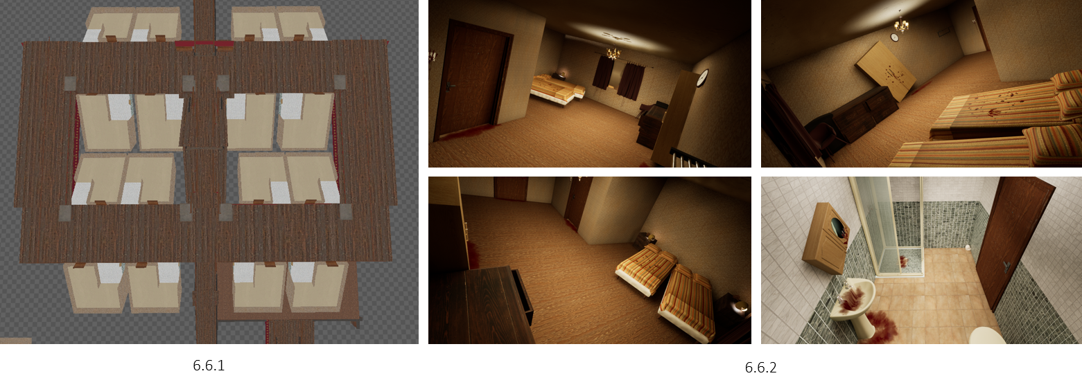
6.6 Second Floor Setup
When it came to making the second floor, I knew I wanted to do something different. I had the idea that there would be two equal sides, having more space to explore and loop the monster (6.6.1). However, I didn’t stop there. I made the whole floor feel wonky, an interesting change of environment. I duplicated one of the hotel rooms and rotated it by 30 degrees. Of course, this by default wood looked unnatural as everything was still in place, so I manually positioned everything to make it look fallen to one side (6.2.2). If I were to do this again in the future, I would definitely use a gravity feature, making these kinds of processes quicker.
6.7 Tilted Door Opening | Node Setup
I will say that I did have a lot of trouble making sure the doors opened at a 30-degree angle in the same way. The door was not rotating with the pivot (6.7.3), so I had to adjust the node setup of the blueprint, editing the XYZ axis (6.7.1) and animation values (6.7.4). However, I was happy with the outcome (6.7.2).
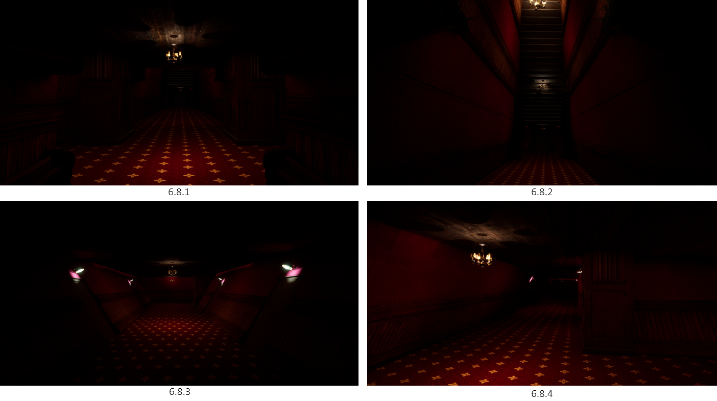
6.8 Corridor Preview
Manually adjusting the lighting levels, I feel that the corridors definitely have an eeriness to them, not knowing what’s around the corner, especially with the 30-degree rotated rooms. I also think that the red theming of the hotel definitely adds that horror aspect, mixing the signs of blood with a similar colour to the walls and flooring.
6.9 Second Floor Showcase
The second floor was then duplicated to make the third floor, with various alterations made.
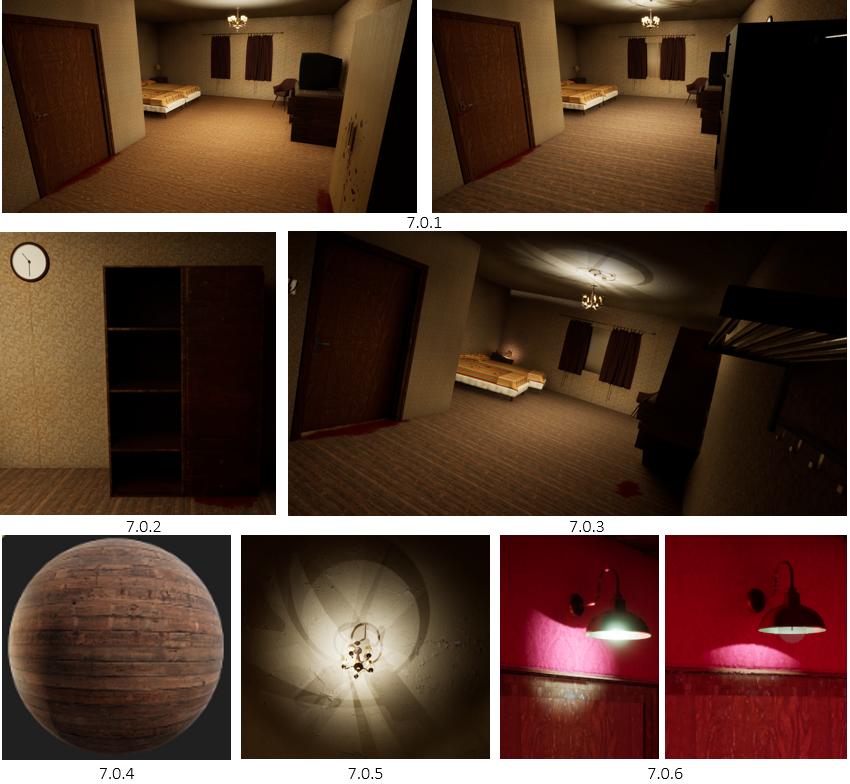
7.0 Acting on Feedback
After showcasing my work to my university lectures, I got some nice feedback on what adjustments I could make. For the hotel rooms, I swapped out the old IKEA-looking wardrobe for an older, darker brown one (7.0.1) (7.0.2). This of course was also added to the rotated rooms as well (7.0.3).
I also decided to add a mirror to where the window would be, attaching a material that reflects the environment but not the player, once again making the player ask more questions (7.0.3). The next changes were the floor, replacing the lighter oak planks with darker planks and adjusting the tiling, making the room a darker tone (7.0.4).
Finally, the lights needed some adjusting to resemble real life. I’ve added a light source for every light on the chandeliers (7.0.5), and adjusted the position of each corridor light inside slightly, making the light cut of more realistic (7.0.6).
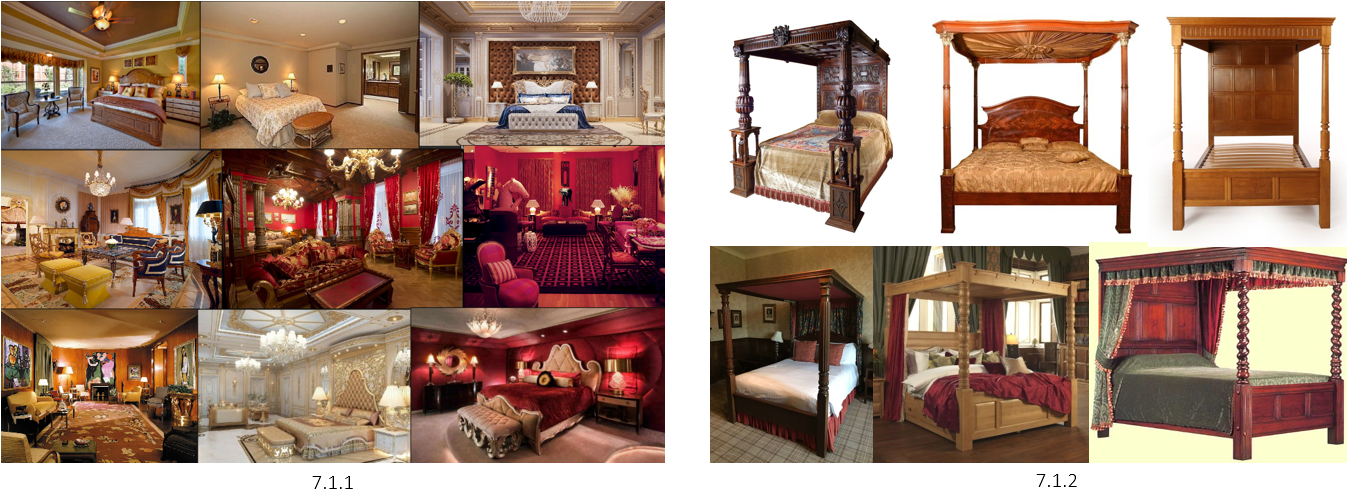
7.1 Master Bedroom MoodBoard
Moving into the final floor of the hotel, I thought about doing the master bedroom, the place where the pig monster would be staying. With the hotel being red and royal-themed, I began my research with various master bedroom compositions (7.1.1). This is then followed by Four Poster Beds research, as the idea would be the monster is very fancy, sleeping only in the luxury beds (7.1.2).
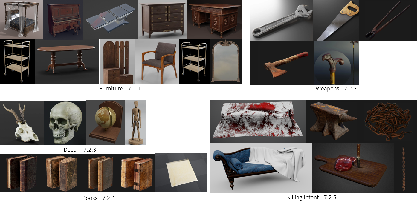
7.2 3D Assets Assembly
Using Quixel Bridge and a mix of BlenderKit’s free-to-use models, I began making a mood board of all the assets I thought could be used to make the perfect master bedroom of a killer.
Links to Model SourcesModel List: Brown Simple Rack: Here New Ornament Locker: Here Victorian Desk: Here Thin upholstered armchair: Here Articulated Dummy: Here Vintage Globe: Here Dining table: Here Ornament Mirror: Here Dusty Piano: Here Murder Scene: Here Walking Stick: Here Deer skull: Here Male Skull: Here Wrench: Here Hand Saw: Here Metallic Cart: Here Cutting board with raw meat: Here Victorian Style Sofa: Here Wardrobe: Here Official Website: click here
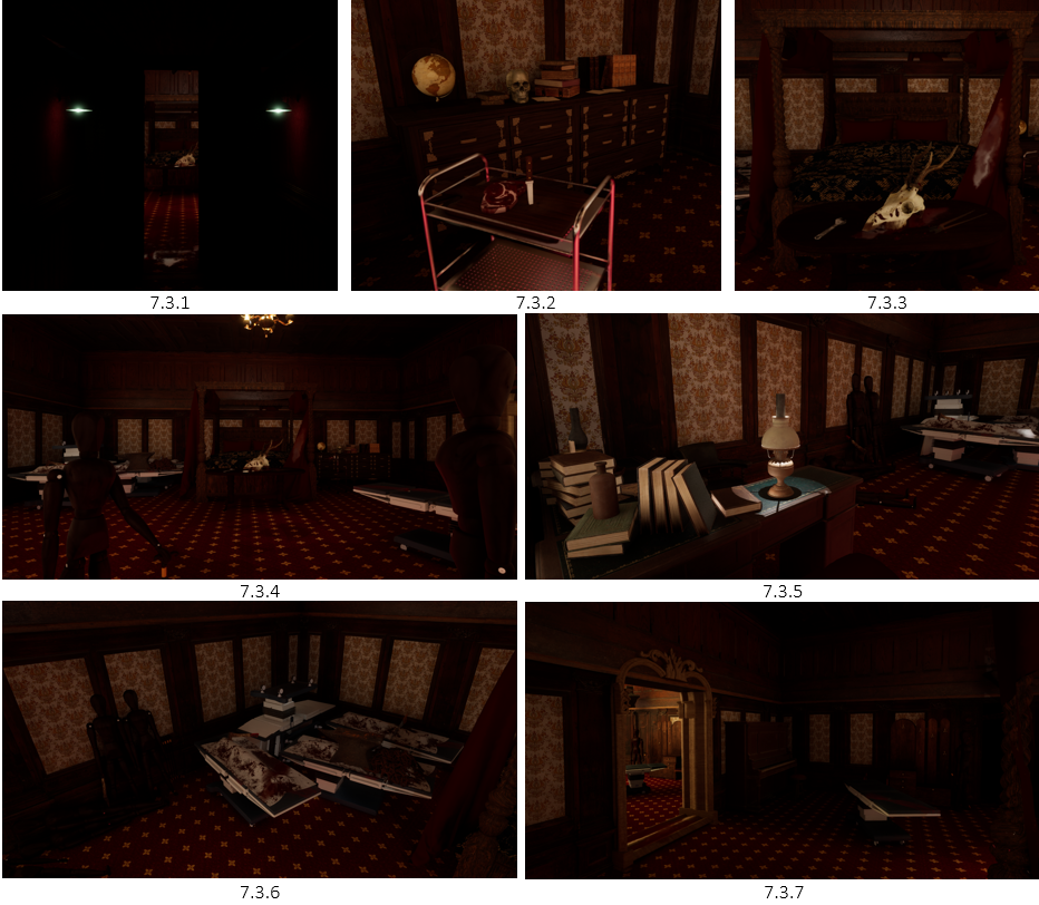
7.3 Master Bedroom Showcase
As you go up the final staircase, you go through a dark corridor to reach the old wooden doors (7.3.1). Various references have been made to give the player an image of who this pig monster is, their interests, and lifestyle. This includes a food tray with raw meat, and a knife stabbed into the cutting board (7.3.2), signifying they eat raw meat, which could be humans too. A table with a skull, weapons and blood is located just at the end of the bed (7.3.3), signifying they may collect things too, but, keep it messy.
As you walk into the room, you will notice various wooden dolls scattered in ominous places. One of which looks like they’re greeting you, whilst holding a cane (7.3.4), which in the lore, is the pig’s main weapon. To the left you will find a desk with various books and a lamp (7.3.5), signifying the monster is knowledgeable. Can the speak? Do they write? Further back, you will notice that there are hospital beds in a mess (7.3.6), having blood all over them. Not only does this show that the monster kills and keeps its victims with weapons still attached, but it shows its incredible strength to pile up a bunch of hospital beds. Are there real victims under the cloth, or just wooden dolls? Finally, to the right of the room (7.3.7), there is a large mirror reflecting the room. Right next to it is a piano. Does the monster have hobbies?
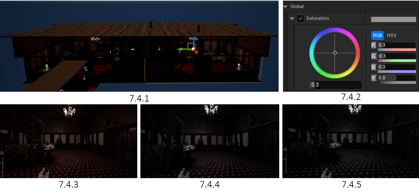
7.4 Mirror Dimension
I wanted to add one more final surreal aspect to this level. I duplicated the room to give the mirror a feeling of reflection (7.4.1), however, I removed the fake glass effect and allowed the player to walk through it. I played around with the saturation of the environment (7.4.2), having some colour (7.3.3), less colour (7.3.4), and no colour (7.4.5). In the end, the team agreed with having some colour as it seems to give a timeless feel.
7.5 Mirror Secrets
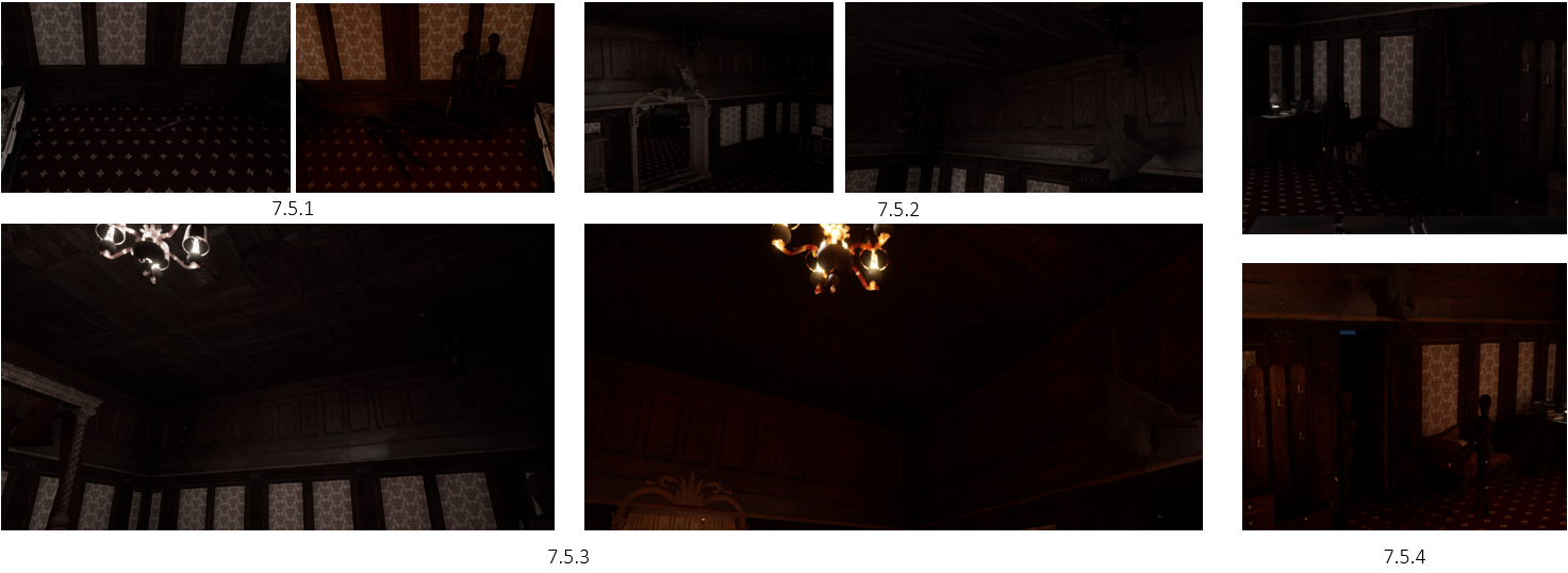
Within the mirror section, I wanted to give some insight into the dolls laying around the room. In the mirror world, where some wooden dolls would be located, seem to be found in different locations, almost alive. An example of this is the pile of dolls missing in (7.5.1). Turns out, when looking above you, those dolls are located on the ceiling, all facing you (7.5.3) Some of these dolls seem to be holding the anvil, but not in the normal room (7.5.2). This is a reference to the hospital beds, as clearly one of these anvils has been thrown to kill. Are these dolls alive? Should I be scared? Finally, there are some differences between the rooms, such as the door being closed, the greetings dolls facing you, and various objects missing that are located in the main room (7.5.4).
7.6 Level Walkthrough | Hotel
Overall, I’m quite happy with how the Hotel developed, making sure to act on feedback from my team and cohorts, and following the writer’s intentions of locations, and soon-to-be interactive objects.
7.7 Conclusion of Project | CaseClosed
Video, Level Mechanics & AI Interactions | Made by Developer Ian
Zombie Monster | Made by 3D Artist Kirsty
To conclude, I can confidently say I’m very proud of my 3D Environments. This being my first time using Unreal Engine 5, I feel that my next step will be to push myself further into making more environments that have a sense of storytelling, something I strive to pursue.
The team on this project was just phenomenal, everyone contributed a good amount of work, communication was consistent, and the organisation was well followed. Although this client project was set by a client who tried to exploit our ability to work for free, we as a team agreed to cut ties and proceeded with the project. We wanted to show all future audiences what we’re capable of in our respective fields, and I personally believe we’ve achieved something amazing.
Handover Document:
The project was Zipped and sent over to the developer to continue development. This was followed by packaging the project as a .exe to make sure the can see how one version of the game functions, vs how it does, spotting any errors that could impact the game.