Web Development

Brief
Create your own individual website to display the journey of your 3D work in a presentable standard.
Goal
Display a journey of all my 3D work that I've done whilst in university and in my own spare time.
Role in Project
Web Development
Software
WinSCP
Notepad++
Visual Planning
Wireframs & Layout Variations
Home Layout Development
Home Mobile Version
Work Layout & Mobile Version
Website Versions
Home & Work Page v1
Home & Work Page v2
Useful Tools & Websites
Bootstrap & W3School
Lightshot & Notepad++
WinSCP
Code Highlights & Snippets
PHP
Java
Organisation

Wireframs & Layout Variations
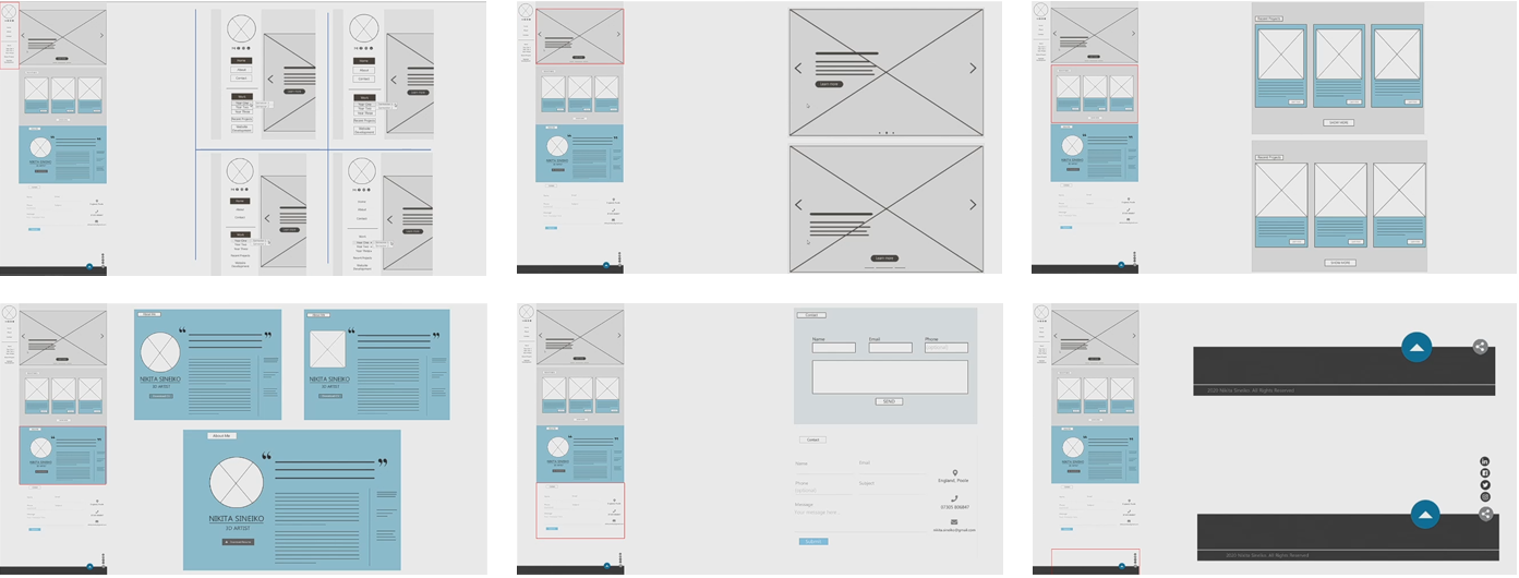
When creating the wireframes, I began sketching a page design variations. I started off with the home page layout, drawing boxes to indicate any images or functions I wanted to use, such as buttons or slideshows. Later I used Photoshop to get a better visual display of my website. Photoshop allowed me to change the layout whilst keeping it clean, which was very handy when trying to see what works and what doesn’t. After some layout variations, I coloured each one using a certain colour pallet to see what works. My aim was to find a colour pallet and layout that was minimalistic, making sure there wisent too much visual information on every scroll. The minimalistic theme also can make my life easier as when designing a mobile version, having not to compress too much information or potentially remove it to make it look somewhat presentable.
Home Layout Development
I was pretty happy with my final layout design, having a modern colour pallet whilst keeping it clean, however I didn’t stop there. I always tried different variations along the way, working in different section to see what looks best, whilst keeping it realistic in terms of what is possible to code. The process mainly consisted of the layout of text and altering positions in various ways.
Home Mobile Version
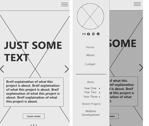
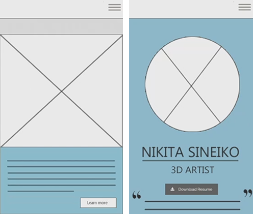
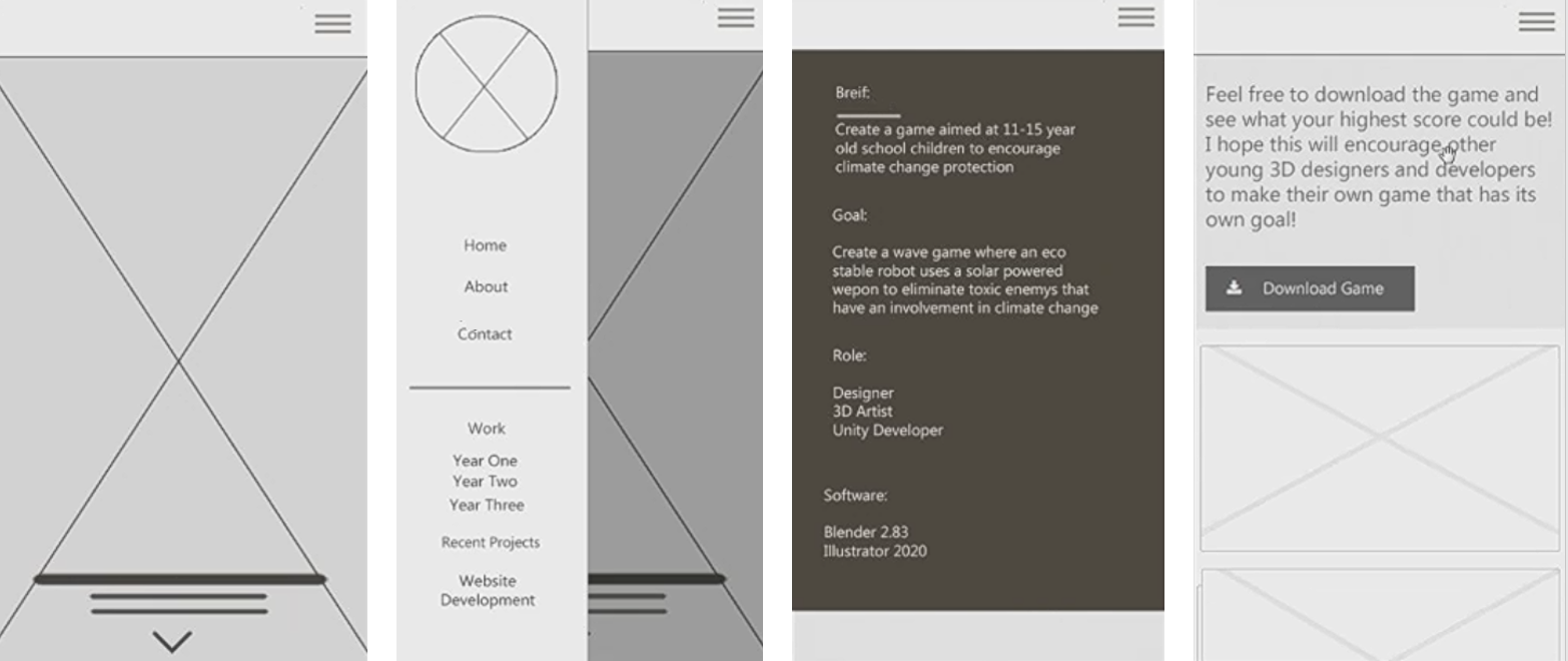
After I was happy with the computer layout, the mobile version was next. I understand that when designing a website its best to begin with the mobile version, however due to me having a very minimal theme, I could see that everything could be repositioned in stacks (one above the other) in a clean format.
I liked the idea of a side bar as it can be easily accessed and not in your face, however when development began, I preferred a simple header nav bar. This was mainly because I felt that the side bar would be somewhat messy when opening on your phone, having too many sections.
Work Layout & Mobile Version
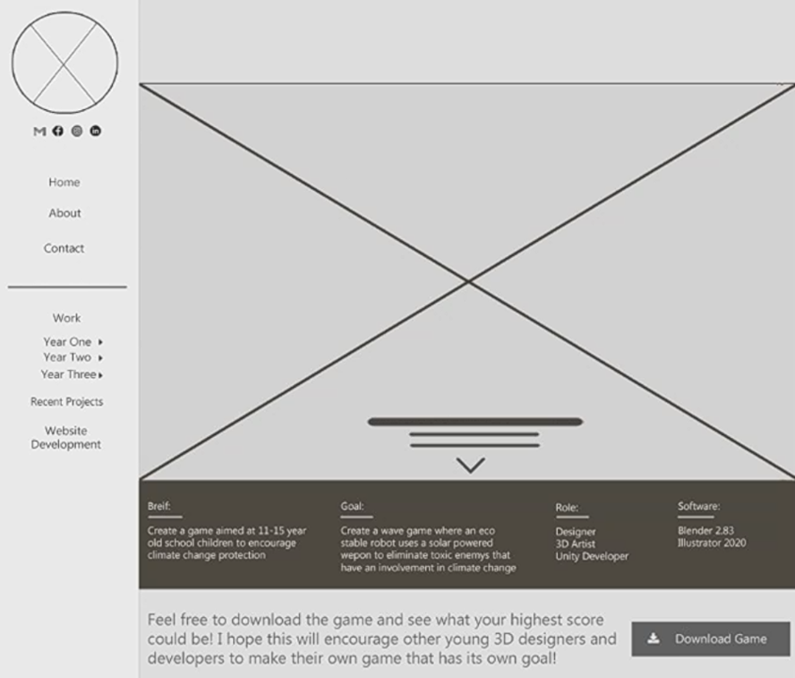
The work page of a project was set to be viewed in sections, starting off with the main image, title and the brief. When scrolling down to the formatting of the work process, images were planned to be on the left and text on the right, keeping it simple.
I later created the work page in a mobile version, giving a visual of how big images should be and what layout works best.
Home & Work Page v1
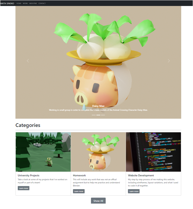
This was my original design when coding my website. The home page was created as planned, having a slider at the top and the categories underneath. I decided to leave out the side bar and replaced it with a simple header nav bar, keeping it slim and out of the way, yet still allow you to navigate throughout the website.
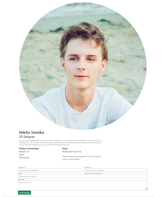
My portfolio and contact me was also set to be on the home page, having easy access to see who I am and how to contact me. However, later on I decided to keep the home page focused on my work, and to move my portfolio and contact to a separate section on the website.
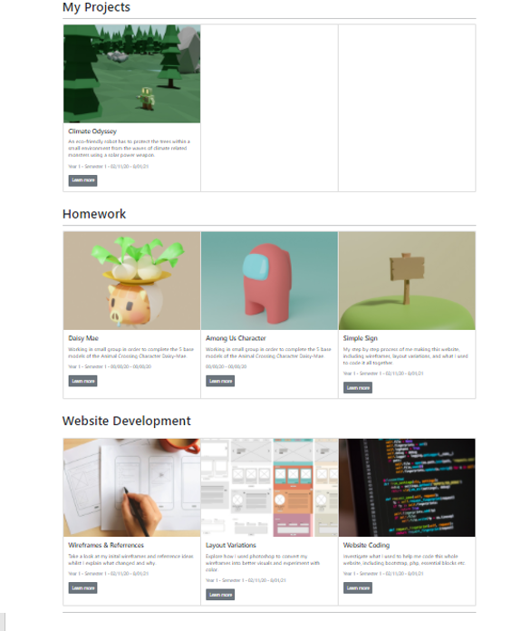
When going to the work pages, I created various categories that will send you to a project. However, after developing lots of features on the website, I no longer liked how boxed everything was. Not to mention each project was displaying a small box, making it seem like it was a small achievement when in reality some of them took a couple of weeks to prepare and create. This lead me to recode a lot of features.
Home & Work Page v2
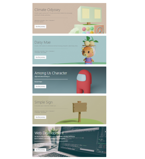
The home page was recoded to display each project at a larger scale, something I really wanted to change. I also removed the categories as each project will be displaying in the home page.
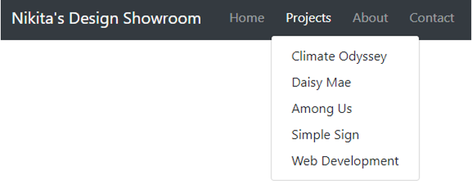
The nav mar was updated to have a drop down section, displaying all my completed projects.
The work page per project however did stay the same to the original plan, having an image, description to be the first section viewed. I also added some more interesting features such as drop down sections for showing and hiding text. Some of the key text was shown to hopefully engage the viewer, who can also press the button to open a whole section. If however they’re not interested, having the hidden text will allow a better scroll past as it wont be in anyone's face, as it could unencouraged the viewer to continue scrolling.
Useful Tools
I was pretty happy with my final layout design, having a modern colour pallet whilst keeping it clean, however I didn’t stop there. I always tried different variations along the way, working in different section to see what looks best, whilst keeping it realistic in terms of what is possible to code. The process mainly consisted of the layout of text and altering positions in various ways.