Trand Bracelet - Development Journey of the Bracelet, Assets & Train Environment
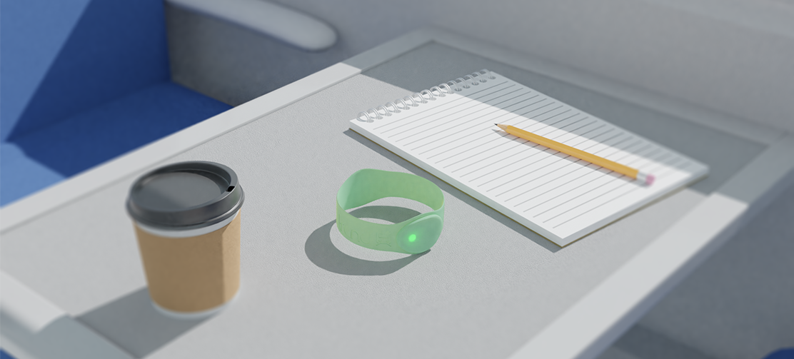
Brief
Create a trailer to sell a product for mobile, portable, wearable or integrated devices
Goal
Create a photorealistic bracelet, Train environment & General Assets
Role in Project
3D Artist
Designer
Software
Blender 2.90
Photoshop
Research & Prep
1.1 Various Material Research
1.2 Statistic Research
1.3 Statement of Objectives
1.4 Reassurance
1.5 MoodBoard
1.6 Sketched Concepts
1.7 Anthropometrics
1.8 CAD Process & Variations
Bracelet
1.9 Shape Setup
2.0 Lump Setup
2.1 Lump Development
2.2 Final Adjustments
2.3 Method 1 - Lights
2.4 Method 1 - Material
2.5 Method 2 - IOR Material Node Network
2.6 Method 2 - Lights
2.7 Bracelet Preview
2.8 Colour Blindness
Logo
2.9 Brand Name Ideas
3.0 Logo Design & References
3.1 Logo Design & Development
3.2 Appling Logo
3.3 Final Bracelet Preview
3.4 Coloured Bracelets
Scene Development
3.5 Similar Product Environment
3.6 Inside Train References
3.7 Scene Set Up
3.8 Notepad Creation
3.9 Pencil Creation
4.0 Coffee Cup Creation
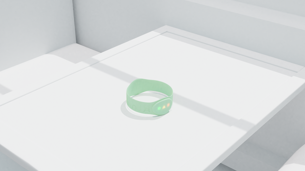
4.1 Scene Alteration - Lighting
4.2 Scene Development
4.3 Final Render
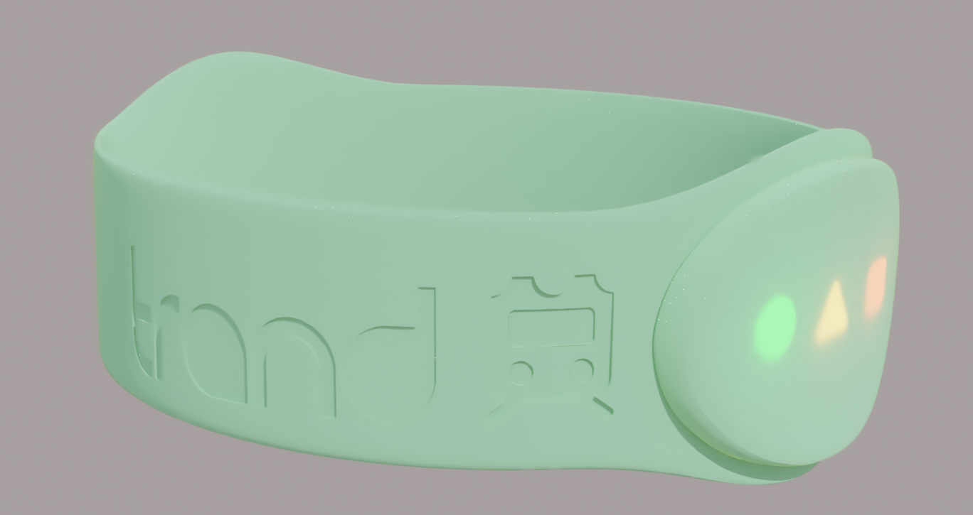
Band Functionality Overview
For our project, we have been asked to create a trailer to sell a product for mobile, portable, wearable or integrated devices from a list of various contexts. We decided to continue the route of “Travelling on public transport”, and develop a bracelet that will be used by daily train passengers.
The material that the bracelet is to be designed from will be a soft rubber silicone band that will stretch over the user’s hand and sit on the wrist. As the bracelet is not adjustable with a strap or clasp to allow adjustability, the bracelet will need to come in two sizes to allow a comfortable fit for smaller and larger wrists across both male and female wrist sizes between the ages of 18-45. Using a material that is both soft and stretches has allowed the design to be kept to creating only two sizes of band.
On the face of the bracelet there are to be three lights that will represent a certain notification to the user. The lights are to be green, amber and red. The green light is a circle shape that indicates when the users train is arriving at the station or at their intended stop to remind them to disembark. Along with this green LED, the band will vibrate to ensure the user wakes up if they have fallen sleep or simply to notify them to check the bracelet.
The amber light is a triangle shape that informs the user that their train is five minutes away from the intended stop. Again, the bracelet will vibrate to notify the user about this.
The final light is red square shape. This indicates low battery to the user and warns there is 10% battery left in the watch. We decided to use shapes as well as different colours to help the user differentiate between the different meanings behind each LED with a quick glance at the device. It can also help colour-blind people differentiate between the different notifications as opposed to if they were all square or circular (skip to colour blindness research).
Key Notes:
- Try not to apply all modifiers as you cant go back! You may want to make some alterations later on.
By Maria-Cristina Chirpac
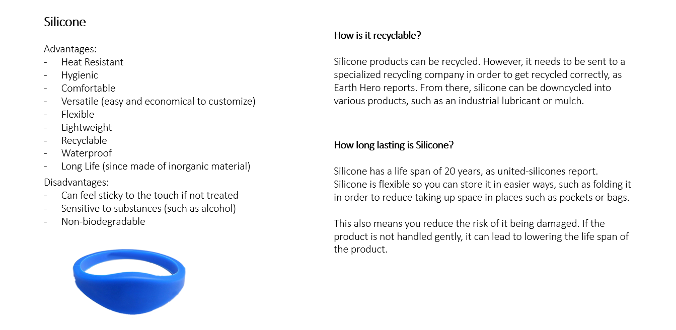
1.1 Chosen Bracelet Material - Silicone
By Maria-Cristina Chirpac
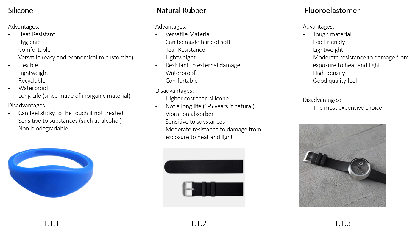
When thinking about materials, we investigated Silicone (1.1.1), Natural Rubber (1.1.2). and Fluorelastomer (1.1.3). We listed the advantages and disadvantages for each material, within a bracelet shape. In the end, we decided to go with a rubber material primarily due to it being easily recyclable, comfortable, waterproof and cheap.
1.2.1
1.2.2
1.2 Statistic Research
Purpose and total use of trains in UK
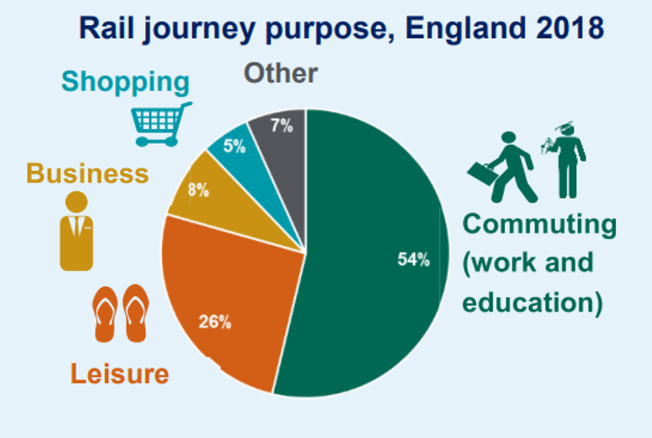
1.2.1: A factsheet published by Department of Transport shows the ‘Rail Journey Purpose’ of passengers in England 2018. Using this statistic, we decided to focus our target audience on passengers who commute for work and education due to this being a popular journey purpose. We can also we get a better understanding of what functions, visuals, design, and cost to aim for in order to fit the target audience’ requirements.
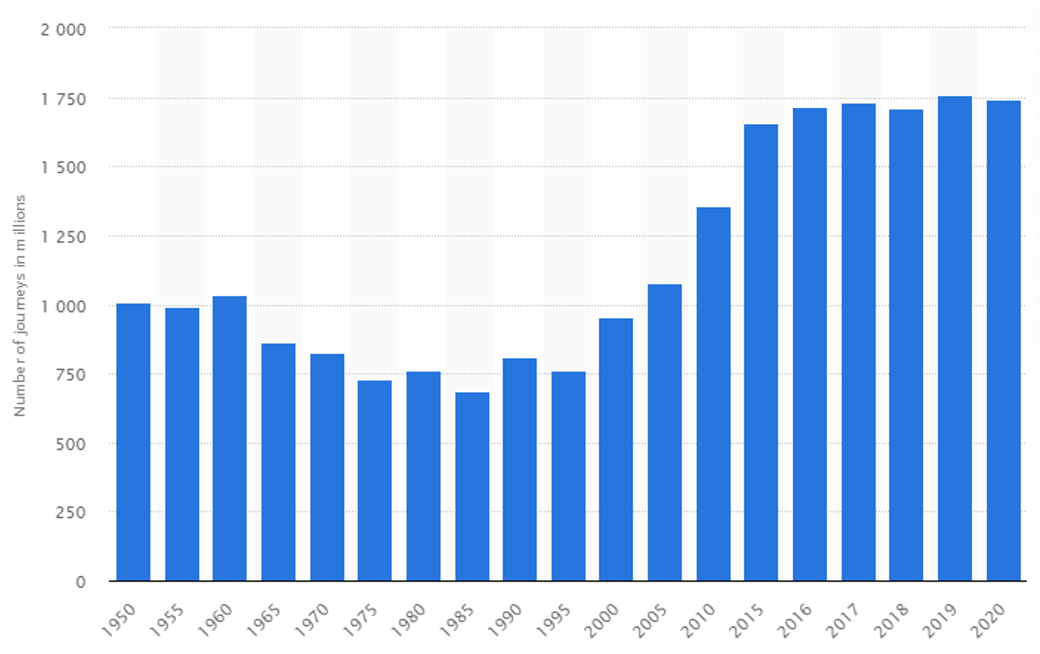
1.2.2: We wanted to acknowledge how many people that 54% was in order to get a better insight of out target audience. A statistic record published by Statista shows the total historical national rail passenger journeys in the United Kingdom from 1950 to 2020. The table shows that in 2018, more than 1.7 billion passenger journeys were made on national rail services in the UK. Comparing this record with the ‘rail journey purpose’ in England 2018, this means 54% of the 1.7 billion passengers were commuting for either work or education, which is 918 million passengers every year.
1.3.1
1.3.2
1.3 Statement of Objectives
Our Goals and how we will achieve them
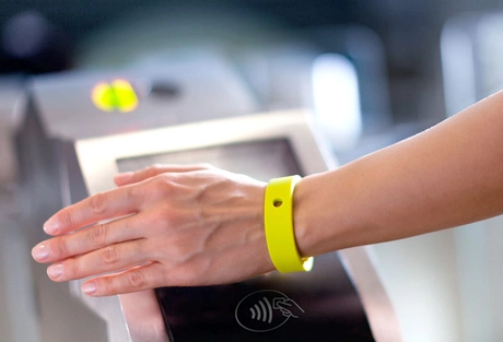
Our goal for this product is give our users a more time efficient and safe way of using trains. The scan as you go function can also help save time when in need of getting pass train gates (1.3.2) or to show on board. This is especially handy when you’re in a hurry, removing the hassle of trying to find your ticket somewhere in your phone.
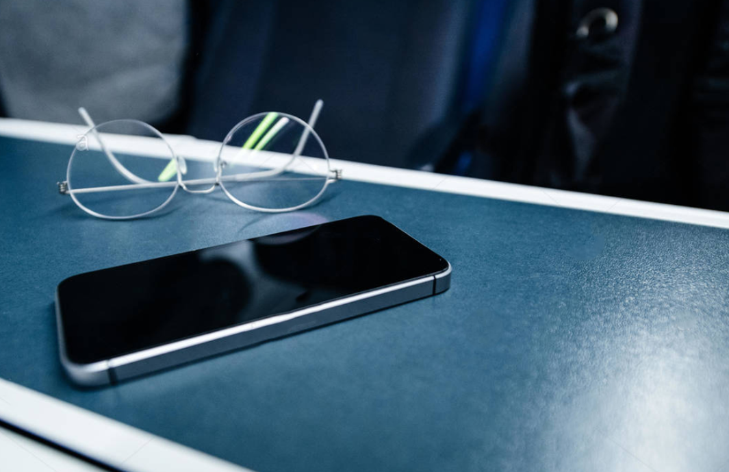
A data display done by Freedom of Information shows that the most commonly stolen item on trains were mobile phones (1.3.1) , followed by other accessories, including cases, chargers and headphones. BTP (British Transport Police) recorded a total of 11,460 instances of mobile phone and accessories theft across the two calendar years – 4,207 in 2018 and 7,253 in 2019, which is an increase of 72 per cent.
Passengers can use the NFC token scan feature in any context that requires them to display a ticket, meaning you won’t need to have your phone out and will reduce the risk of your expensive phone being stolen, and swiftly move on with your journey. Most importantly, you wont lose the bracelet as it will have a nice comfortable and stable fit around your wrist, meaning you wont have to worry about it falling off.
Our other goal is to also make the bracelet cost effective, meaning our target audience will see it more of a quick investment than just save up for a smart watch. This will also follow in line with safer travels, as in the off chance you lose the bracelet, its not as bad as losing your mobile phone.
1.4.1

1.4.2
1.4 Reassurance
Majority of train users buy their tickets online or on their mobile phone through the official Train Line App (1.4.2). So we wanted to connect this with our bracelet.
When you buy a ticket though mobile, the bracelet will receive a vibration with 3 LED’s flashing to tell the user that their ticket has been processed (1.4.1).
Your ticket is then connected via Bluetooth, allowing the bracelet to know where you are, and be in sync with train times to accurately indicate when you should arrive.
Most trains have WIFI and good signals, meaning the bracelet will still let you know when its your stops. However in the chance you get no internet connection, the bracelet will use the last time check made to notify you when its your stop. Keep in mind the bracelets NFC scan feature will still work, meaning you can continue the scan as you go.
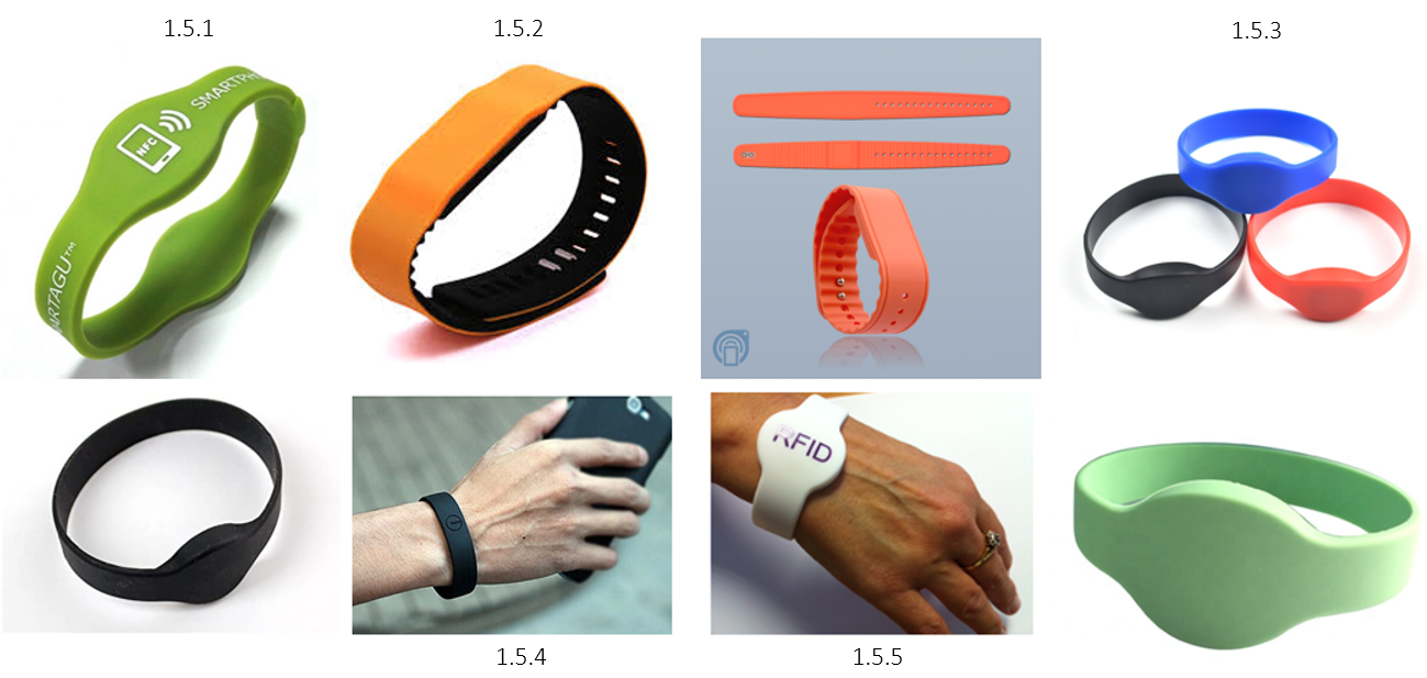
1.5 MoodBoard
The mood board helped us to outline important features for the bracelet. When looking at the orange bracelet that has an adjustable strap (1.5.2), we decided to keep our bracelet singular sized, as we thought it may be at risk of falling off, caught in some way, or a general concern to some who’s want to guarantee their bracelet won’t come off. The other main feature we decided on was having our reader chip being on both sides, similar like (1.5.1) as we think this will be a unique sell point due to the user not been to rotate their risk every time when they need to scan a train pass machine.
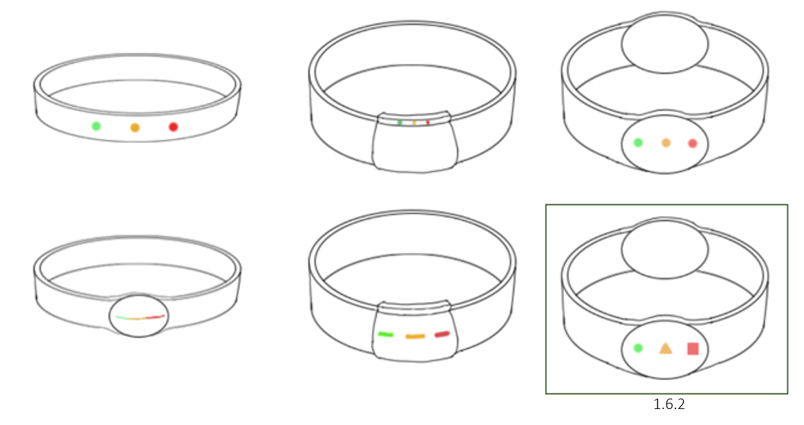
1.6.1
1.6 Sketched Concepts
As we agreed on what material and what features we wanted, we can now focus on choosing what design to go with! I sketched 6 different concepts for our bracelet, to which we narrowed down to the bottom 3. Since we still didn’t like the one-sided bracelet style, we decided to go with the original (1.6.2). I added the shapes for the different lights as I thought about colour blindness, making sure everyone has the best user experience.
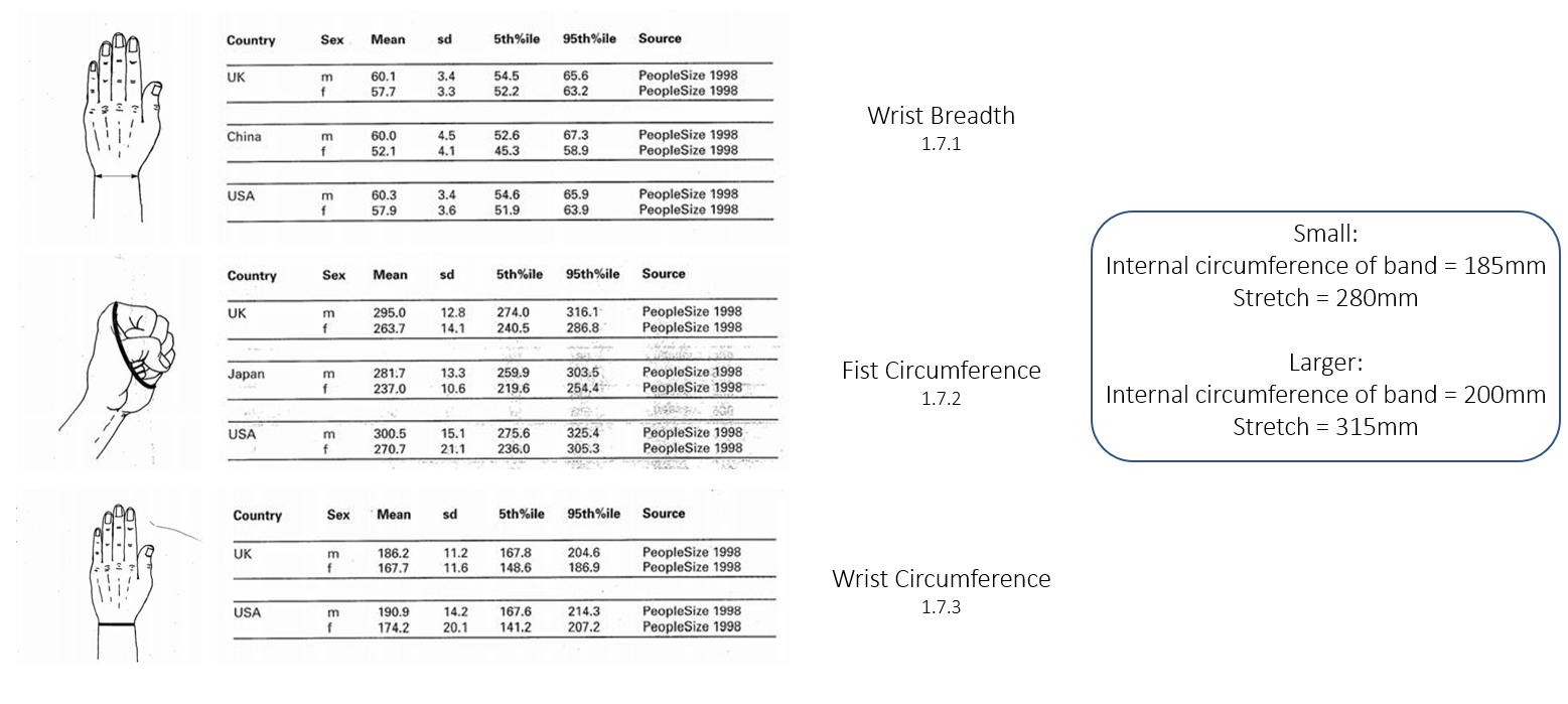
1.7 Anthropometrics
By Christopher Jones
Our CAD team member, Christopher Jones, did some Anthropometrics research on what size should our bracelet be, and if we should have more than one. We resulted in having 2 sizes for the bracelet, one for smaller wrists, and one for average/larger. This ensures more users to try out our bracelet as there will be a fit made for them.

1.8 CAD Process & Variations
By Christopher Jones
Using the knowledge of the scaling and how the design should look like, Christopher started to create some digital mock-ups of our bracelet (1.8.2). Although we choose the design we wanted to focus on, Christopher still created some variations to help the team to visualize the different designs (1.8.2). However, we were all set on the initial design, so we were satisfied to continue to the next step.
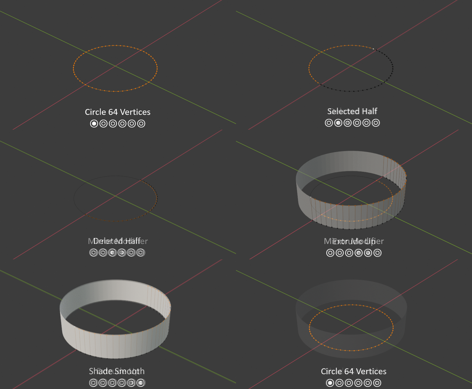
1.9 Shape Setup
I started to create the basic shape of the bracelet, starting off with a circle at 64 vertices. I then selected half of the vertices, deleted them, and added a mirror modifier. This allows me to only need to edit half of the bracelet, very useful when created the symmetrical sides. Finally, I extruded up the vertices up to create the 3D shape and finalized it when a shade smooth.
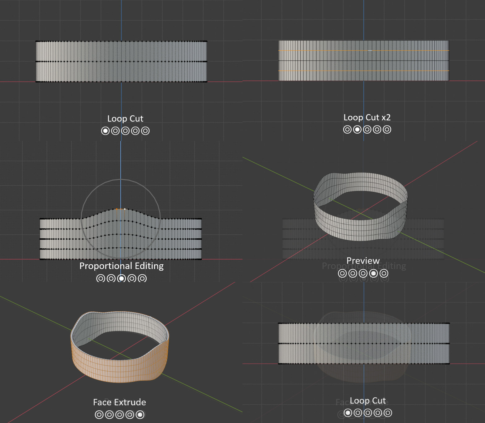
2.0 Lump Setup
To create the lump of the bracelet, I needed to add some extra vertices to allow me to make smoother edits. I did this by loop cutting 3 times in the Y axis and use the proportional editing tool to lift the vertices around the selected. Finally, to add some depth to the bracelet, I selected all the outer faces and extruded outwards.
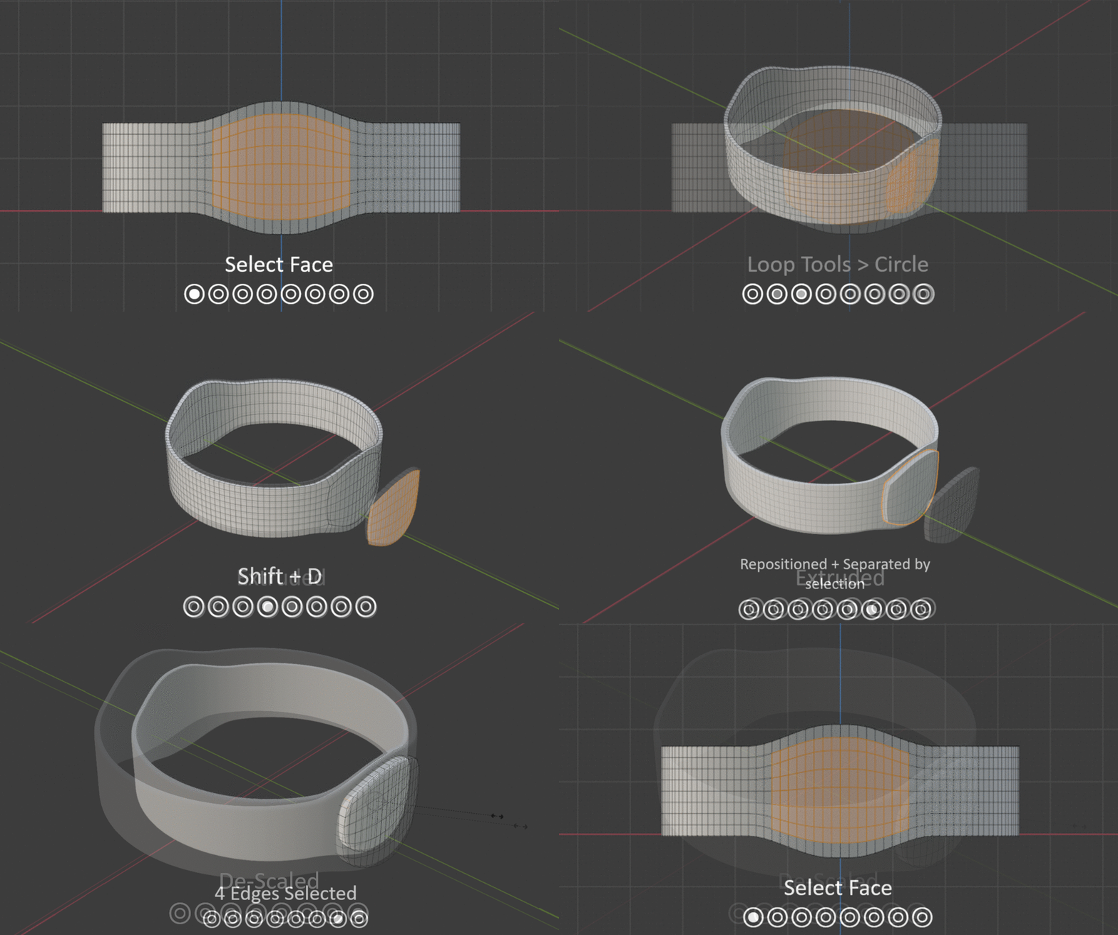
2.1 Lump Development
The lump needed some thickness to its shape due to having various components inside, such as the LED’s, a battery, and the NFC chip. To make the lump, I started by selecting the faces of where I wanted the lump to be formed and used the addon Loop Tools to reposition the vertices in forming a rounded shape (loop tools > circle). I then copied the selected faces with Shift + D and extruded to a reasonable thickness. However, I also wanted this to be separate from the bracelet as it would make it easier for me to work with later down the line, so by using the separation tool (Ctrl + P), I separated the extruded lump by selection, and repositioned it back. Finally, to add a smoother look, I selected the front outer edges and scaled them down, creating a smoother curb.
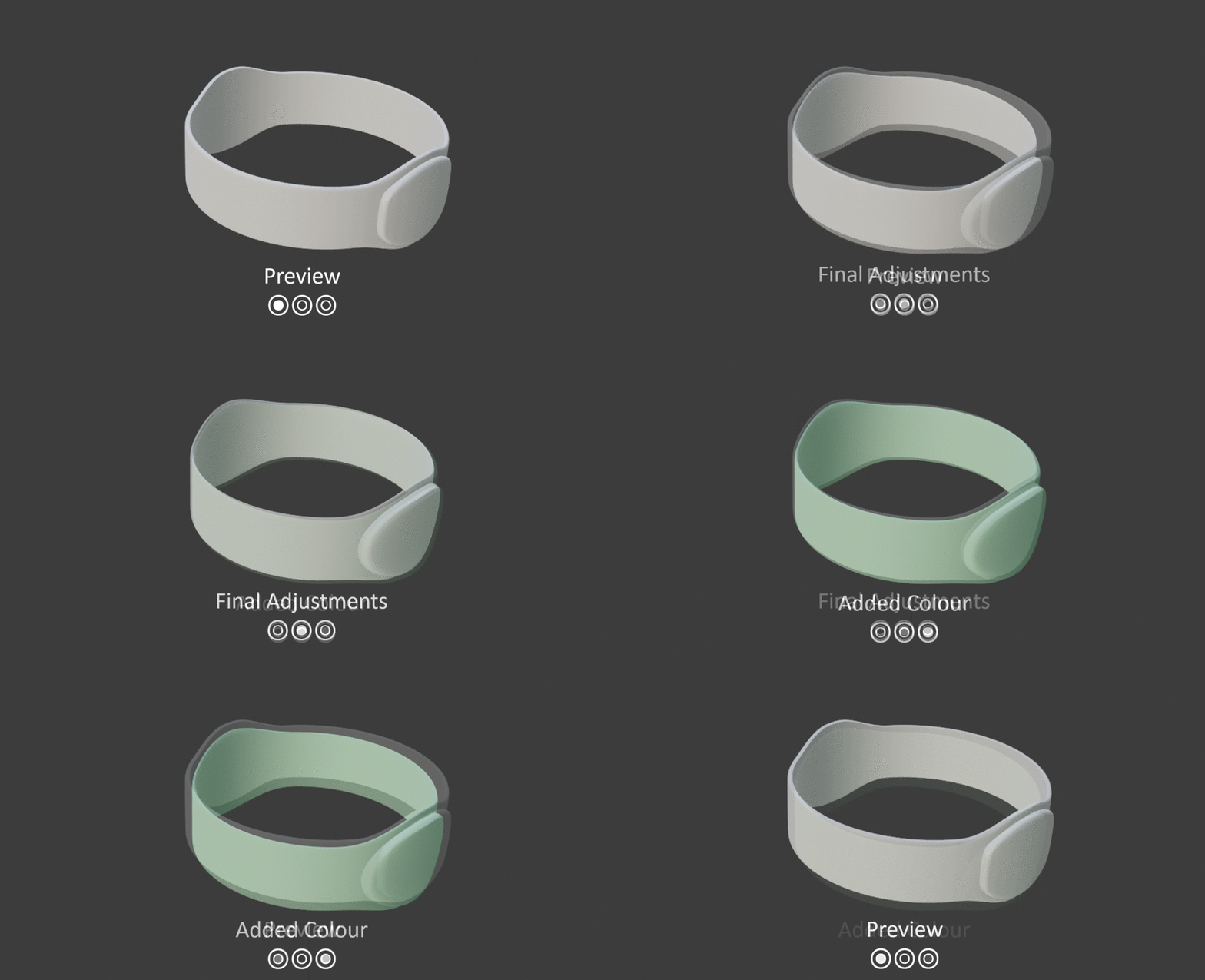
2.2 Final Adjustments
For the final adjustments, I played around with the vertices to create more stretched oval shape with the lump. Both sides now look perfect due to the mirror modifier mirroring the other side of the bracelet. I later talked to the team about what colour we should have, and we decided to have various ones, so I applied a simple base colour to represent one of our coloured outcomes.
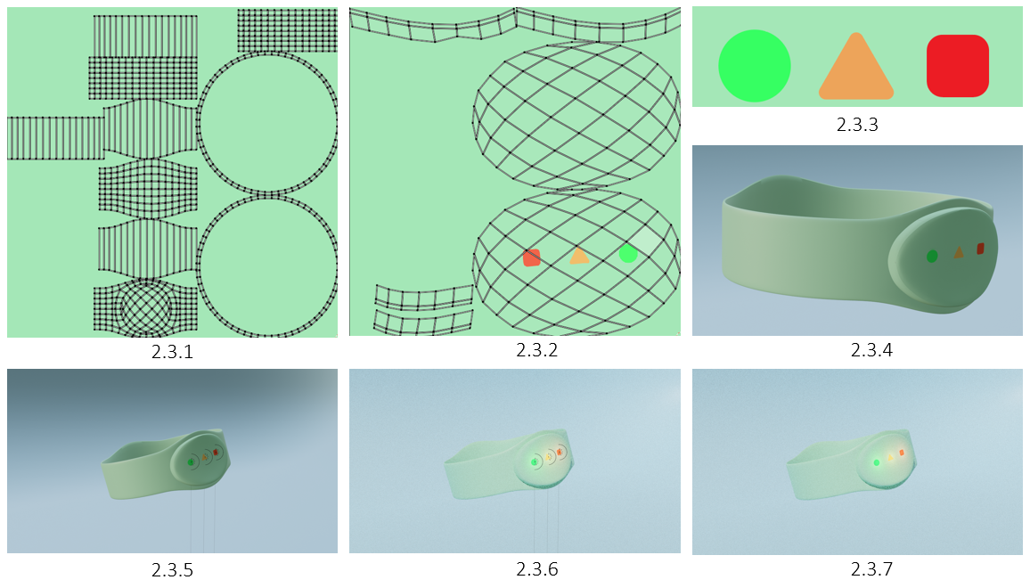
2.3 Method 1 - Lights
My initial method with lights was to UV unwrap the bracelet, and paint in the shapes, either within blender or though Illustrator, to which in this case, was Illustrator for perfect shapes. This was then followed by adding spotlights halfway into the bracelet and select the different colours. However, after doing all this, I figured there must be a better way, so I scrapped this method.
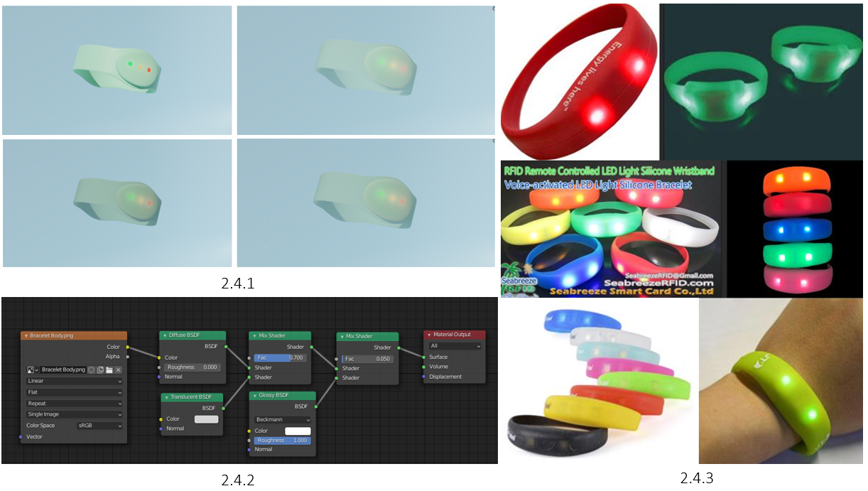
2.4 Method 1 - Material
As for the material, I wanted to make the bracelet look more photo realistic, so I found some visual references and to see what kind of material I needed and how it reacts to light (2.4.3). I started to play around with diffuse and transparent BSDF into mix shaders to see what outcome I could get, and to my surprise they were close, but not perfect (2.4.1).
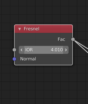
2.5.1
2.5.2

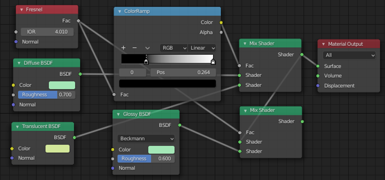
2.5.6
2.5 Method 2 - IOR Material Node Network
I was unhappy with method 1 since it didn't look too photo realistic, so I tried to discover more nodes. Fresnel takes the current computation that is happening and turns it into what looks like sub surface scattering. Subsurface scattering is a physically based rendered phenomena that takes in all of the raze of the light hitting onto an object, penetrating through them, and refracting those light raze correctly. So, what the Fresnel node does is find the furthest edge point of every angle that an object is hit and creates a fall off.
The Diffuse BSDF node is the colour bouncing off the light in the scene, and the roughness shows how much it resolves in the material being shiny, creating a specular highlight.
Glossy BSDF was set to 0.6 in order to add some shine towards the material creating a wax kind of look.
When you put colour in front of a light it won’t just change the appearance in terms of colour, it will change the intensity because it filters the wave length. This is where the Translucent BSFD node comes in, allowing me to alter the light intensity of the bracelet to add towards the photo realistic look.
I checked the index of refraction of silicon, and added the variable to the IOR section (2.5.1). When connecting the IOR back into the Mix Shader node (2.5.5) on Fac, it will blend my diffuse (2.5.3) and translucence (2.5.4) together, giving me a physically based example of what it would do as a index of refection. This ultimately creating a realistic material through how the light razes hit the band.
2.6 Method 2 - Lights
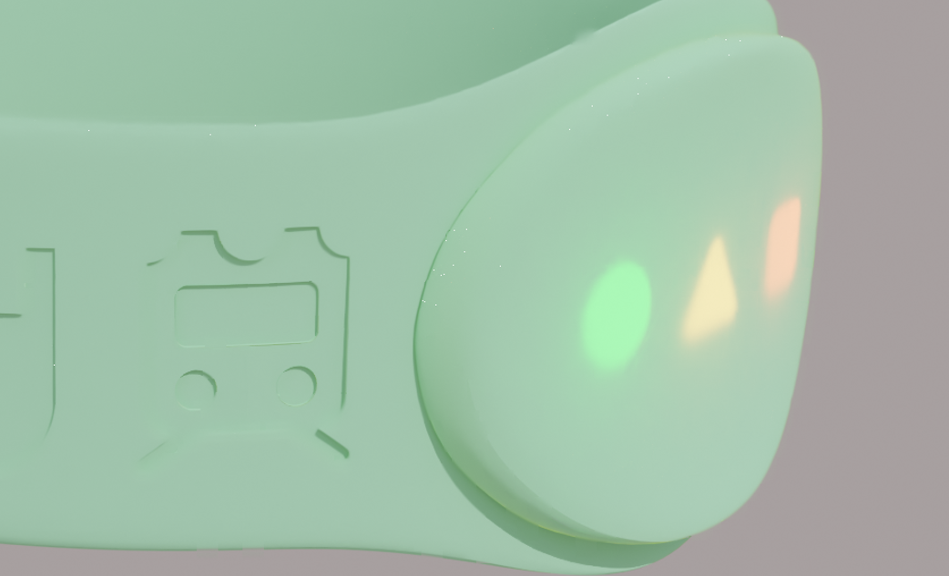
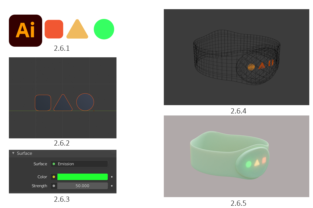
Using the same shapes, I created in Illustrator (2.6.1), I decided to go with a different approach. I exported the 3 shapes as SVG, and imported them into Blender as SVG’s, transforming them into mesh planes (2.6.2). Later, I add an emission material to the 3 shapes (2.6.3), allowing them to be more visible within the bracelet material due to the IOR. Finally, I went into wireframe view and positioned the shapes close to the edge of the bracelet’s lump, making sure there wasn't too much material in the way (2,6,4). Overall, I believe the bracelet came out as intended! (2.6.5)
2.7 Bracelet Preview
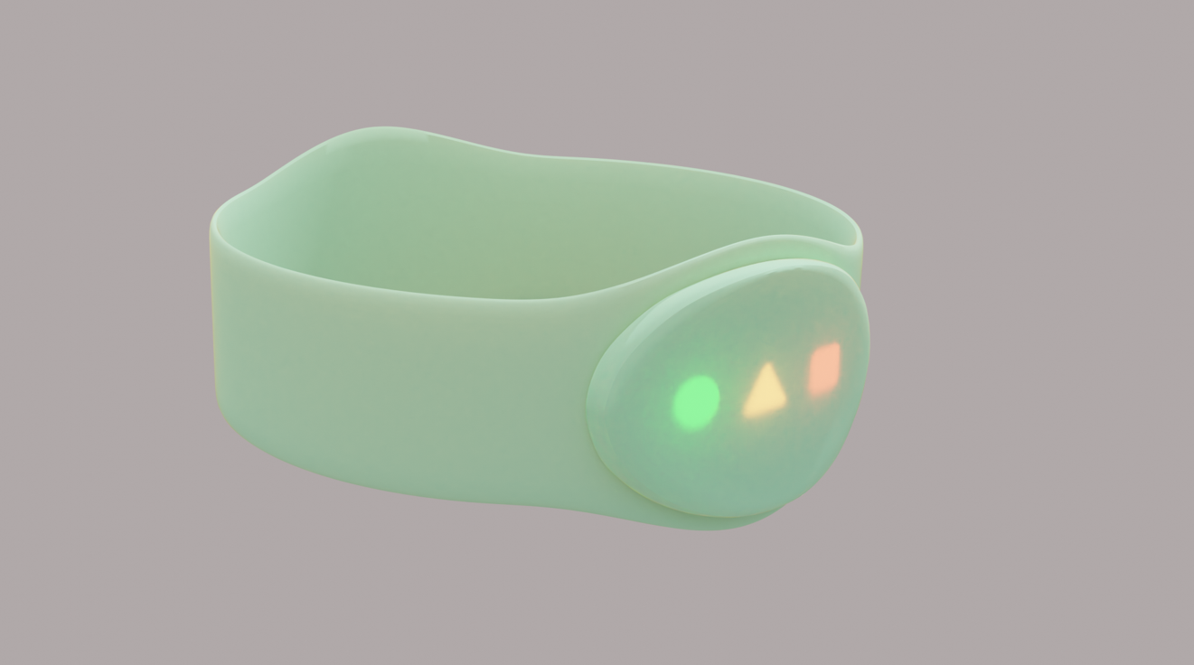
This is a preview of the complete bracelet, having smooth silicone looking material, and with 3 LED’s lit on at the same time (for display purposes). Overall, I was proud that I got this far with a photorealistic looking bracelet since this is only my second semester, and just a few months of knowing Blender!
2.8 Colour Blindness
We decided to use shapes in order to help the user to identify a shape with an event, having the circle symbolising a go, triangle a warning, and a square for an alert. However this doesn’t stop there as having these shapes can also help people who are colour blind in various ways.
According to Colour Blind Awareness Organisation, colour blindness affects approximately 1 in 12 men and 1 in 200 women in the world. A study in 2019 found that In Britain there are approximately 3 million colour blind people.
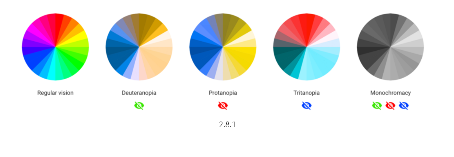
After doing some research (2.8.1) I found that the most common types of colour blindness are due to the loss or limited function of red or green cone photopigments. This type of colour blindness is commonly referred to as red-green colour blindness. For example, in people with deuteranopia (2.8.1) , there are no working green cone cells, which means that they are unable to see not only green but also the constituent colours with it. The same is with protanopia (2.8.1), but in this case, the individual has no working red cone cells.
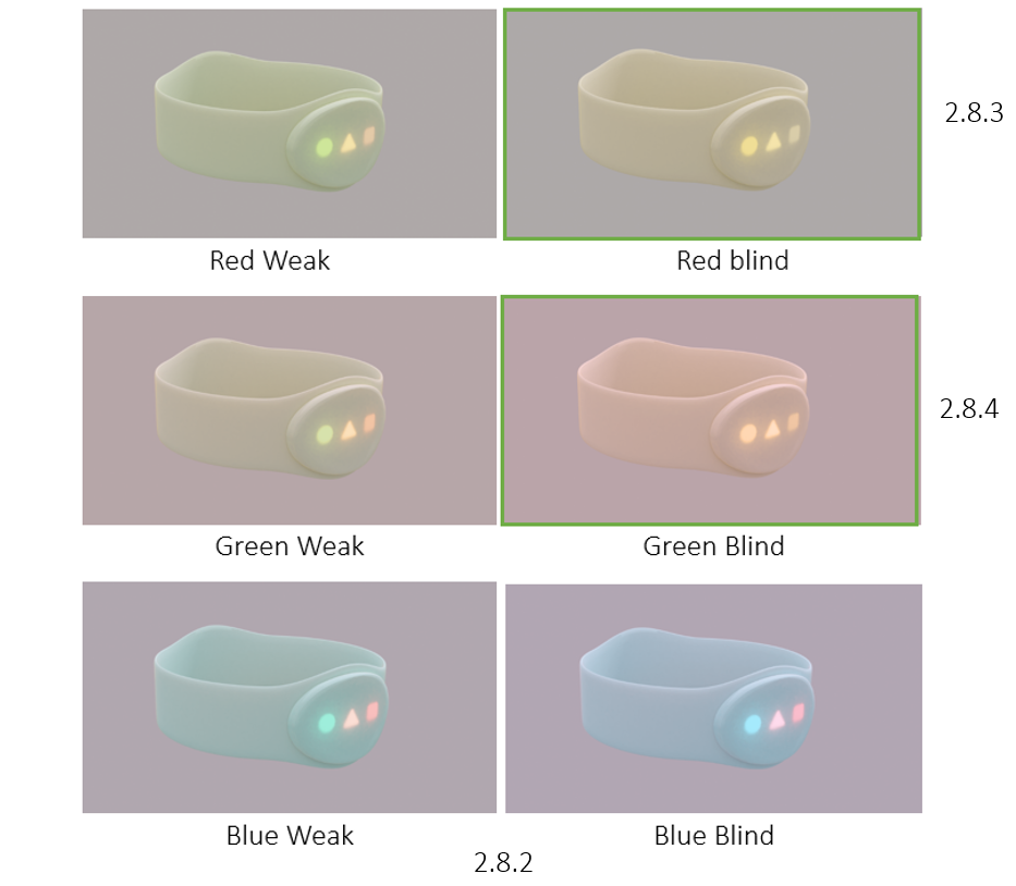
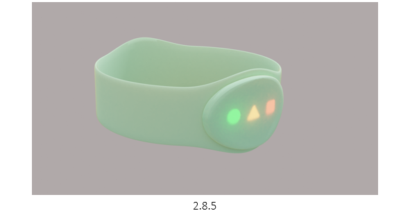
Using this information, I wanted to test how our LED’s showed up for various colour blind people, I used a colour blind simulator color-blindness.com. On there, I was able to add an image of our product and test the variations of colour blindness (2.8.2) and use my original image as reference to see the difference (2.8.5). The results I got was that being red (2.8.3) or green (2.8.4) blind was what made all the colours sync up to look somewhat similar. However, this does prove that the shapes really do help a colour blind person differentiate between the different meanings at a quick glance.

2.9 Brand Name Ideas
As a team, we brain stormed brand names, trying to keep it short, simple, and easy to remember. We came up with names such as: Velo, Torbit, Bondi, Tripsia, Chell. However we didn’t really think any of them linked well enough with our product.
We then decided to try out online generators in hope that we can find some kind of phrase or word that we can develop in out official brand name. The website we used was namelix.com (2.9.1), allowing us to enter key words that we wanted to focus on, making sure its one word and under 6 letters.
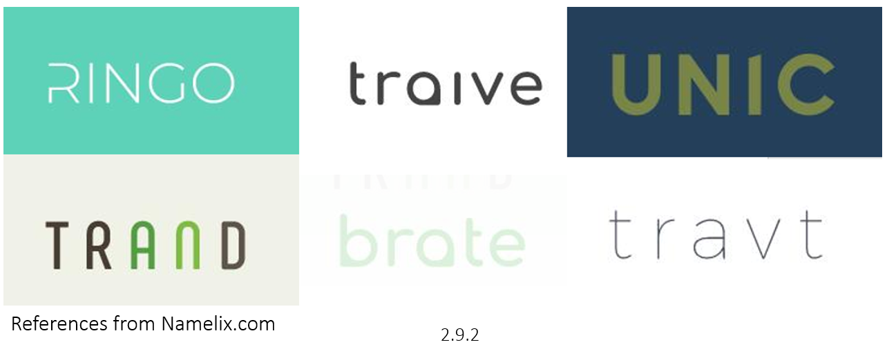
We found some interesting names that we thought linked well with our product (2.9.2). In the end we had a top 3: Unic, Trand, Ringo. We decided to stick with ‘Trand’ as we liked how the word can be split into ‘train’ and ‘band’, therefore having a nice link with our product.
3.0 Logo Design & References
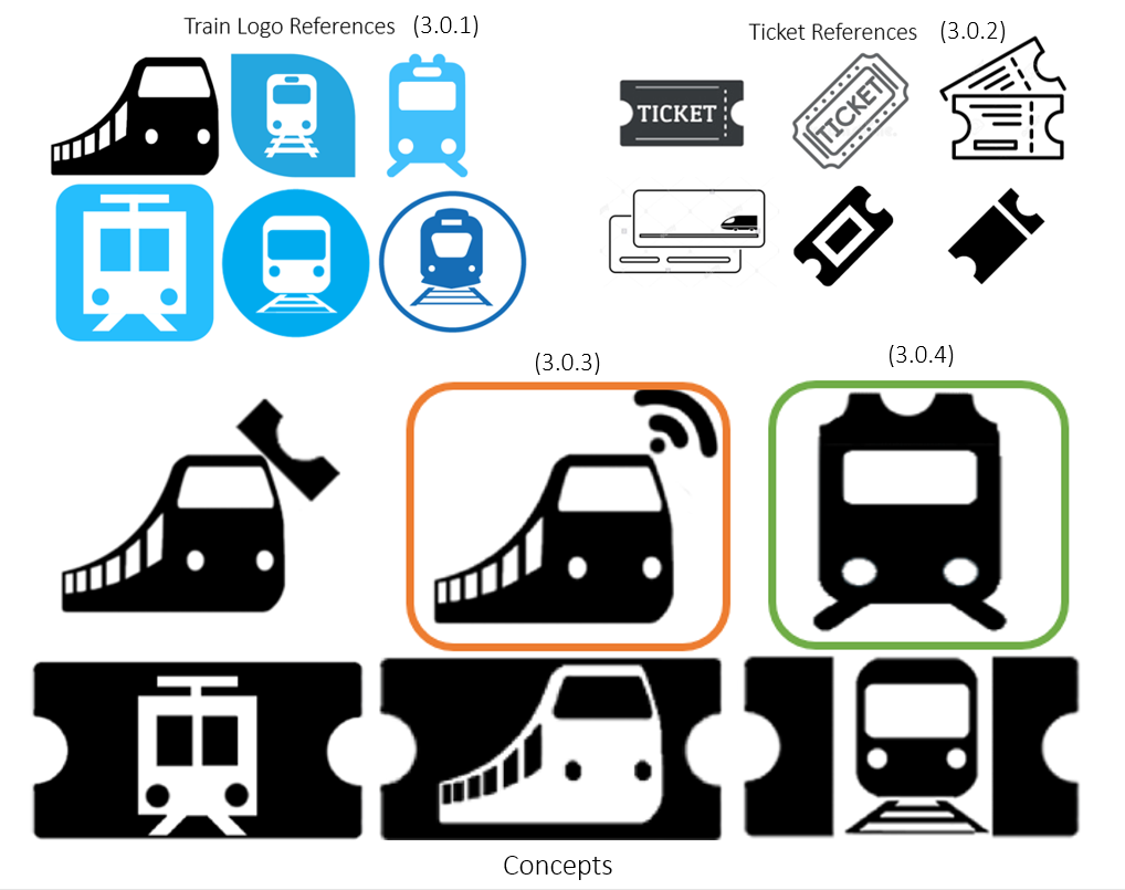
To create the logo, I started by looking for some references to help be create something unique. The references I have picked out were mostly the top results (3.0.1) (3.0.2), meaning that these logos seems to be popular for their simplistic design and recognisable image. Using these logos, I attempted to combine some in various ways, seeing what works and what doesn’t.
I used Photoshop for this process as it makes the process easier due to me being familiar with the program, allowing me to navigate quicker and edit much faster to give rough ideas.
I sent the concepts to my team and we decided to stick with the one highlighted in green (3.0.3) due to the simplicity and unique combination of a ticket and train. We decided not to go with the logo highlighted in orange (3.0.4) due to it potentially being misread to train wifi, not really fitting with the bracelet on the go theme.
3.1 Logo Design & Development
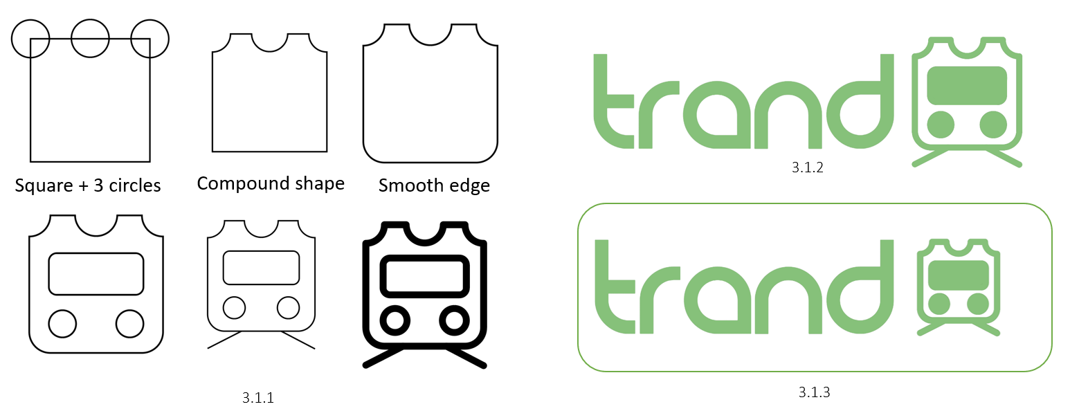
I used Illustrator when creating the logo due to me being able to export it as an SVG into blender later. I started off with a square for the body and added 3 circles to where I want the gaps to be (3.1.1). To make these cuts, I used the Compound Shape option (3.1.1). Later I smoothened the edges and started to add the other shapes requires, keeping them smooth edged as well. Finally, I added the rail track and thickened the strokes by a few pixels (3.1.1).
I also did some quick experimentations with the logo to see if it would look better more open (3.2.2) or more compact (3.1.3), to which I showed my team and agreed on compact due to it being more in line with the logo and how in general it being small.
3.2 Appling Logo
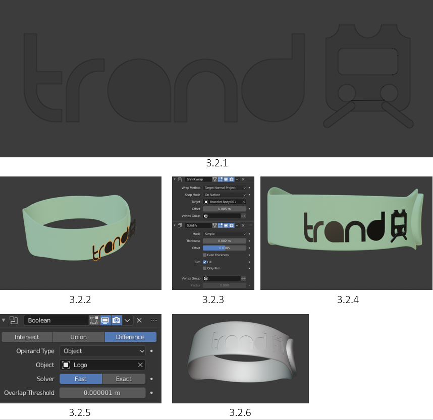
I started by importing the logo from Illustrator to Blender as an SVG, to which I then cleaned up to make it all clear and ready to be applied to the bracelet (3.2.1). I positioned the branded logo over where I wanted the bracelet to be (3.2.2), and applied a shrink wrap modifier (3.2.3), which wrapped the branded logo over the bracelet (3.2.4).
However, I wanted to make an indent to the bracelet as a way of branding our product. To do this, I applied the shrink modifier and extruded the branded logo a few mm into the bracelet (due to the bracelet being to scale). Finally, I applied the Boolean modifier (3.2.5), set to difference, fast, and applied it. This means the few mm I extruded the text and logo within the bracelet has now been carved out! (3.2.6)

3.3 Final Bracelet Preview
I made another render to showcase how the engraved trademark looks like! As you can see (3.3.1), it's not too far in, but it's enough to make the logo and the text visible! (3.3.2)
3.4 Coloured Bracelets
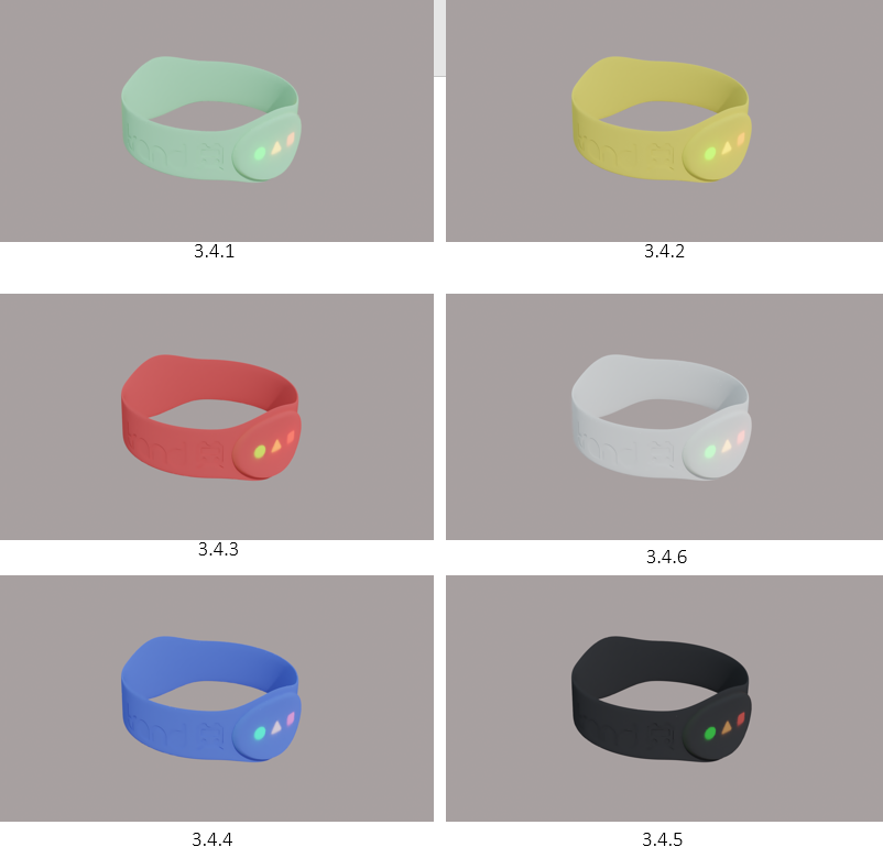
After finishing the bracelet with the original base colour (3.4.1), I talked to my team again to clarify what colour pallet we want or our bracelet, such as pastel, vibrant, eco theme etc. We decided to stick with a semi vibrant colour pallet as we wanted to keep it simple (3.4.2 - 3.4.4), whilst keeping the original base colour to represent our brand, making it “the bracelet where it all started”. We also decided to have a white and black coloured bracelet for anyone who wants to keep a modern look (3.4.5 - 3.4.6), or just in general if they don't like the coloured bracelets.
To change the colours of each bracelet, I simply duplicated the original bracelet material and changed the RGB colours.
3.5 Similar Product Environment
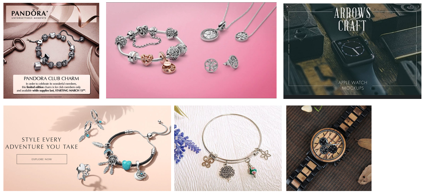
When looking for similar products, I found focused my research on bracelets and watches. I did some research on how these products are displayed within an environment, and how it attracts the audience.
A common theme I found was that the camera display of each product were positioned at 45 to 80 degrees. This gives the product depth whilst having other items to be within the shot to fill in the empty space. However, it seems important to keep the shot minimalistic, as having lots of things could distract the viewer from the main product.
Following minimalism, its also important to make the product the centre of attention. This means making it stand out by having different materials from the environment or simple by adding depth of field, blurring out the extra assets.
3.6 Inside Train References
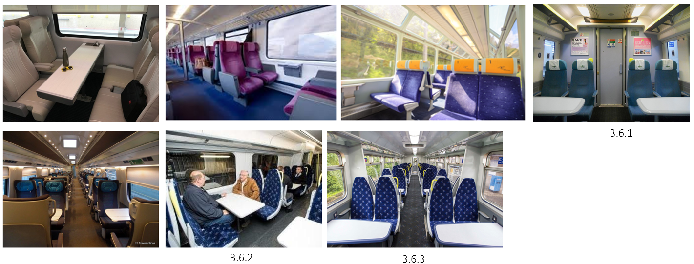
Using google images, I took some references of how the inside of a train looks like, specifically the tables, chairs and window. The best references that helped me were (3.6.1 -3.6.3) as they showed me some good angles and helped me decided on what design I'm going to be focusing on doing.


3.7 Scene Set Up
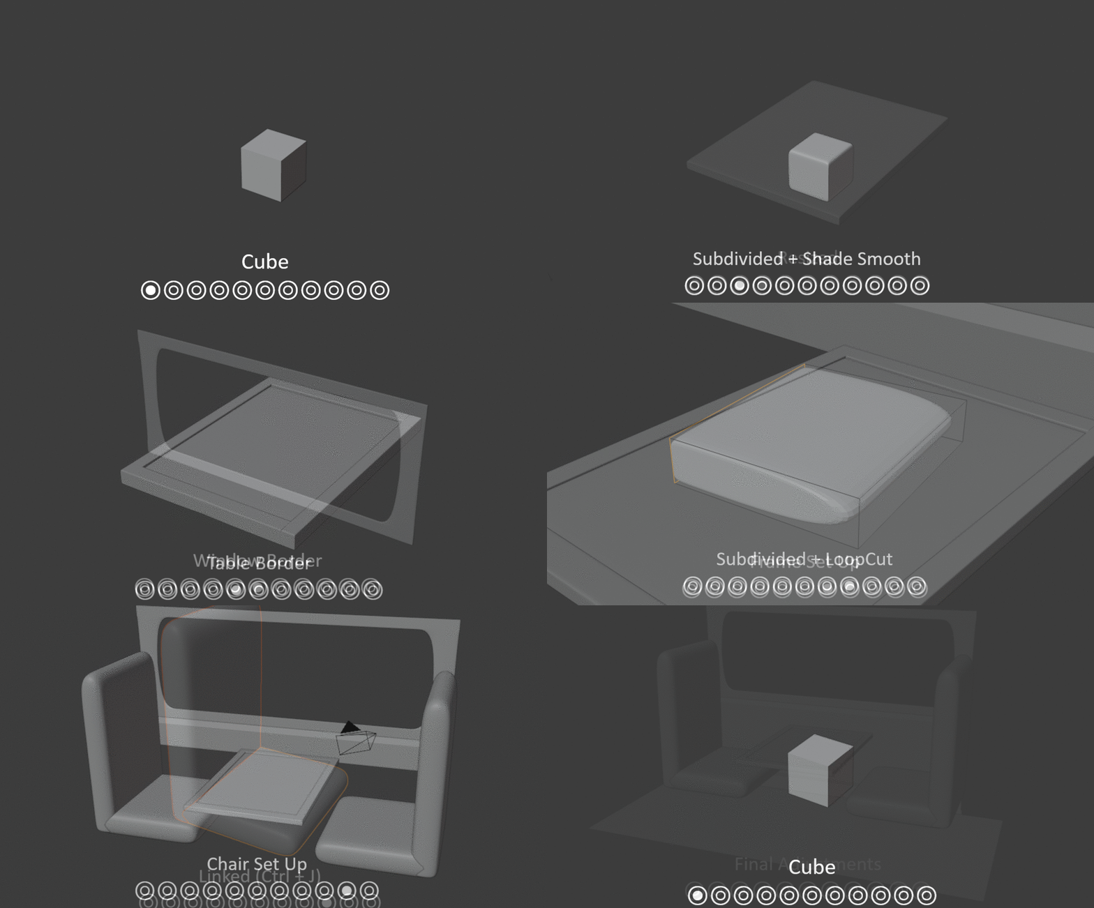
To create the scene set up (3.7.1) I started with the table to give me some scaling to work with. This was done by getting a cube, adding a subdivision modifier, to which I then loop cut from the middle to each edge, creating a smoother cube. I started to resize the cube to create a rectangular table shape, followed by the table borders which were created by extruding the edged faces of the table, and rescaled to fit.
With the table ready, I began making the wall and window frame. The frame was done by creating a flat thin plane, giving it a subdivision modifier, loop cutting 5 times, and pulling down the 2 edges at each end. This made sure there was a smooth curve.
With the table and window frame set up, I made a quick camera frame check to see where I wanted to see the bracelet, and what else would be seen that I will need to fill in. I found that the window frame needed to be extended as a wall, and 2 chairs would be visible from the camera angle.
To create he chairs, I created a thin cube and gave it a subdivision modifier, and look cut it once on only 3 sides, meaning I can pull the loop cut back to create a smooth shape. This is then followed by creating the same object and connecting them together with Ctrl + J to create the chair shape. I didn't focus too much on the chair model as you will only see a small amount of the cushion.
Finally, I made the final adjustments to the scene, extending the train wall going down, added a floor, and made general fixes to some of the models.


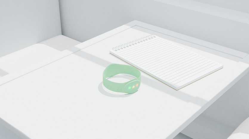

3.8 Notepad Creation
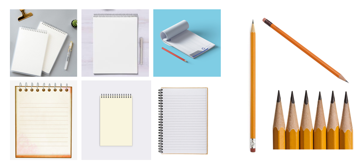
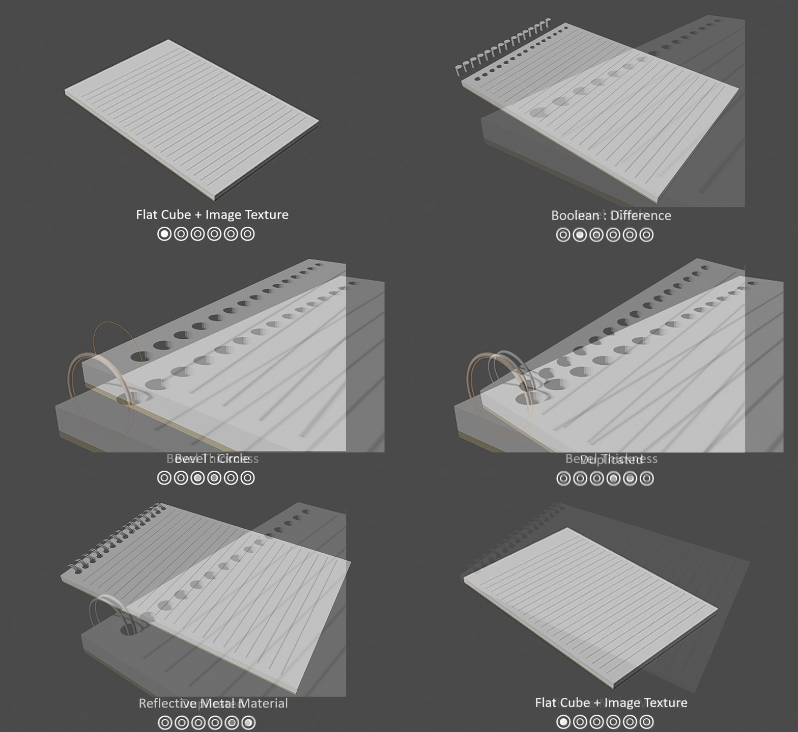
To create the notepad (3.8.1), I started off by flattening a cube to form a note pad shape. To add the lines, I used an image texture node containing note pad lines and connecting to the white notepad material. I wanted the note pad to have a few holes where I can later add the metal rings. To do this, I added a circle, filled, and extruded it to make a cylinder shape to use as hole markers. I duplicated them and positioned them at equal spaces on top of the note pad. Selecting the note pad, I added a Boolean Modifier, set it to difference and applied it with the cylinders, taking the shape of the cylinders and cutting them from the note pad.
When making the metal rings, I used a Bezier circle and added some thickness to it and duplicated it in pairs. Finally, using the Principle BSDF node, I applied a grey colour and increase the metallic strength.
I then added the note pad into the scene to see how it looked, to which I'm satisfied (3.8.2)
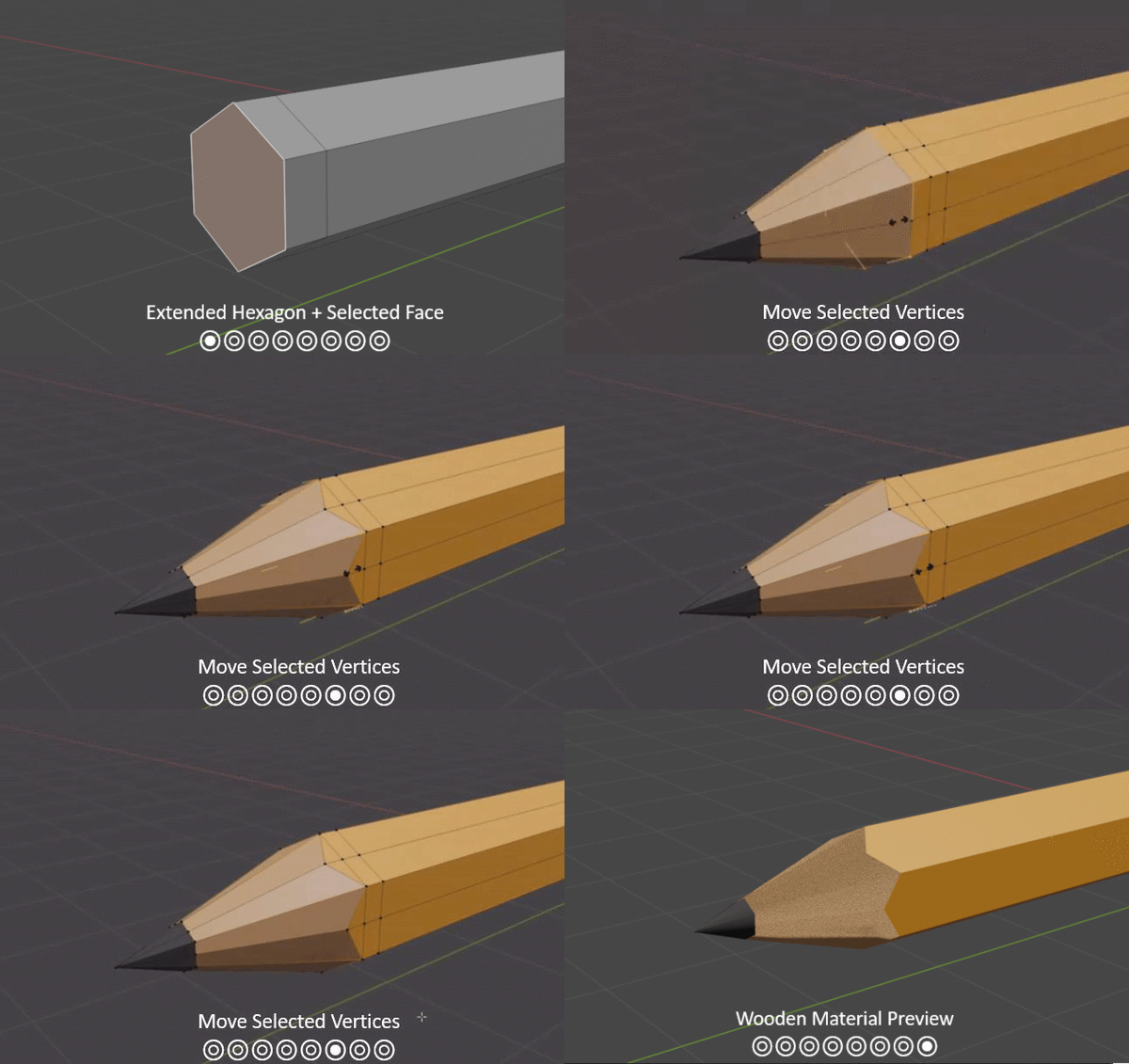

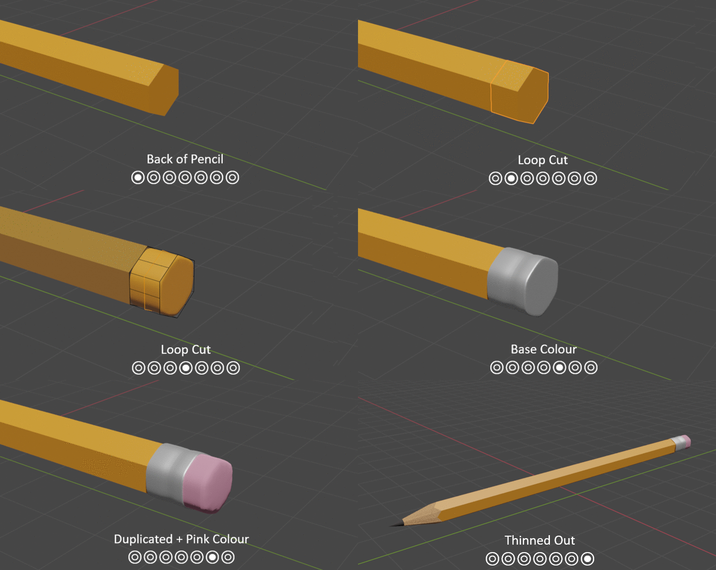

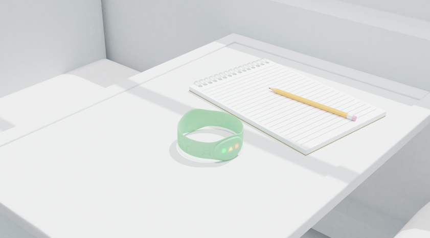

3.9 Pencil Creation
To create the pencil (3.9.3), I started by adding a circle with 6 vertices, making it into a hexagon as this is the most common pencil shape (3.9.1). This was followed by extruding the shape and scaling it to create the pencil shape. I began with selecting the face, extruding it and scaling all the vertices at centre, creating a single point. I then extended the point to an appropriate length to make the pencil tip, and made a loop cut just over halfway for the led. To add some better understanding of the shape, I added some base colours, going with a simple orang/yellow colour for the pencil. The best way for me to add the zigzag at the end of the pencil was to loop cut the end base 3 times and move the first row of vertices back until it reached the others, keeping it symmetrical.
The next step was to give the pencil a wooden material, making it more photo realistic. This was done by using the Musgrave texture node, followed by a displacement modifier to help scale the texture scattering and control the amount of detail.
(3.9.2) Moving onto the rubber, I created a loop cut, subdivided it and applied another loop cut to extend it to a flat surface. This was followed by another loop cut to make a crease in it and finally giving it a metallic material by increasing the metallic strength on the principle BSFD node. I then duplicated the flat edge, and simply rescaled it whilst creating a new material that has no reflection (lowering the specular).
Adding the pencil to the scene on top of the note pad, I am satisfied with the outcome! (3.9.3)

4.0.1
4.0.2
4.0.3
4.0.4
4.0.5
4.0 Coffee Cup Creation
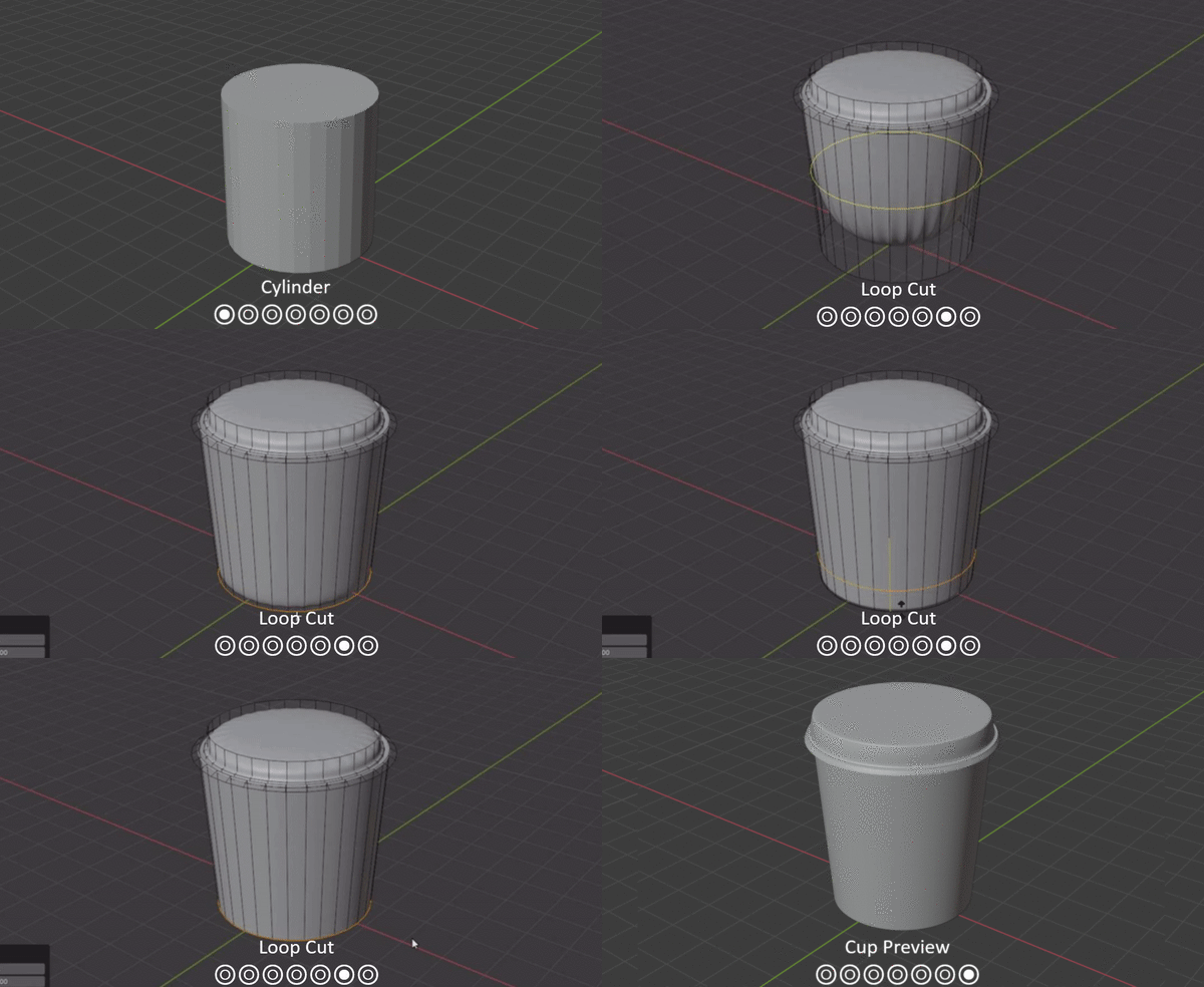
I gathered a mood board of various coffee cups and lids to see what I liked and what would be the best way for me to create this (4.0.1).
(4.0.2) The cup was defiantly interesting to make due to the way the lid is done, but I loved outcome! I started with a large cylinder and selected the top face, and widened it up, creating a more cup shape. I then went into edge select mode, grabbed all the edged on the top part of the cup (Alt + shift + click) and began extruding the lid, following the lid reference s (4.0.1). To give the cup a more detailed and smoother look, I applied a subdivision modifier and begin loop cutting various faces, created much more smoother edges.
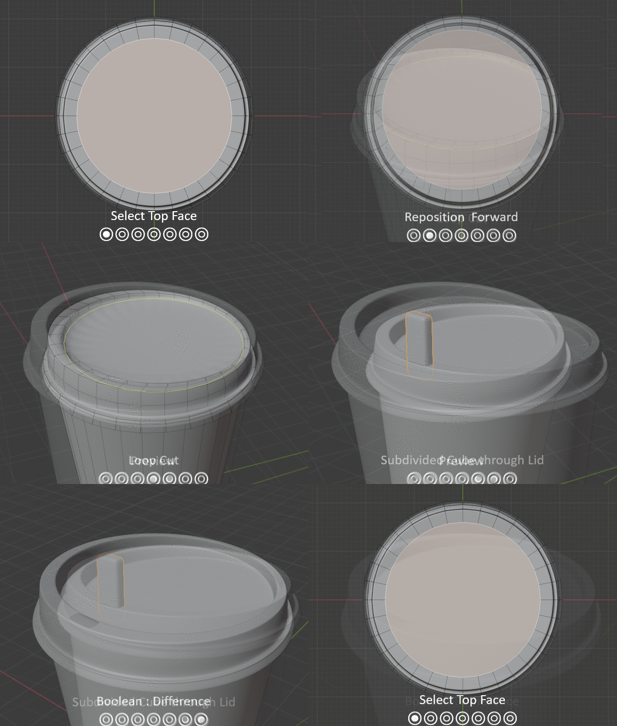
(4.0.3) To finalise the lid, I started by selecting the top face, extrude and descale to make a smaller circle, to which I repositioned close to an edge to later make the cup hole. Since the cub has been subdivided, I moved the circle face down and made a loop cut to remove the any bad smooth shading areas. Finally, to make the hole, I created a subdivided rectangle and positioned it into the cup, and applied a Boolean difference modifier.
(4.0.3) To finalise the lid, I started by selecting the top face, extrude and descale to make a smaller circle, to which I repositioned close to an edge to later make the cup hole. Since the cub has been subdivided, I moved the circle face down and made a loop cut to remove the any bad smooth shading areas. Finally, to make the hole, I created a subdivided rectangle and positioned it into the cup, and applied a Boolean difference modifier.
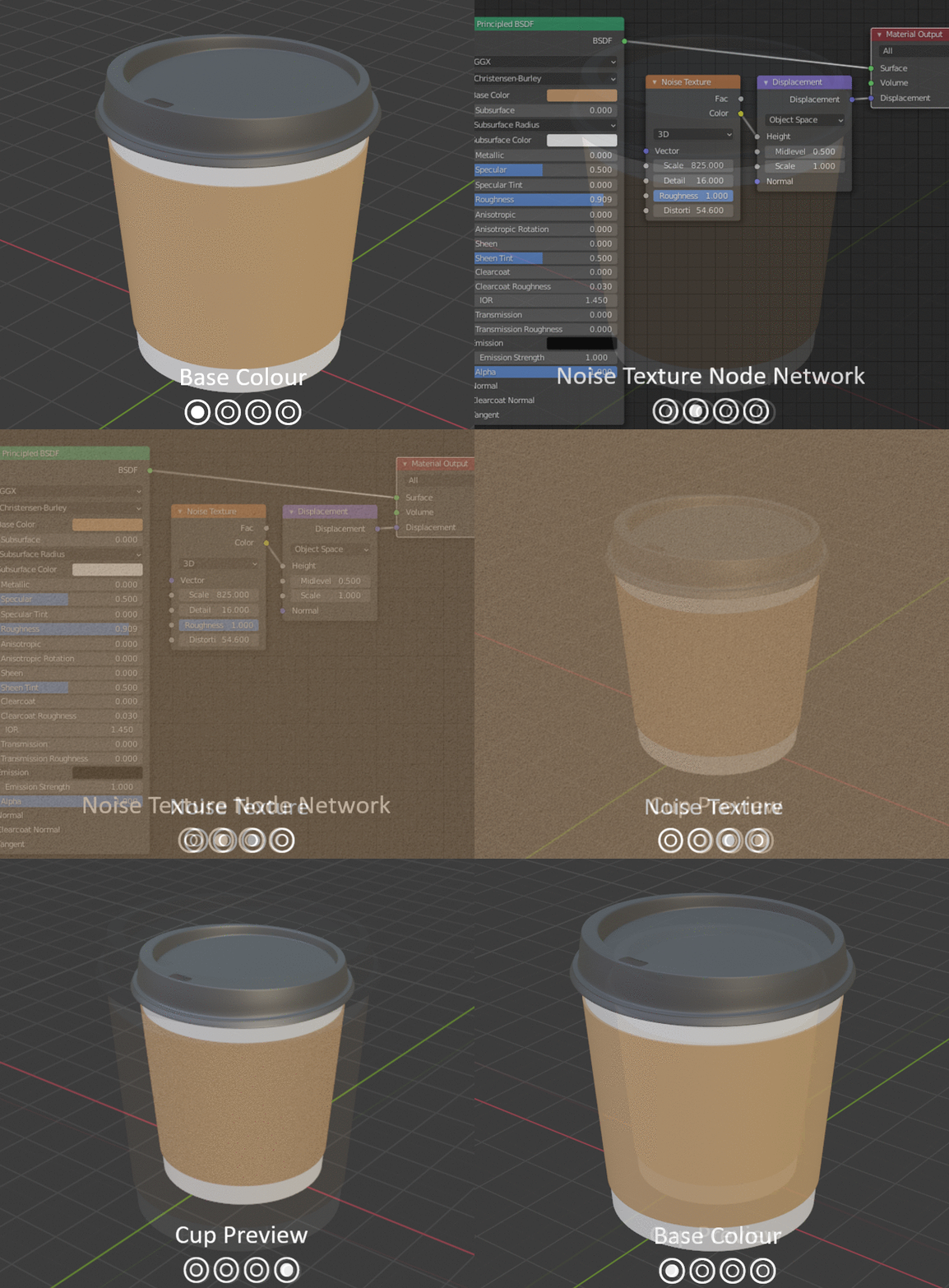
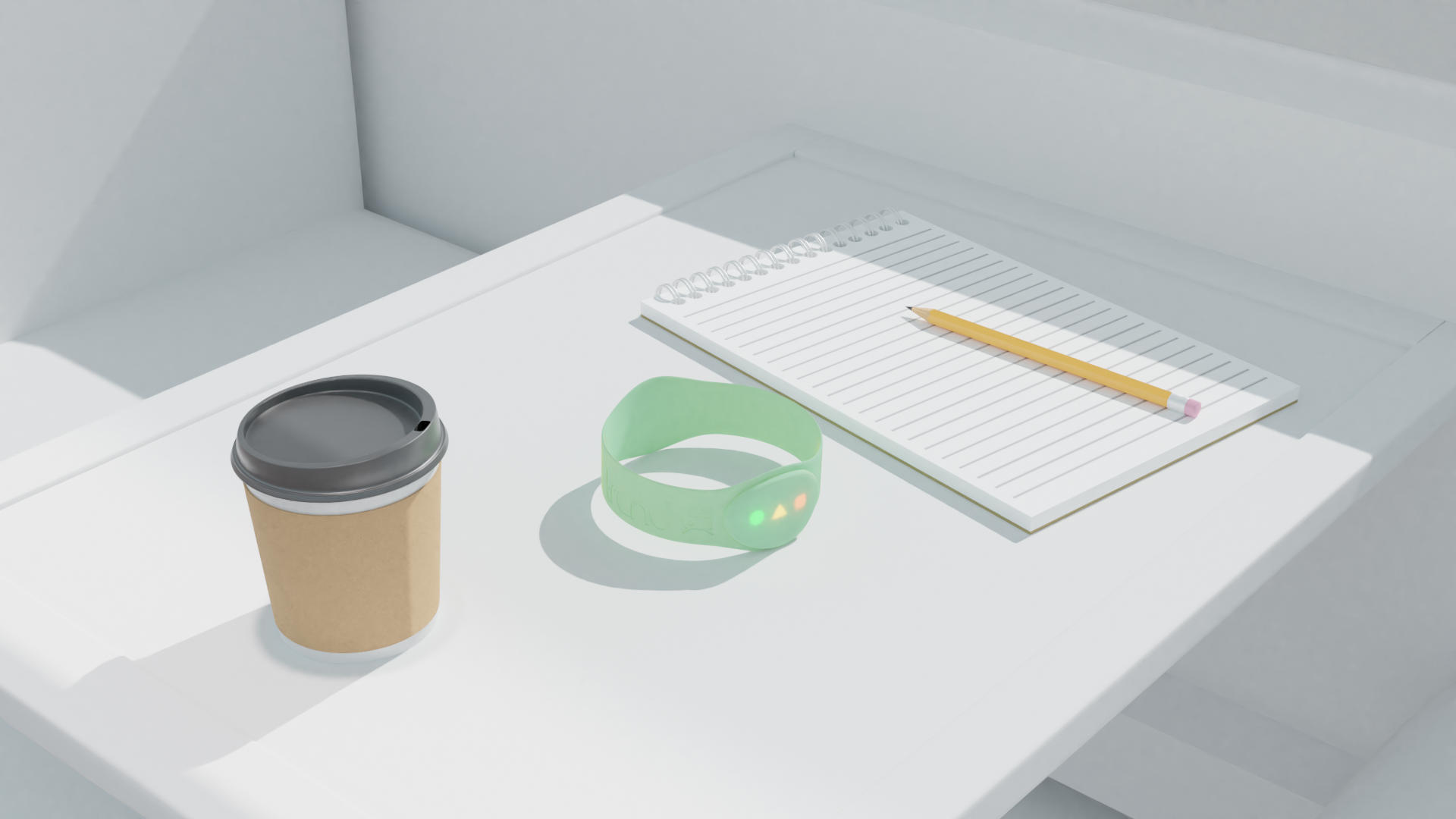
(4.0.5) I placed the coffee cup into my scene, and was satisfied with the results!
4.1 Scene Alteration - Lighting
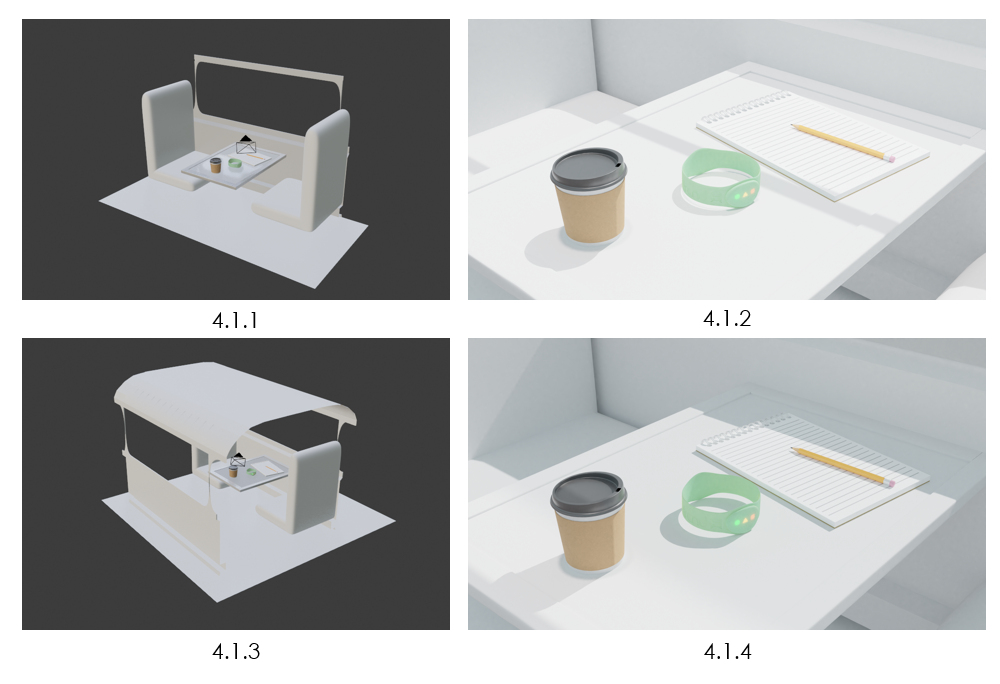
Whilst observing the scene setup (4.1.1), I noticed that the light was not focused from the window, but was coming in from all angles (4.1.2). To fix this issue, I decided to duplicate the walls and add a roof over the scene (4.1.3). With this in place, I repositioned the sun light to aim towards the window frame (4.1.4), giving a similar effect as before, but is not more realistic to a real scene.
4.2.5
4.2 Scene Development
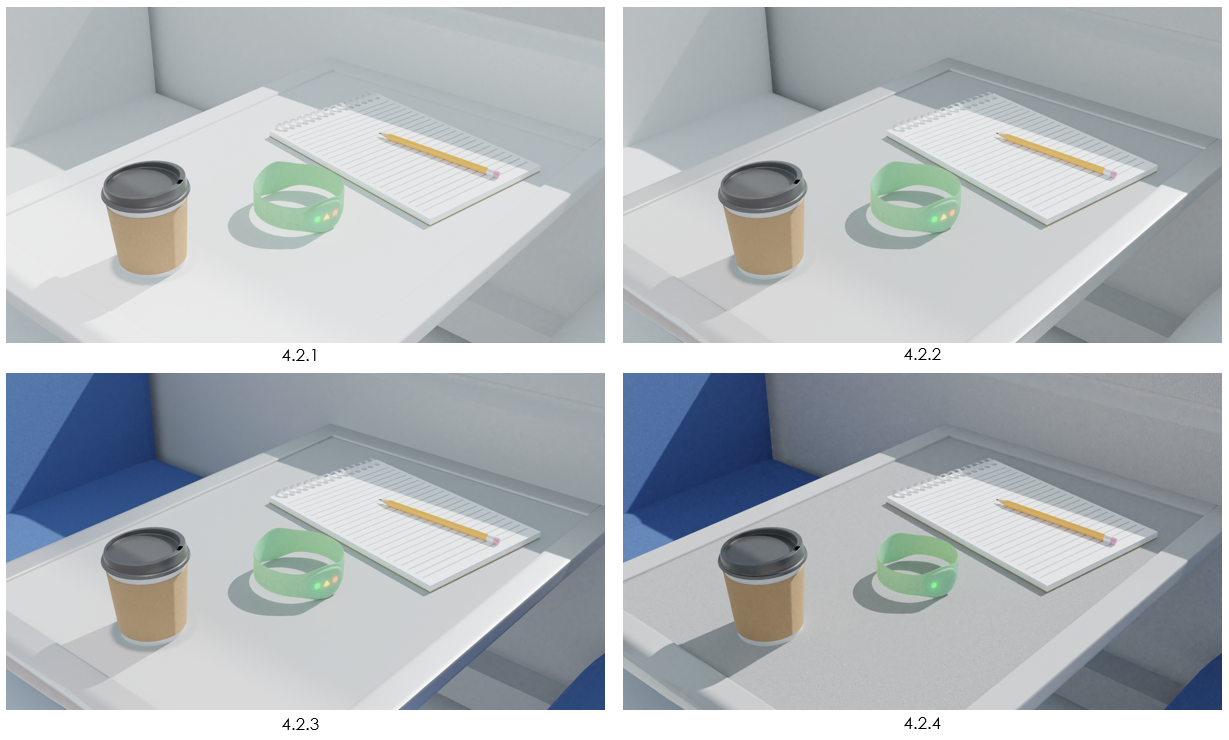
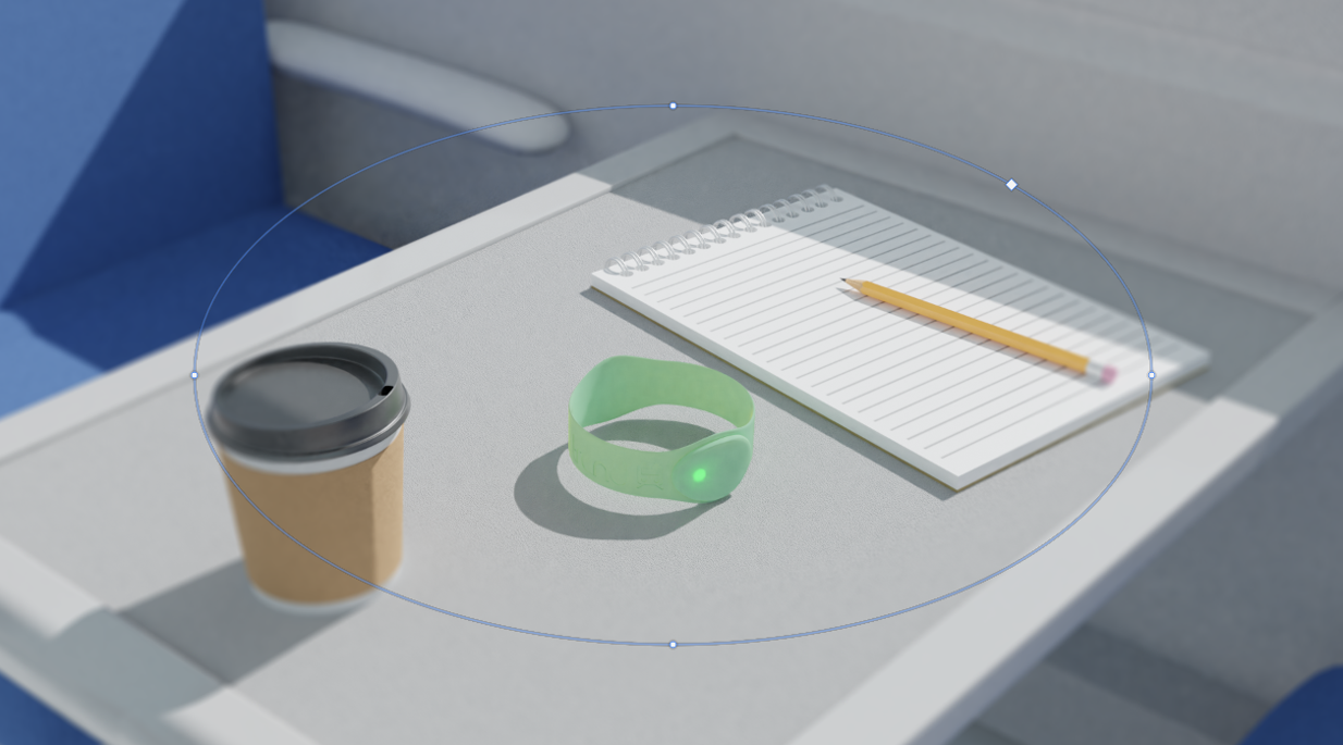
As all the assets were in place, it was time to add some materials to the scene. I started with the table (4.2.1), giving it a grey colour with an increased specular to give off some shine from the sun. The table border received a similar material (4.2.2), but with a light shade of grey. The chairs were giving a blue colour because it’s a common colour to have in trains, whilst also adding a detailed noise material to give it some texture. For the final adjustment, I turned off the emission of the 2 LEDs within the bracelet (4.2.4), as the actual product will only use 1 LED at a time, to which in this case meaning their stop is about to arrive.
Although the scene was complete, I wanted to add some depth to the image. For this, I used Photoshop’s radial blur filter (4.2.5), allowing me control what is blurred and by how much!
4.3 Final Render
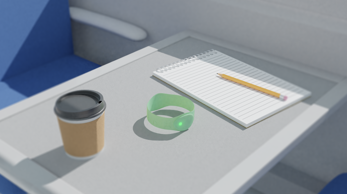
Overall, I am very proud of this environment! I’ve learned so many new things, such as material making, texturing, complex shape building and what elements are required to create a great environment scene!
Although this is just a final render of an environment for our product, I will be using this scene to create a mock-up, displaying it as a still rendered advertisement!
To see how I use this scene, create new assets and create the other 2 still render advertisement mock ups, Please Click Here