3 Still Render Advertisements
Brief
Advertise your product within an environment, and apply to a various mock-up
Goal
Create 3 different environments & Personas for the bracelet, and apply the renders to advertisement mock-ups
Role in Project
3D Artist
Designer
Software
Blender 2.90
Photoshop
Concept #1
Instagram Post
1.0 MoodBoard & Selected Persona
1.1 Earphone Body
1.2 Earphone Buds
1.3 Mesh
1.4 Air Pods Lighting
1.5 Scene Set Up
1.6 Phone Creation
1.7 Phone Preview
1.8 Render Preview
1.9 Photoshopped & Mock Up
Concept #2
Train Poster
2.0 Concept #2 - Train Poster
Turnip & Leaves
2.1 Persona
2.2 Workflow
2.3 Mock-Up Creation
2.4 Final Mock-Up
Concept #3
Magazine Cover
2.5 Concept #3 - Magazine Cover
2.6 Persona
2.7 Render Blur Set Up
2.8 Mock-Up Creation
2.9 Final Mock-Up
Conclusion
3.0 Conclusion
Concept #1 - Instagram Post
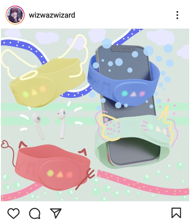
This concept was aimed towards the younger audience, using the various coloured bracelets I made, a photo photorealistic phone, and some earphones! This render was also later put into photoshop to add some fun artwork, in hope that the target persona would be interested if they saw this on Instagram!
1.0 MoodBoard & Selected Persona
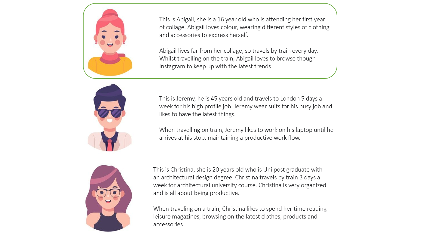
My first render is targeted towards Abigail, a 16-year-old who loves colour, wearing different styles of clothing and accessories to express herself. My only and first thought in how to show an ad to a 16-year-old is though mobile advertisements, due to most people her age have a mobile phone that they use for social media. When it comes to social media, Instagram is well known to be used by the younger generation, to which made me decide to create an Instagram post.
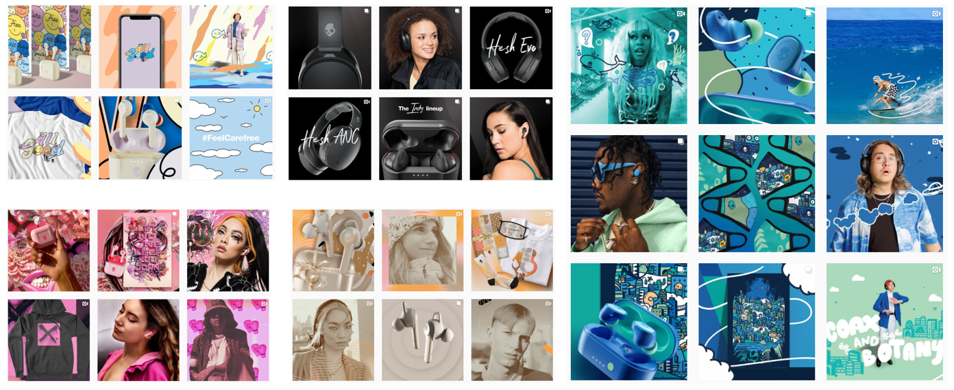
To get some visual intake from what makes an Instagram post/ad look attractable, I went onto the Instagram app (surprise surprise)! I found a brand called Skull Candy, a well-known headphones company that appeals to a large target audience. Their Instagram page seems to have sections in different styles to show how their product appeals to all audiences. I also noticed that they use a lot of art work over their product to help express the environment and look of the product, whilst keeping to a colour pallet. Finally, their products are shown in various compositions, such as being in the air, on someone, on the table etc. With all this knowledge, I will attempt to use their strategies to create my own Instagram post!
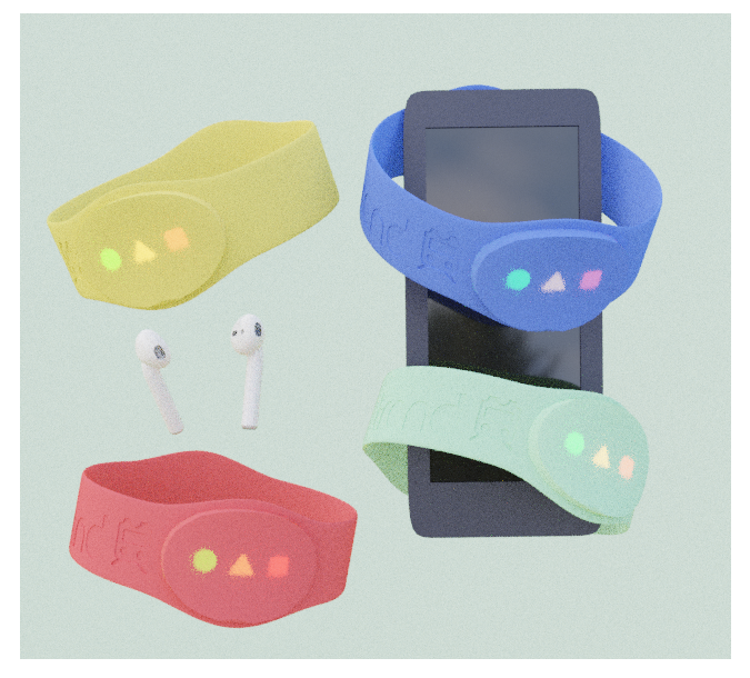
The idea I came up with was to have some coloured bracelets floating in the ear, have a mobile phone and a pair of air pods in the scene to show that our product is ‘the item’ that you need to carry with you. The air pods and phone will be there to help emphasis that the user has air pods, and a phone, but not the Trand Bracelet. This will be followed by an artistic approach to help give the post a bit more life!
1.1 Earphone Body
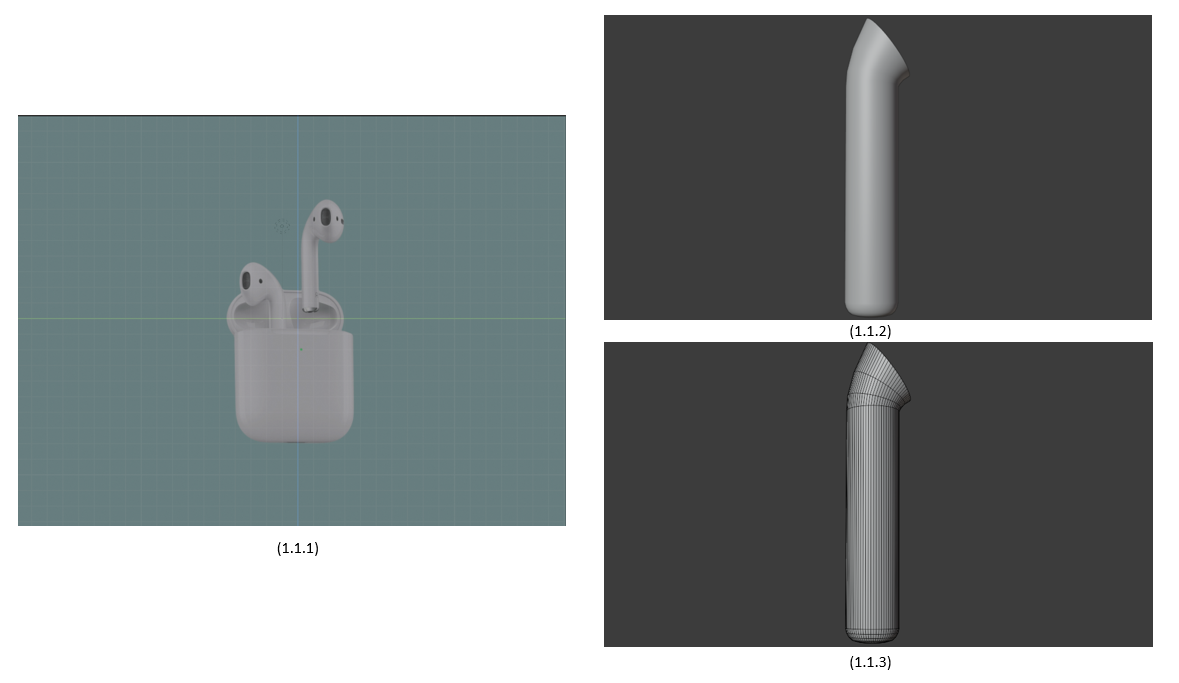
I imported an image of air pods (1.1.1) that display the product in a clear way. This allowed me to trace the product, aligning my meshes around the air pods to build within an equal scale. I imported a circle with 64 vertices aligned it to the image, and began extruding. As I reached the top, I selected the face and began rotating to create a bend (1.1.2) (1.1.3).
1.2 Earphone Buds
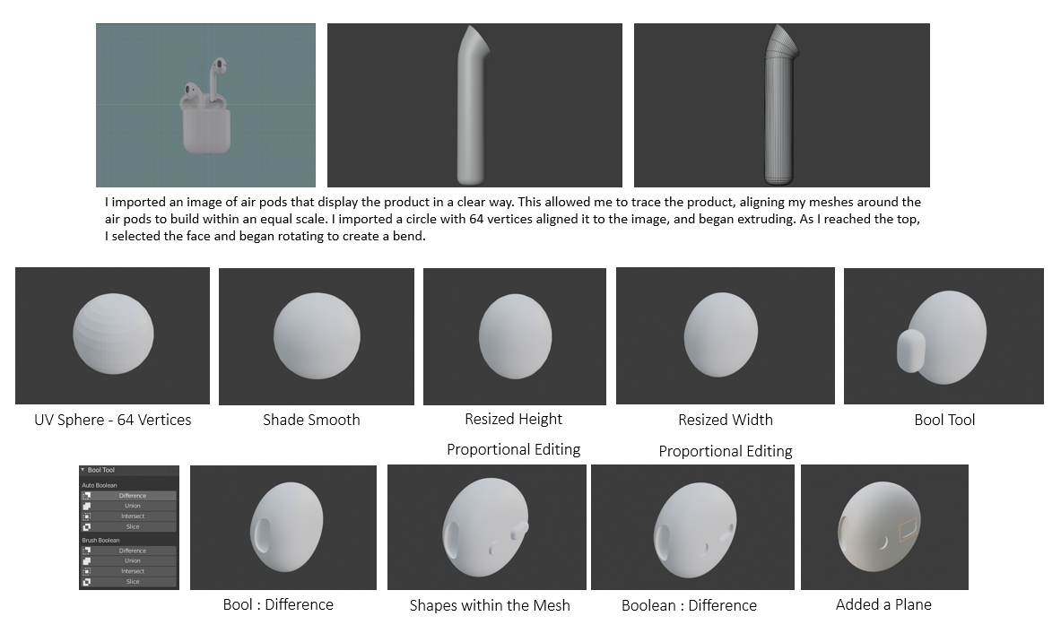
To make the air pod, I started with a UV sphere at 64 vertices, allowing for smoother modelling.
I shaded it smooth and began resizing it to match the air pod. Proportional editing was the main
tool used to alter the shape of the air pod, allowing me to stretch and flatten areas without
distorting the shape.
Once I was happy with the air pod shape, I moved onto the mesh (where the music plays from). Due to the
unique shape of the air pods, I decided to use the Bool Tool. This tool allowed me to make a gap within
the air pods without distorting the shape. I created a subdivided cube with loop cuts that resembled the
mesh and selected the 2 shapes, and applying ‘Difference’ within the Bool Tool editing tab. This tool is
an addon you can add by going to Edit > Preferences > Add-ons and search “Bool Tool”.

1.3 Mesh
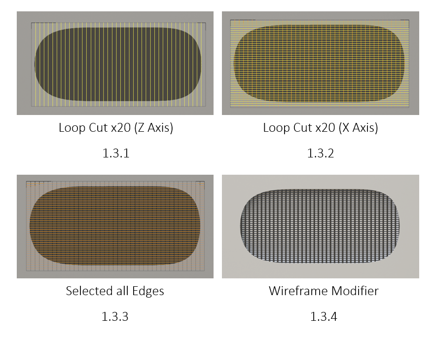
To create the meshes inside the air pods, I started off with a plane and loop cut it both sided by 20 (1.3.1 – 1.3.2). This is followed selecting all the edges (1.3.3) and add a wireframe modifier (1.3.4)!
This Is a really cool and simple way of making meshes, and it works out great (1.3.5)!
1.4 Air Pods Lighting
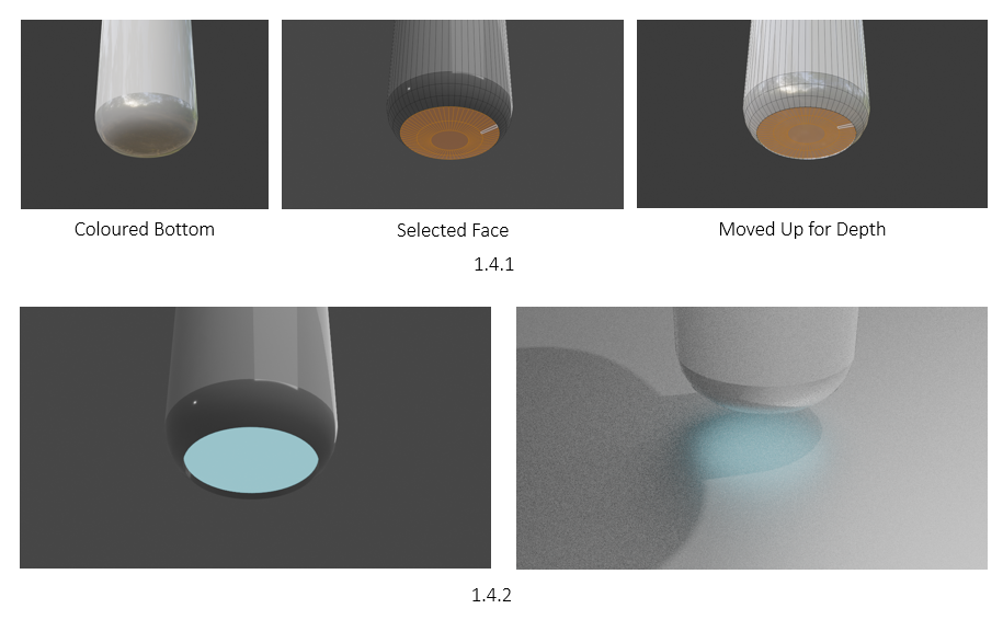
For the base material, I simply decreased the roughness strength to get a nice reflective plastic look. To create the glow at the bottom of the air pods, I started by selecting the faces and assigning a new material set to a grey (1.4.1). I then selected the bottom faces of the air pods and moved then up slightly to create an indent (1.4.1). Finally, I selected the indented faces and assigned a new material as a blue emission set to a small strength, creating subtle glow (1.4.2).
1.5 Scene Set Up
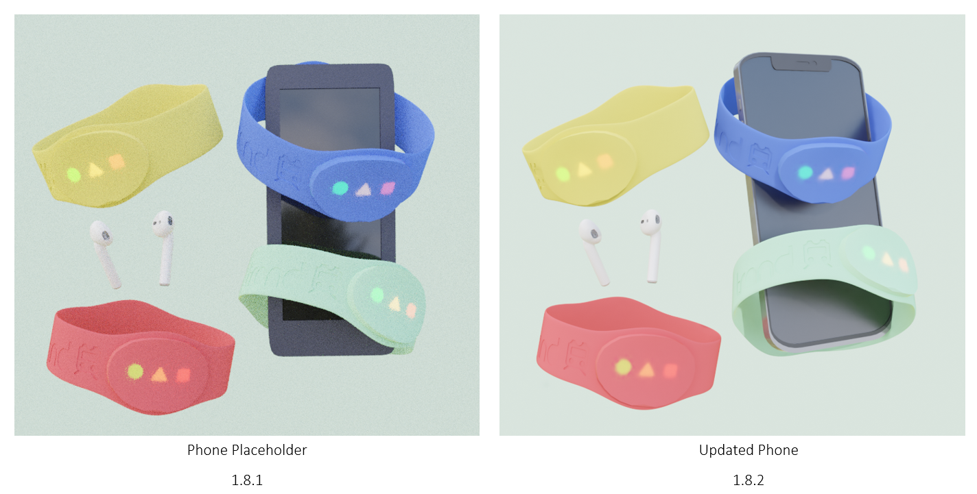
With the air pods created, I set up my scene with 4 coloured bracelets, the finished air pods, and a placeholder phone model. When looking at the scene set up, I was even more satisfied that I made the air pods to go with the bracelets, as its fills in the empty air whilst not adding too much! My next step is to create the phone to replace the placeholder one.
1.6 Phone Creation
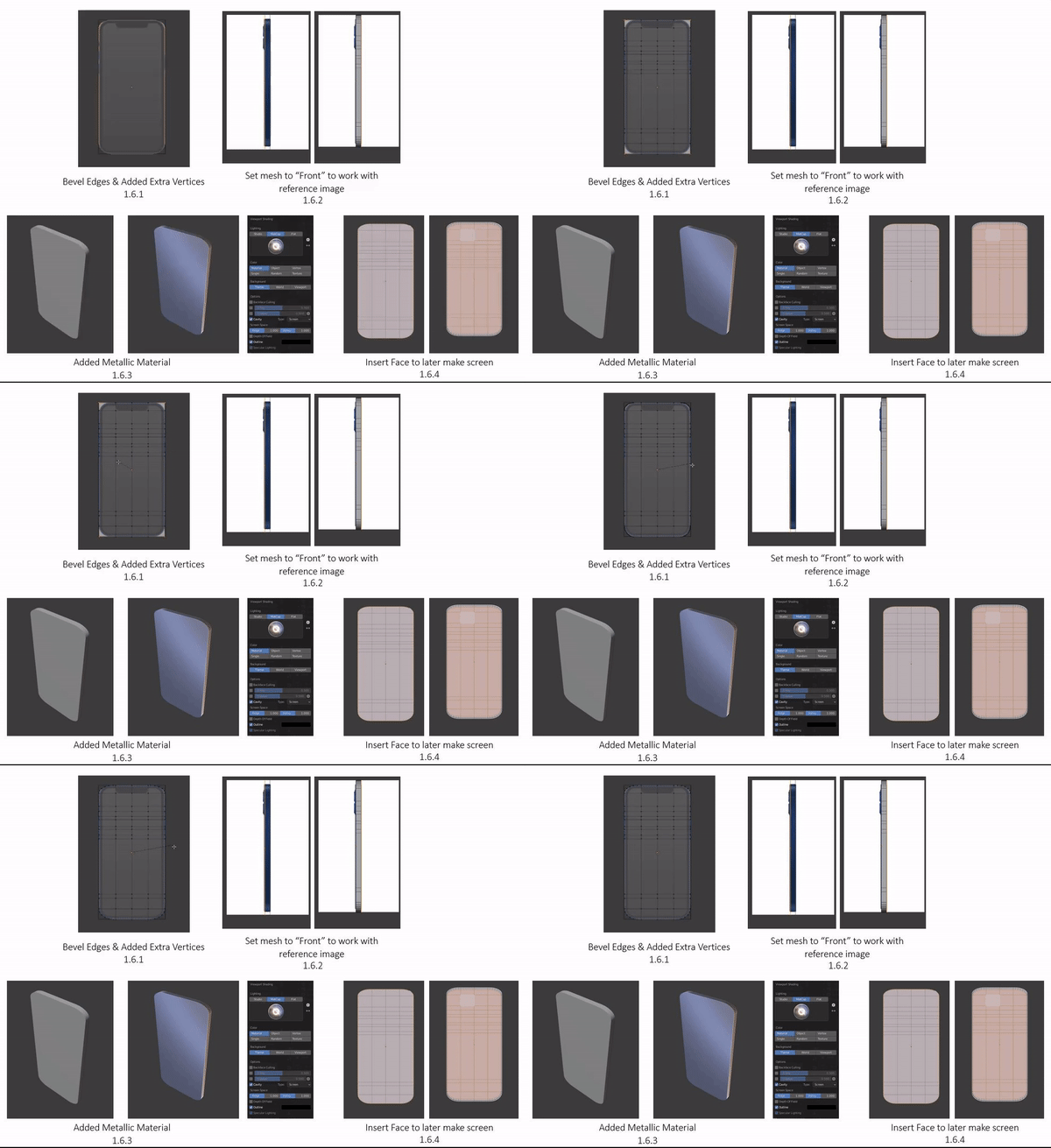
I started by taking some images of an iPhone from the internet to use as reference, but later decided to import them to blender as I can build the phone to scale. I started to make the basic shape of the phone, loop cutting where there would be any buttons or cuts (1.6.1), later bevelling the edges with extra vertices. I also imported a side view of the same iPhone, and set my mesh to front view from both sides, allowing me to work with my mesh, whilst the image is in the background being transparent (1.6.2).
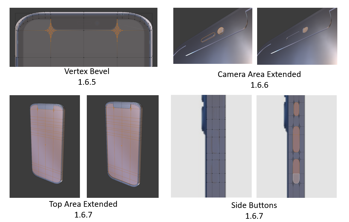
The phone was given a metallic material due to the iPhone having a metallic & plastic surface that’s filled with reflection (1.6.3). To begin making the screen, I inserted the front face of the phone (1.6.4), keeping it to scale with the reference. Vertex bevelling was very useful when creating the camera section (1.6.5), allowing me to create smooth curves. With the face template of the phone done, I selected the faces and moved it backwards, whilst extruding the camera and audio parts forward (1.6.6) (1.6.7). Using vertex bevel, I selected the faces where the buttons were located and smoothed out the edges and extruded them (1.6.7).
1.7.1
1.7 Phone Preview
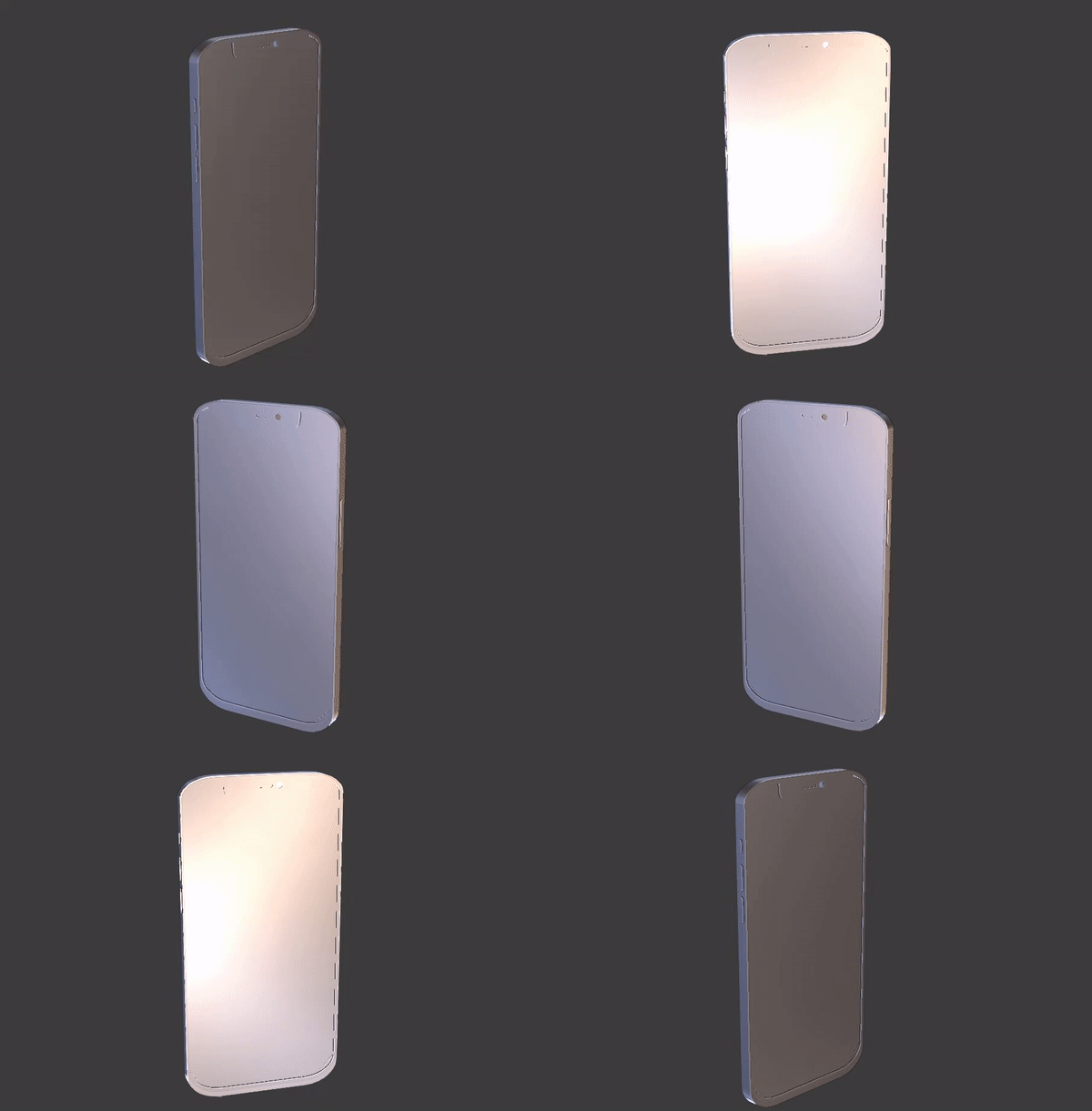
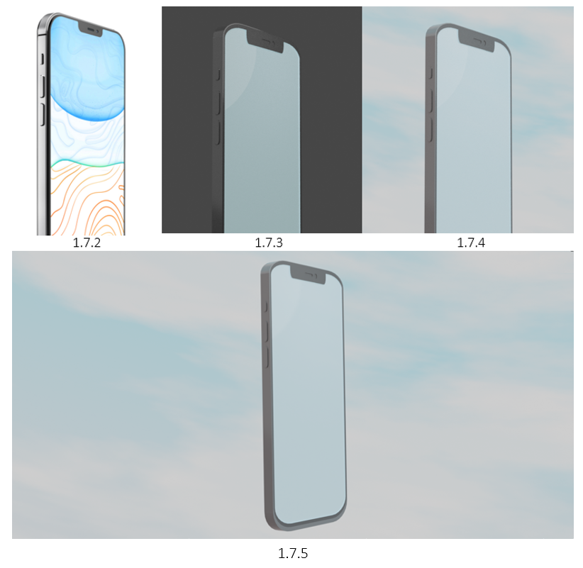
With the phone shape done (1.7.1) I began adding the base colours. Using the iPhone reference (1.7.2) for reflection, I altered the materials roughness and specular to get the most realistic shine (1.7.3 – 1.7.4).
I’m pretty proud of how the phone turned out, having a nice shine to it, whilst resembling a black iPhone to scale (1.7.5)!
1.8 Render Preview
On the left is the old scene set up with the placeholder phone (1.8.1), and on the right is the scene with the updated photorealistic iPhone model (1.8.2)! I think the phone works very well with the scene, having a nice reflective surface whilst wrapped by the bracelets (1.8.2)!

1.9 Photoshoped & Mock Up
As the finishing touch, I used Photoshop to incorporate some artwork to the scene! I tried my best to involve all the assets as much as I can, giving them characters, personality and a theme! This is followed by some background patterns and waves to fill in the empty space.
Overall, I think this Instagram post of our product hits our targeted audience on point! Following my personas interested about wanting to express themselves, I think that the bracelets have their own identity has a very nice connection with the product and the viewer! The use of bright colours was also a priority as I wanted to make our product seem fun and the next cool thing that you need! I do think that the Instagram pose is very engaging due to so much happening, yet cleaning enough to see that our product is the main advertisement.
2.0 Concept #2 - Train Poster
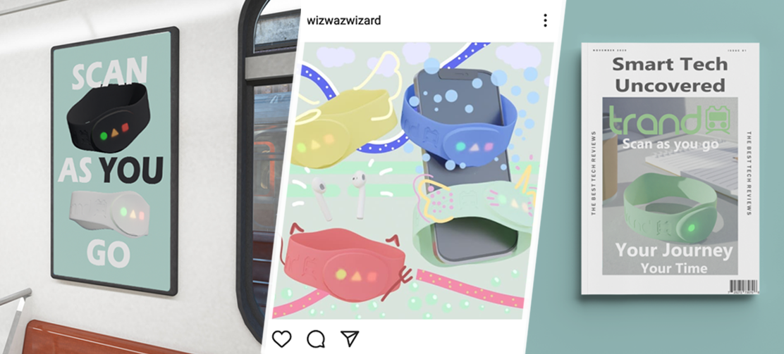
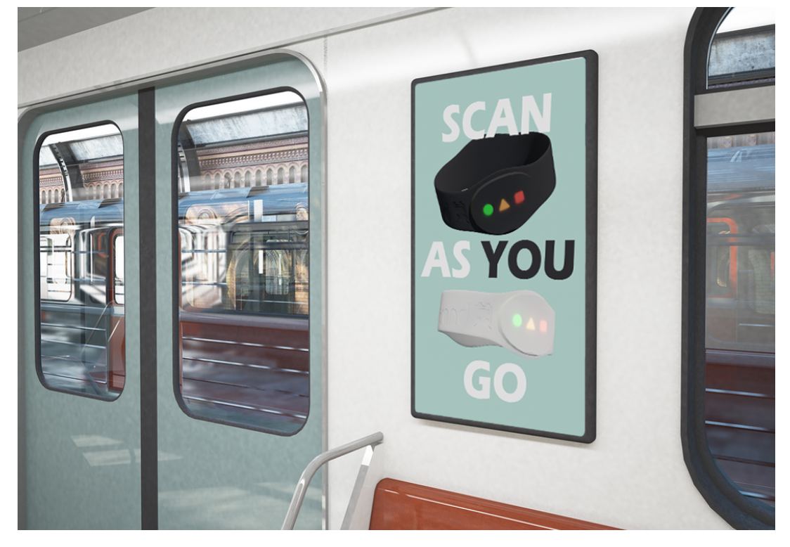
This is my second concept of a still render advertisement, a train poster! The idea for this concept was to use the black and white bracelets and position them in the air, whilst making sure the product is properly shown and can be recognised as our brand name Trand. This concept includes a black and white bracelet floating in the air, with the slogan “Scan as you Go”, emphasising that it’s an easy-to-use kind of product and could be worth acknowledging for a few seconds that would make someone check it out later on.

2.1 Persona
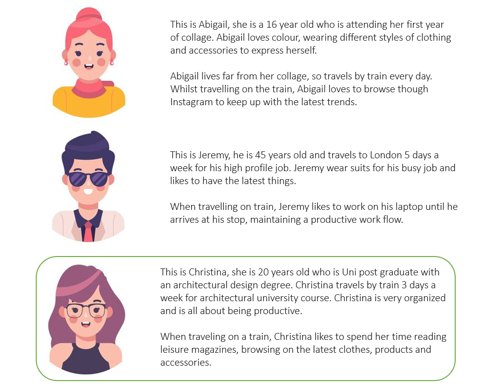
My persona for this concept is Jeremy, a 45-year-old who travels to London 5 days a week for his high-profile busy job. What’s interesting about Jeremy is that he doesn’t sit on his phone when on the train, but maintains productive on his laptop whilst traveling to London. This means I cannot simply make an Instagram ad or add an image onto a magazine cover since he is a focused man who loves productivity. My goal for this persona was to create a form of advertisement that someone who is busy as Jeremy will notice it and create some kind of engagement.
My idea for this was to apply a poster within the train near the doors, meaning there will always be room for a glance or two since he is either about to leave, or about getting on board.
2.2 Workflow
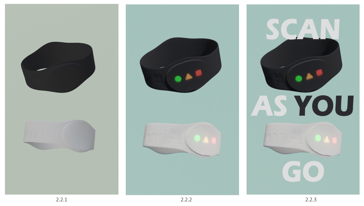
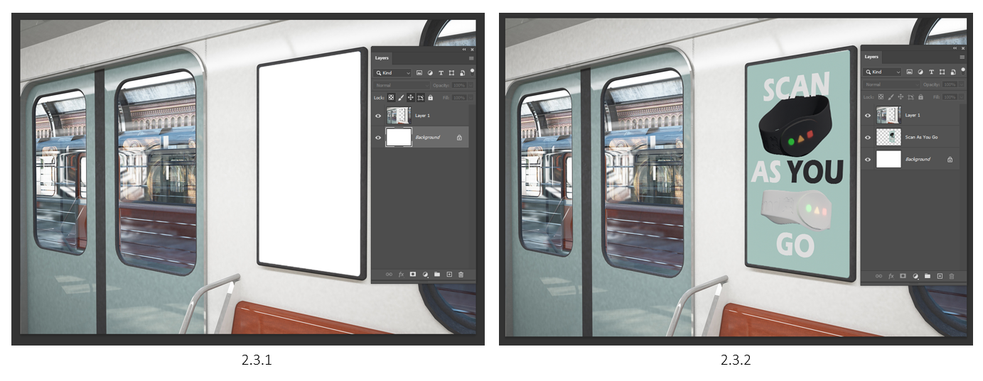
I started by positioning the 2 bracelets in the air (2.2.1), making sure their rotation was displaying the brand name and the LEDs. The white bracelet was the main way of getting the name Trand due to the rotation, whilst the black bracelet shows a more different angle to show off the form of the bracelet. I altered the background colours to a soft blue as the colour is often seen as a sign of stability and reliability (2.2.2), something we want our audience to see within our product.
Finally, using Photoshop, I added the slogan using the Arial Black font, making sure it stood out and filled the space (2.2.3). With the main text being white, I believe making the word ‘You’ in black makes it more impactful and directed towards the viewer (2.2.3).
2.3 Mock-Up Creation
I found a free to use train image, so I used it for these concepts mock up! I applied my poster to the available space and was very happy with the outcome (2.3.1 – 2.3.2)! I think this mock-up shows the perfect example in how I wanted to advertise the poster, right next to the doors as you come in, and out (2.3.2)!

2.4 Final Mock-Up
Overall, I am happy with how my mini environment is displayed within the mock-up, showing exactly what I intended to do! I think really works with my persona Jeremy, too busy to look on social media to read a magazine, but never too busy when getting on and off the train.
The only thing I would improve with these forms of advertisements is that I could have added a AR code, allowing the user to make a quick photo or camera scan and get on with their day!
2.5 Concept #3 - Magazine Cover
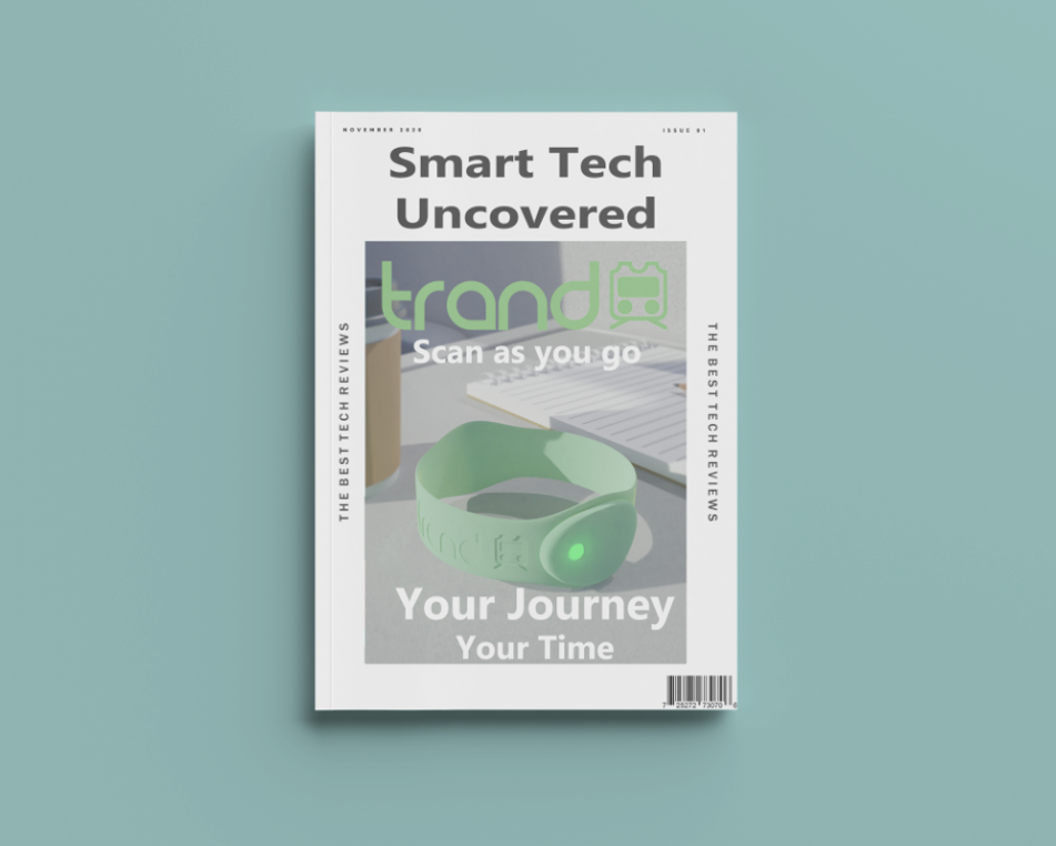
My is my third concept, a magazine cover! This is the same environment that I initially created for the bracelet environment, and I feel that this is one of the best ways of using it for a mock-up concept! This concept was all about keeping it clean and simple, and although you don’t see the whole scene itself, I believe this is a great way to advertise to my intended persona!
2.6 Persona
My persona for this concept was Christina, a 20-year-old Uni student who travels to by train 3 days a week. Christina likes to be very organized and being productive as possible! Now this persona can be described as quiet a few Uni students now, trying to stay organized and generally productive for their course work, however they’re mind is not all set on work and can be focused elsewhere. I say this as my intention with this persona was to create a magazine that they could read whilst on the train. Although most people now days use their phones, I still think this is a valid yet niche target audience that I don’t intend on missing out on!

2.7 Render Blur Set Up
With the scene already made (2.7.1), I used Photoshop’s Field Blur Filter to add more focus onto the bracelet (2.7.2 – 2.7.3).
2.8 Mock-Up Creation
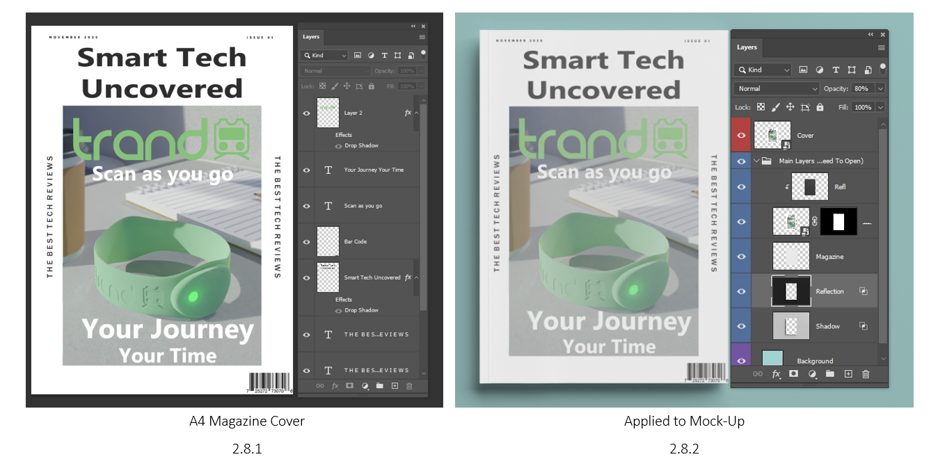
Using a free to use mock up of a magazine, I added my image to the front cover (2.8.2)! I also looked at some other magazine designs and their composition, making sure I my mock-up was looking similar to a real one. I added my title Trand with the logo, and positioned the slogan ‘Scan as you Go’ underneath the title, followed by another slogan ‘Your Journey, Your Time’ to make the user aware that this product is here to save time (2.8.1). Since our product is tech based, I though of making this magazine titles Smart Tech Uncovered, making this magazine potentially more desirable. Finally, I added a bar code because what magazine doesn’t have a bar code.

2.9 Final Mock-Up
Overall, I believe this mock up have an appeal towards my persons! Although this is a tech-based magazine, the idea behind it is that if you’re not on your phone, or read a book, and want to do something, you may take a look at magazine that may be already laid on the train table. The only think I would say about the image it self is the lighting. My intention behind it was to reveal the logo a bit more, making it more visible, however the origan scene has a window on the right side of the image, meaning there apparently isn’t any light coming through.

3.0 Conclusion
In conclusion, I am very happy with all the outcomes I’ve created! Each mock-up has a purpose, and is targeted towards 3 different personas, to which I feel has been accomplished! I’ve learnt so many new Blender skills which will defiantly make my life easier in the future! This project was really fun to work on, and I can’t wait to explore more 3D techniques!